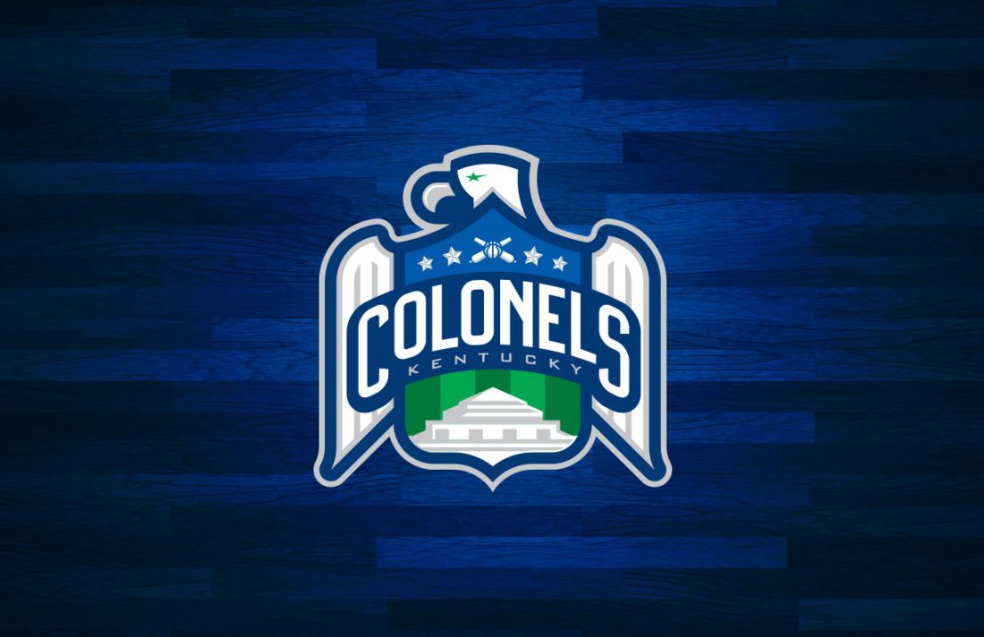
NBA

Kentucky Colonels Logo Concept

Kentucky Colonels

The Kentucky Colonels were one of only two teams that neither moved, changed their nickname, nor folded during the duration of the ABA. Unfortunately, they did not survive the 1976 ABA-NBA merger, unlike the Indiana Pacers. Born in 1967, the Colonels originally sported a kelly green...

0
2
Oakland Oaks Logo Concept

Oakland Oaks

The Oakland Oaks were a charter member of the ABA in 1967, playing two seasons across the Bay from the NBA's San Francisco (at the time) Warriors. Adding fuel to the rivalry was former Warrior Rick Barry, who sat out the 67–68 season and joined...

0
2
Washington Wizards Logo Concept

Washington Wizards

In 1997, when the Washington Wizards changed there name from the Washington Bullets in order to downplay gun violence in favor of a more family-friendly name, they unveiled a logo that drew the ire of the Association for how the abstraction of the wizard mascot...

0
2
Portland Trailblazers Logo Concept

Portland Trailblazers

From a branding standpoint, the Blazers have been a model of consistency by occasionally tweaking their identity rather than overhauling it. Their primary mark has always featured an abstraction of the five-on-five game, with lines symbolizing the players running down the court and back. My...

0
4
Oklahoma City Thunder Logo Concept

Oklahoma City Thunder

After showing the League from 2005 to 2007 that Oklahoma City could support pro basketball by offering the Hornets a temporary home after Hurricane Katrina, the Seattle Supersonics decided make a controversial move to the Sooner State. The team was somewhat rushed in the development...

0
2
New Orleans Pelicans Logo Concept

New Orleans Pelicans

The New Orleans Pelicans actually began play as the original Charlotte Hornets in 1988. The team moved to New Orleans in 2002 and played two seasons in Oklahoma City in the wake of Hurricane Katrina. In 2013, the team had new ownership and that new...

0
5
Phoenix Suns Logo Design

Phoenix Suns

The Suns have worn purple and orange since their inception in 1968, but in recent years, they've reduced the role purple has played by removing it from everything but the road uniform in 2013. This summer, with the Nike switchover, the team's Icon and Association...

0
2
San Antonio Spurs Logo Concept

San Antonio Spurs

Since moving from Dallas in 1973, the Spurs's logo has always featured a SPURS wordmark with a literal spur on the U. Over the years, the team added a pastel paint splash which was replaced with a southwestern themed holding shape before being removed when...

0
0
Houston Rockets Logo Concept

Houston Rockets

Much of the Rockets' history has been built around a simple red and athletic gold scheme. In 1995, that changed when the team unveiled a rebrand in navy, red, and silver, complete with boldly pinstriped uniforms. In 2003, the team dropped the navy to focus...

0
1
Detroit Pistons Logo Concept

Detroit Pistons

The Pistons' brand identity has been rather consistent over the years, with the exception of a period from 1996 to 2001 when the team sported teal, black, cardinal, and athletic gold uniforms. It was the 90s and Detroit got sucked into the teal and purple...

0
2