Arizona Diamondbacks

Arizona Diamondbacks
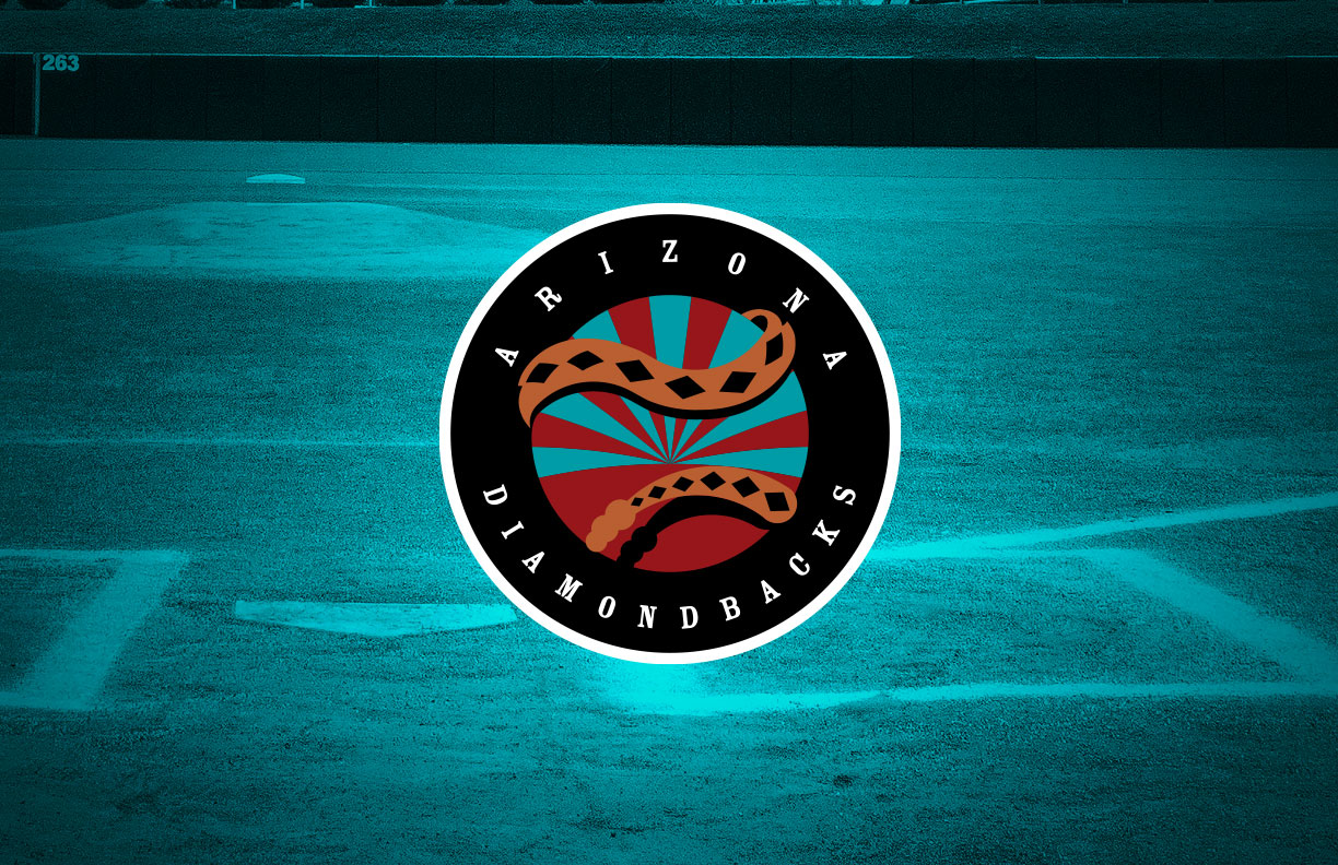
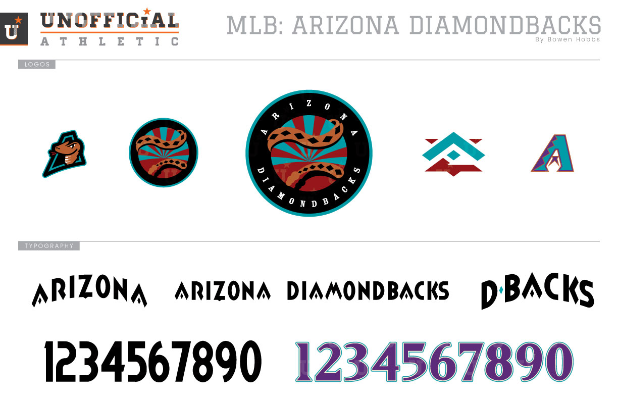
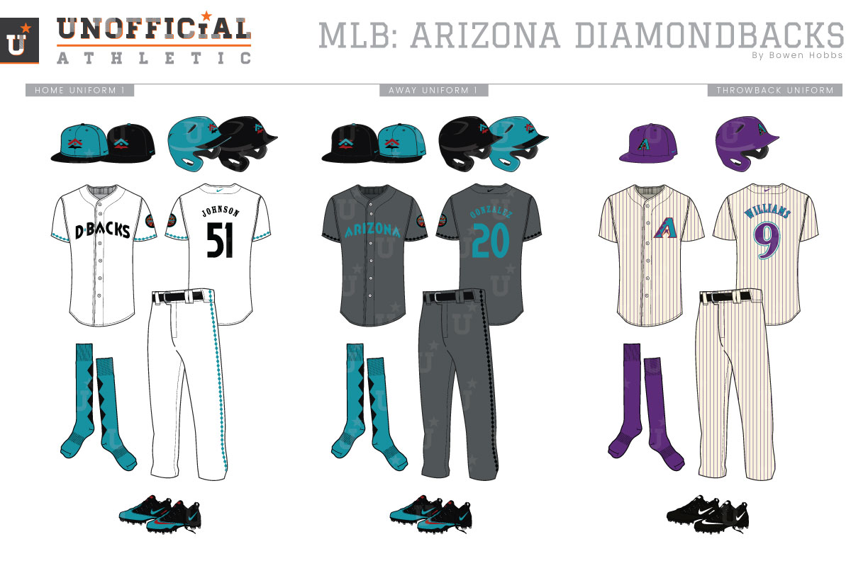
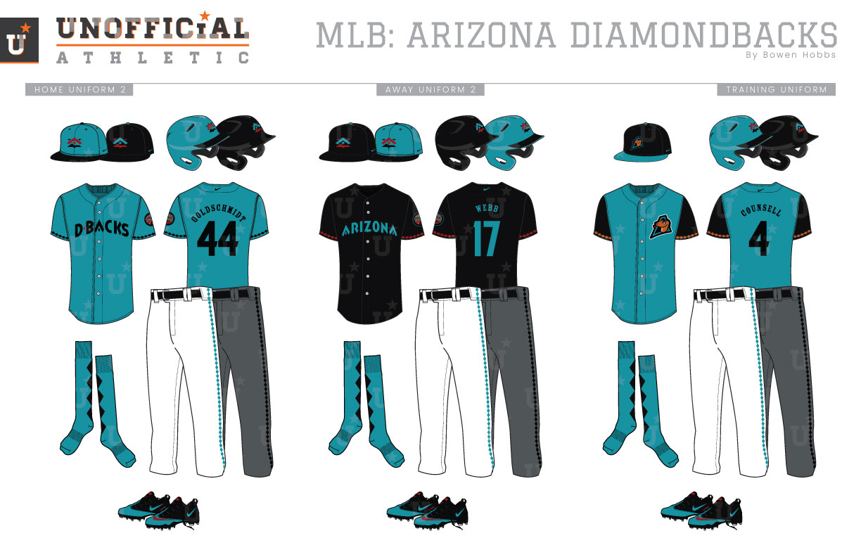
The Arizona Diamondbacks started their major league journey in 1998, alongside the Tampa Bay Devil Rays. Their original color palette of purple, turquoise, and copper was shaped by the fashions of the time, as well as their original owner’s proclivity for the grape-like hue. Their first caps were marked by an angular A with a diamond pattern along one side and an abstract flourish standing in as the letter’s crossbar. The team scripts were rendered in a sharp italicized serif font. The original home uniforms started with a purple cap over a cream uniform with purple pinstripes. DIAMOND BACKS was displayed across the chest in a two-tiered style. The inaugural road uniforms opted for a black cap with a teal brim over a grey uniform with purple pinstripes and ARIZONA on the chest. The team also included some alternate options from the beginning, featuring a cream home alternate cap with a purple brim, a cream jersey with purple pinstripes and the angular A on the left chest, a purple jersey with ARIZONA on the chest, and a black jersey with the angular A logo on the left chest. With some tweaks along the way, this purple-turquoise-copper scheme would last almost a decade before the redesign of 2007. The 2007 redesign would recast the D’Backs in sedona red, black and sand. The Snake-D, introduced in 1999 on a black and copper cap, was retooled to look less jagged in the new red and black scheme. The Angular A was also retained and recolored, but the scripts were replaced with a taller, more angular font in title case. Arizona would redesign their brand again for the 2016 season, introducing a diamond-based snakeskin pattern on the caps, jerseys, and pants. The typography was streamlined and switched to upper case, and teal was added for an alternate home and road uniform. My Diamondbacks redesign seeks to unify the team’s brand under one color scheme of turquoise, black, sedona red, and copper. The primary logo takes a circular sunburst mark and places a rattlesnake around the icon that mimics the seams of a baseball. ARIZONA DIAMONDBACKS appears around the circular mark to complete the roundel. The cap logo features an abstract AZ mark with a diamond pattern radiating out from the center of the A. The Sunburst-Snakeball mark also appears without text as a sleeve patch, and is complemented by a snakehead/A hybrid and the angular-A on throwbacks. The typeface plays on the angular nature of the diamond theme and appears in a single color treatment for a modern classic appearance. All of the uniforms except the throwbacks and training uniforms can pair with either a turquoise cap with a black trim or an all-black cap. The home uniforms place black type and teal diamond trim on a white base. Turquoise socks with black diamonds down the back complete the uniforms. The away uniforms use a graphite base with turquoise type and black diamond trim. The throwbacks bring back memories of the 2001 championship team, combining purple caps with purple pinstriped cream uniforms. The alternate jerseys come in turquoise with black trim and type, as well as black with turquoise type and red trim. The training caps feature the snakehead-A logo on black, accented by a turquoise brim, while the training jerseys are turquoise with black sleeves and the snakehead-A on the left chest.
Date
May 9, 2019
Category
Baseball, MLB

