Atlanta Thrashers


Atlanta Thrashers
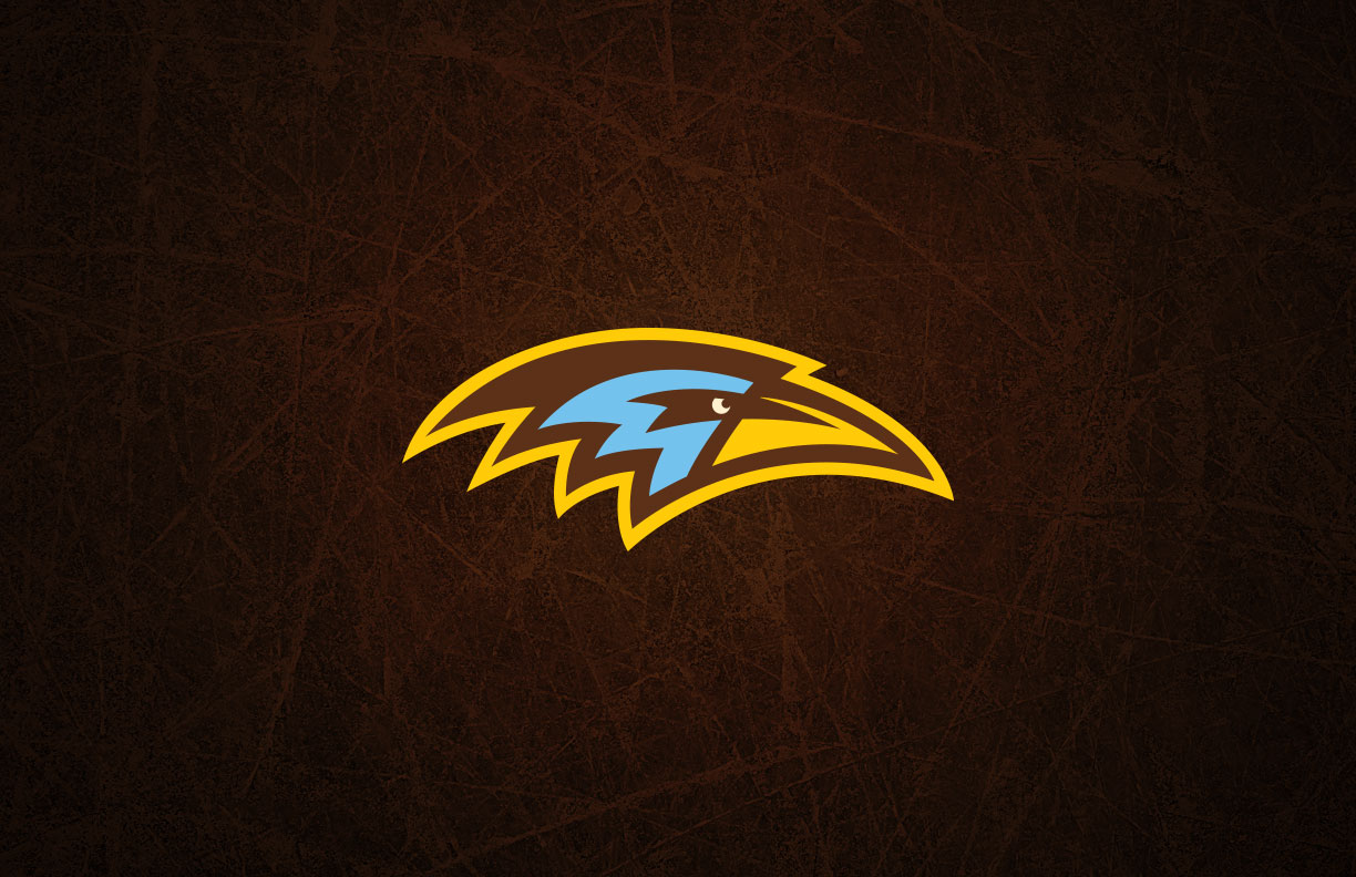
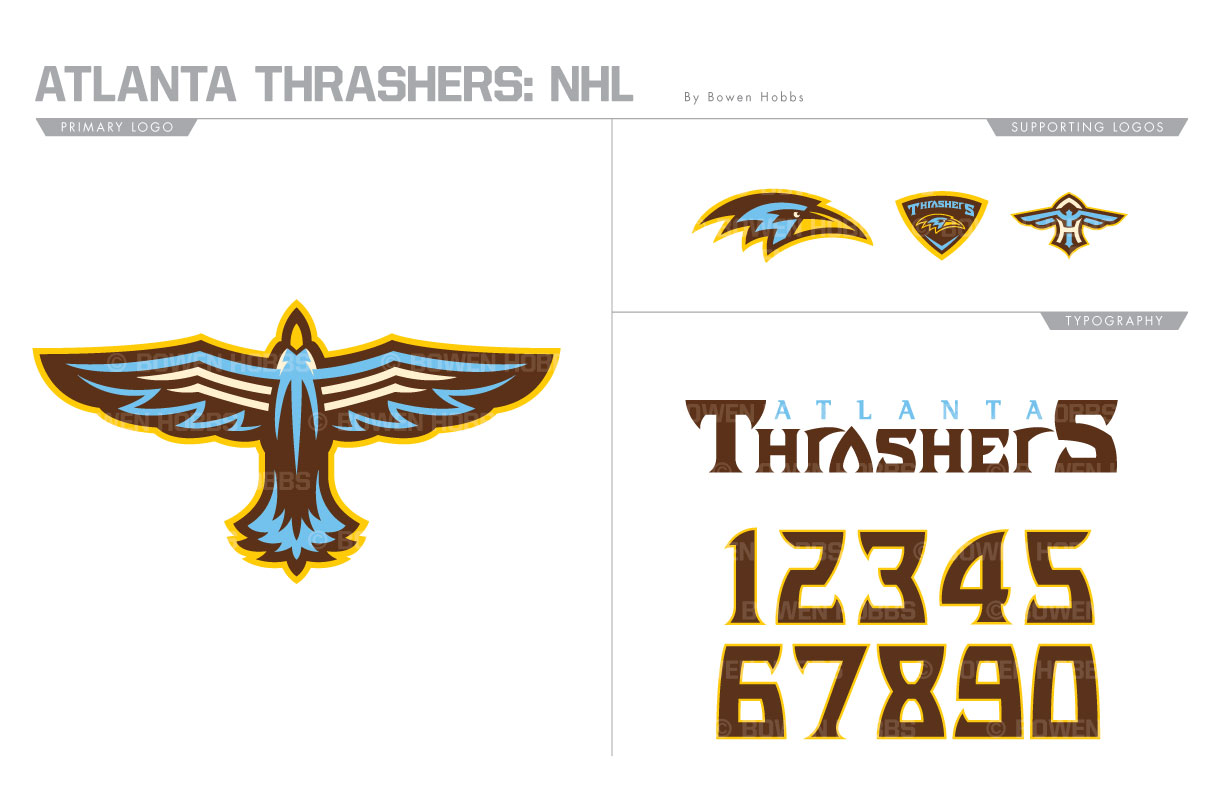
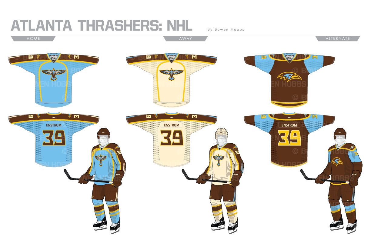
In 1999, NHL hockey returned to Atlanta for the first time since 1980, when the Flames evacuated Georgia and moved to Alberta. They were named the Thrashers for the Georgia state bird, the brown thrasher. Their color palette included navy, carolina blue, burgundy, yellow, and a caramel color. They would play at Philips Arena until relocating to Winnipeg to become the second-generation Jets in 2011. My Thrashers rebrand emphasizes the brown in brown thrashers, with a primary logo that is more ornithological in nature than the team’s previous T-Bird logo. A standalone profile bird head and a version within a crest accompany an AT-bird mark to fill out the logo set. The typeface is round yet sharp, similar to the thrasher’s beak. The home and away uniforms feature two accents on each sleeve near the gloves to emphasize the bird’s speed, and yellow piping for a modern touch. The home features a blend of carolina blue and brown, while the aways pair a warm cream hue with the brown breezers. The alternates go all brown with large blue sections on the sleeves and the bird head logo on the chest.
Date
July 3, 2017
Category
Hockey, NHL

