Baltimore Orioles
Baltimore Orioles
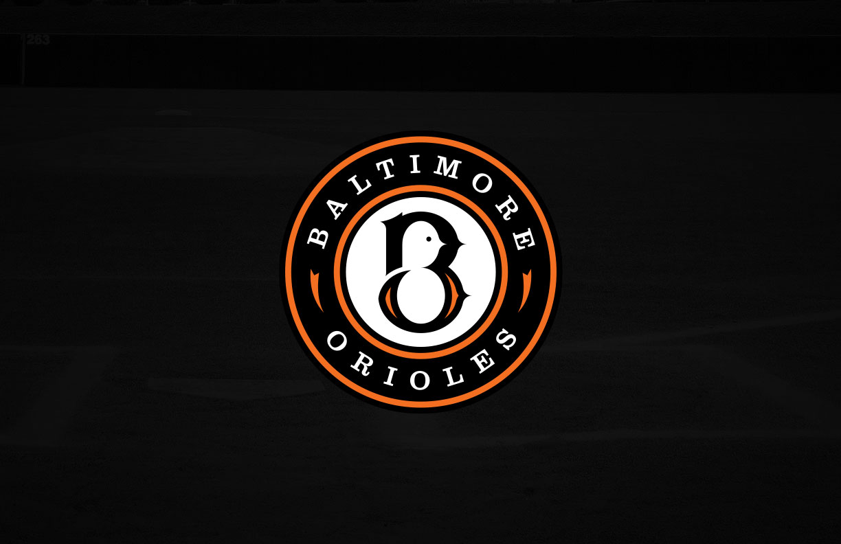
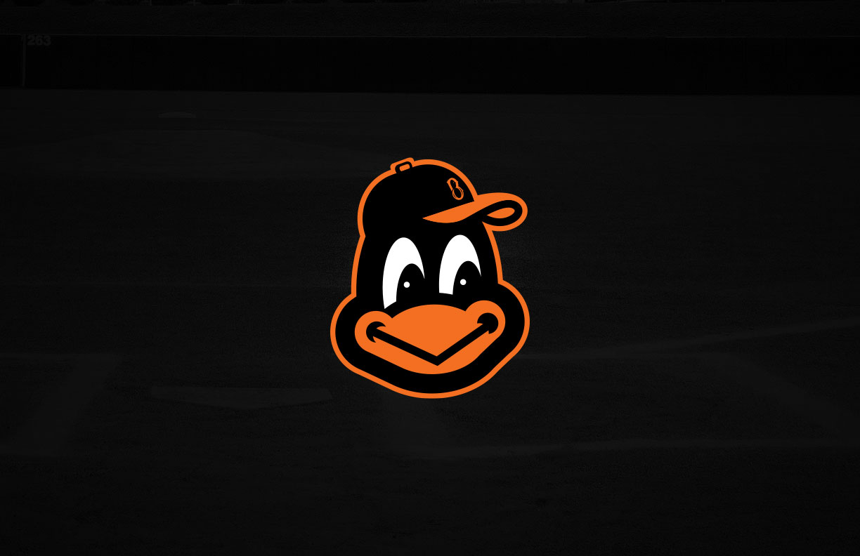
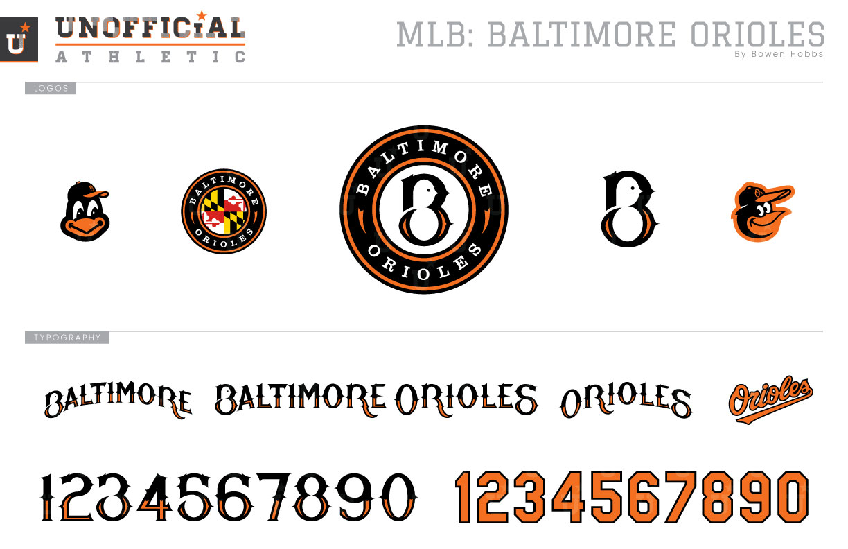
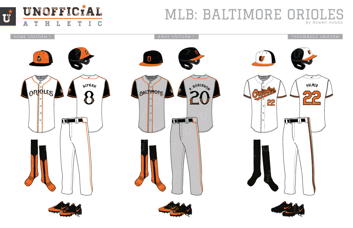
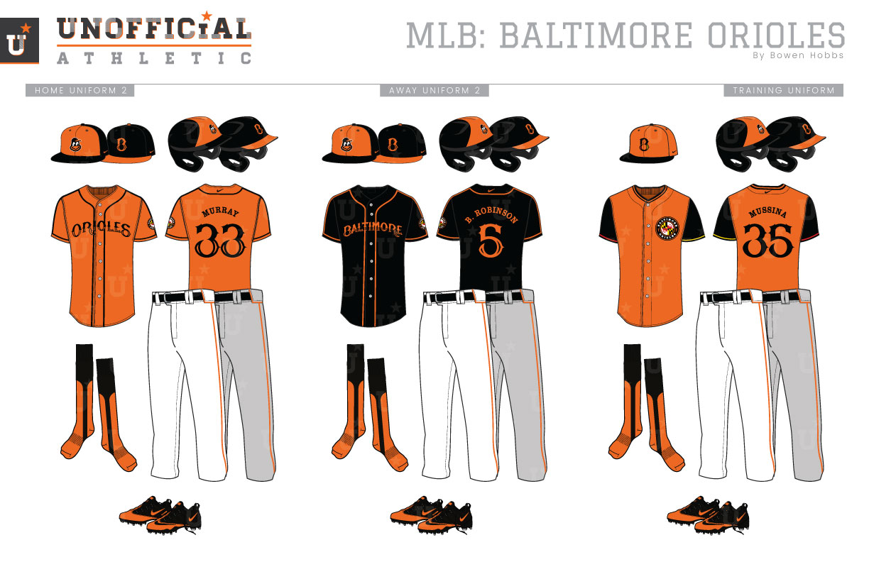
The first iteration of the Baltimore Orioles was a charter American League team that would play two seasons in Charm City before moving north and eventually becoming the New York Yankees. The most notable uniform of the first Orioles team was an all-black getup with an orange O on the left chest, orange belts, and black-and-orange striped socks. Fast forward to 1954. The St. Louis Browns left Missouri for Baltimore and the Orioles were reborn. The home and away uniforms were a more traditional white and grey, with black caps and orange trim accenting the players. The following season, the type on the jerseys would become orange outlined in black. This style would last into the 1960s, when the O’s would experiment with block lettering for three seasons before returning to the familiar orange script. The Orioles would try out vests in 1968 and 1969, but the big change was in 1971, as the team would make the switch to sansabelt pants as well as an all-orange uniform with black caps and typography. The all-orange ensemble would only last two seasons, but the orange jerseys would make a return for the 1975 season and last on-and-off through the 1980s. The 1989 season marked another shift in the Orioles’ visual language, as the team would return to button-down jerseys and belted pants. The new uniforms were also paired with a new cap that eschewed the cartoon bird head for an ornithologically correct full-body oriole. An orange alternate would remain for the first four years of the ornithological era before being replaced by a black alternate jersey that lasted two seasons. The ornithological era would continue through the 2011 season, but the fans were simply too vocal in calling for the return of the cartoon bird, which would return to its perch on the team’s caps for the 2012 season. My Orioles rebrand imagines an alternate history for the team in which a Tuscan-style B with a bird hidden in the negative space is the primary identifier for Baltimore baseball. My primary logo concept places the new B in a roundel format with BALTIMORE ORIOLES around the edge of the circular mark. A revised cartoon bird is used as a cap logo, as is a standalone form of the new B. A Maryland flag roundel was created as a sleeve patch, while the classic cartoon bird is kept for the throwbacks. The home uniforms start with black caps that feature orange front panels, similar to the color distribution of a live oriole with it’s orange stomach. The home uniforms feature black sleeves and orange piping on the head spoon and sleeves. The ORIOLES wordmark (as well as the BALTIMORE wordmark and number set) continues the trend of looking to the team’s namesake for inspiration with it orange accents on the lower half of the letterforms. Orange socks with black stirrups are spec’d to continue the black/orange mix through to the shoes. The away uniforms use a grey base with the BALTIMORE wordmark and pair with a black cap with the B logo and an orange brim. The throwback uniforms keep the classic styling of the current era, with white-front caps and the classic script and numbers in orange. The first alternate jersey is orange with the ORIOLES wordmark and black trim, while the second alternate is black with the BALTIMORE lettering and orange trim. The batting practice caps place the B, but with red and yellow accents, on an orange cap with a black brim and pair with orange training jerseys that feature the Maryland flag roundel on the left chest. The sleeves are black with red trim on one sleeve and yellow trim on the other.
Date
April 23, 2019
Category
Baseball, MLB

