Buffalo Sabres
Buffalo Sabres
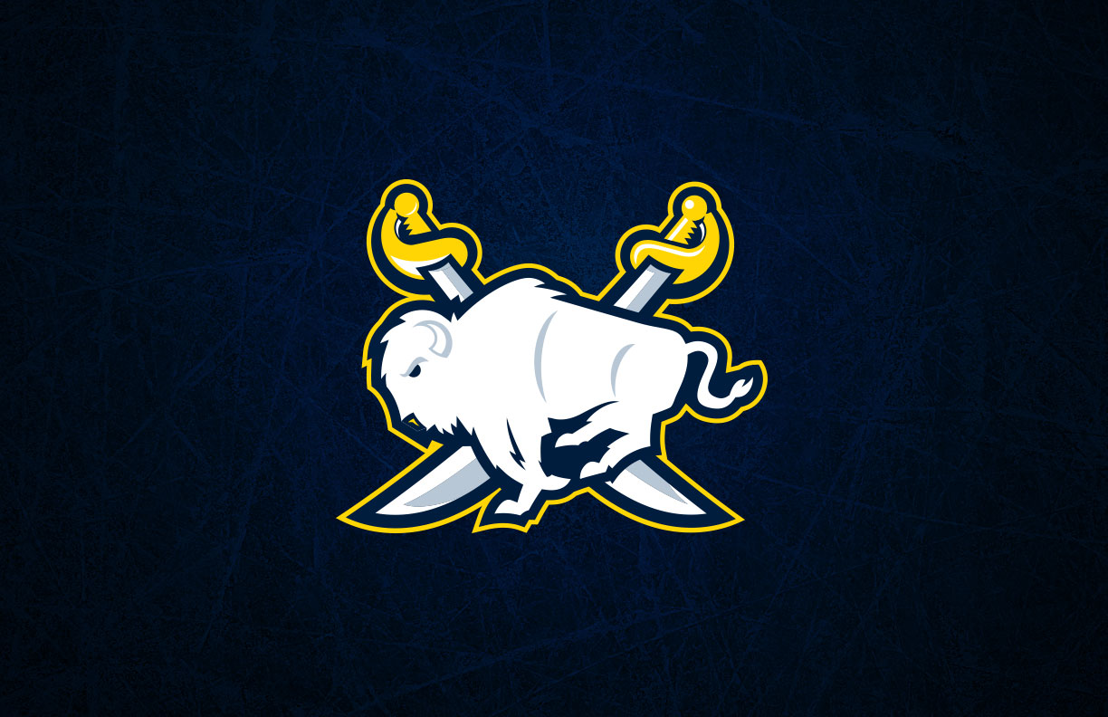
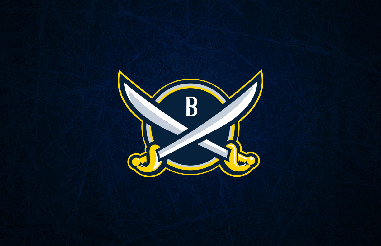
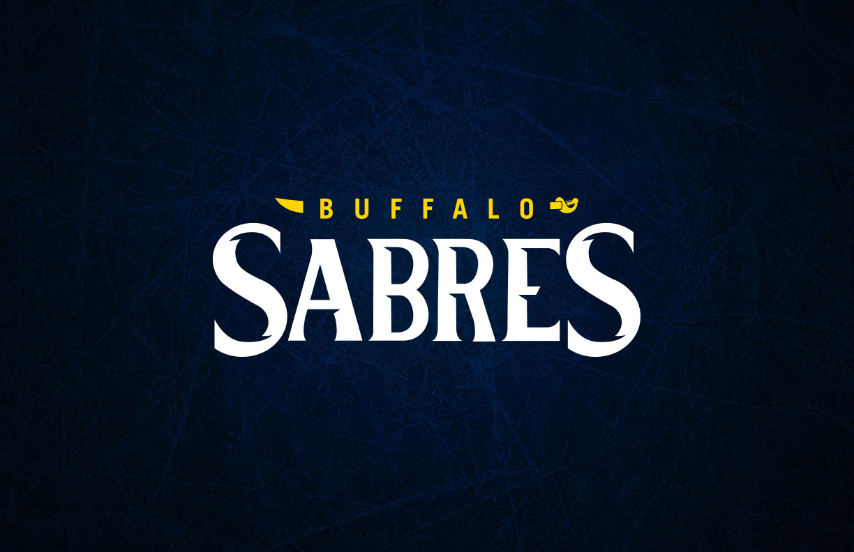
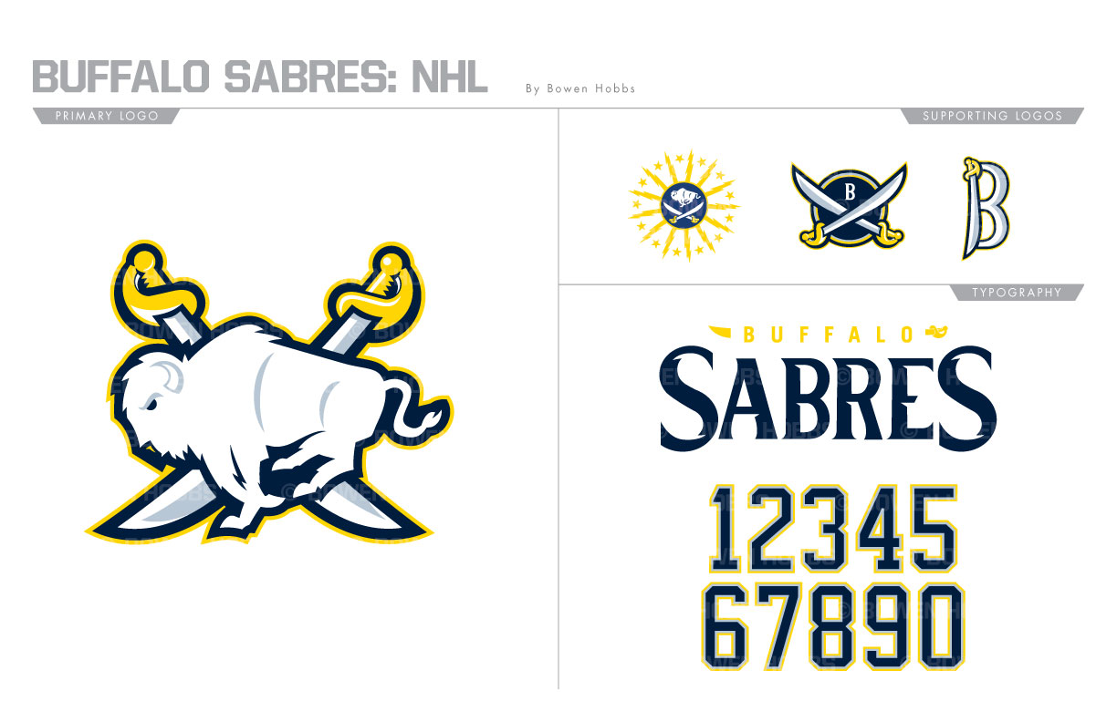
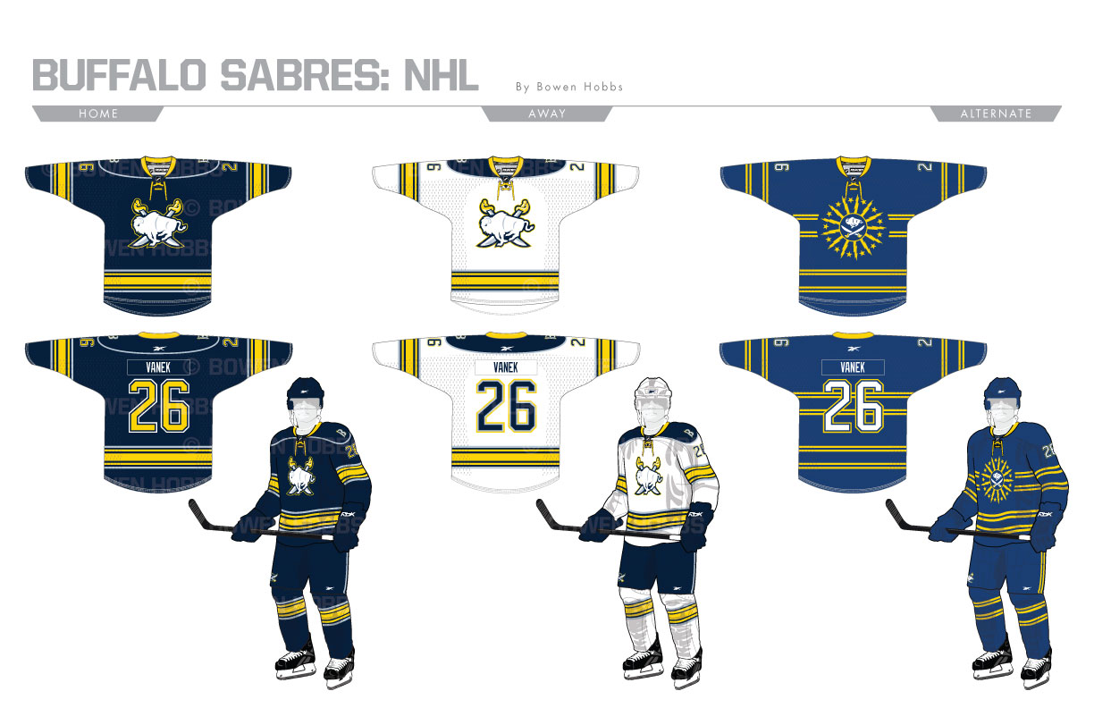
The Buffalo Sabres returned to a modified version of their original logo for the 2010/11 season, and while that mark has some charm the buffalo in it is rendered rather poorly. My Sabres primary logo places a greater emphasis on the buffalo, which is redrawn to show greater detail and a more realistic pose. Behind it are two crossed sabres, which are also redesigned to be sharper and more detailed. The secondary logo contains the crossed sabres against a circle with a B for Buffalo. A standalone B and a Buffalo city flag crest round out the logo set. The wordmark features a custom-designed serif font with sword-like cuts in it, while the numerals remain a standard block font. The home and away uniforms feature a yellow, navy and silver striping pattern and navy shoulder yokes outlined in silver piping. The alternates uniforms are royal blue and proudly display the aforementioned Buffalo city flag-inspired crest.
Date
July 2, 2017
Category
Hockey, NHL

