Chicago Bulls
Chicago Bulls
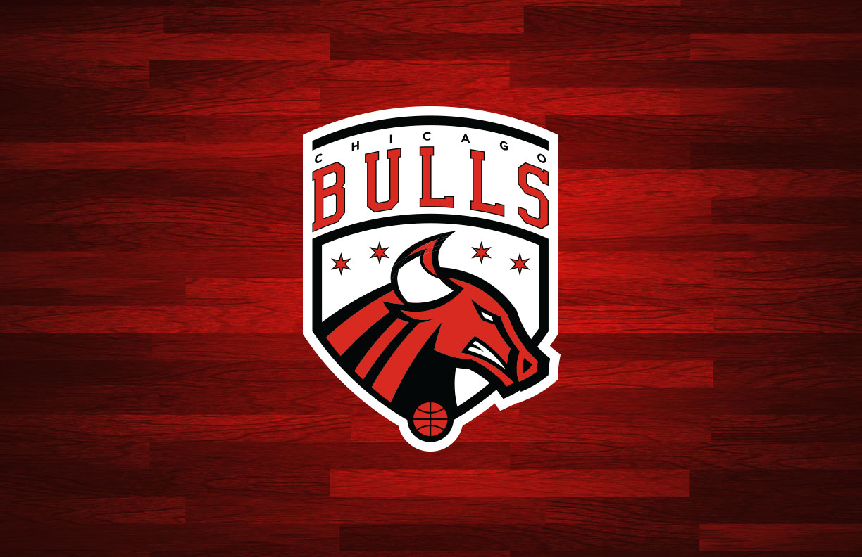
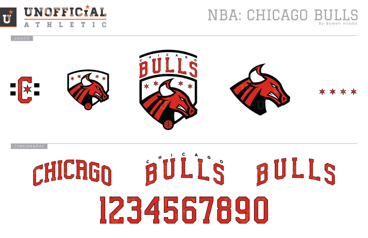
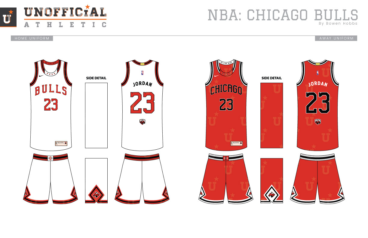
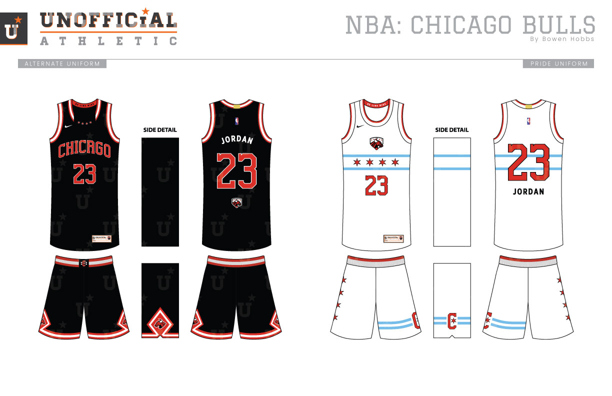
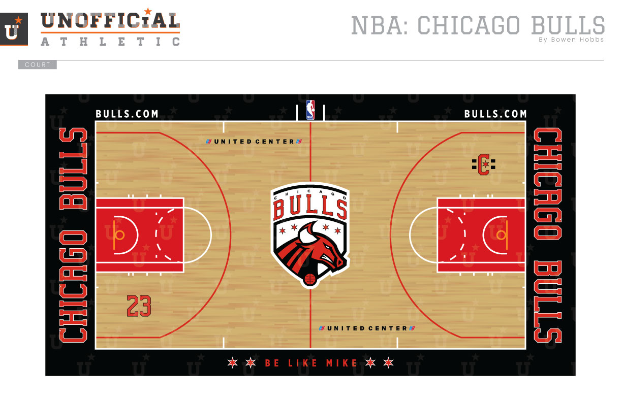
The Chicago Bulls sport one of the most iconic logos in the NBA. The forward-facing bull head hasn’t changed since the team’s inception in 1966. The Bulls are also one of the only NBA teams that do not feature a basketball in their primary or secondary logo. My goal in redesigning the Bulls was to develop a mark that all Chicagoans could be proud of. I created a logo not unlike a coat of arms. The team name appears above a shield containing a charging bull head, four six-pointed red stars, and a basketball at the point. The primary logo breaks down to a wordmark-free shield and a standalone bull head. Those marks are complemented by a C with a star and two bars and a line of four stars symbolizing Chicago. The typeface takes the Bulls existing block font, raises the x-height, adds some subtlety to the serifs, and squares the A in CHICAGO. The uniforms simplify the trim of the old uniforms and add the four stars to the collar. While the BULLS wordmark remains on the Association uniforms, the Icon and Alternate uniforms proudly display CHICAGO on the chest. The belt buckle is accented by the C logo. The diamond pattern remains on the shorts, but it is now adorned with the updated bull head logo. The Pride uniforms take a different route, with no wordmark on the chest. Instead, the shield mark appears above two light blue bars containing four stars, an ode to the city. The four stars also run down the right leg go the shorts, with the C logo on the left leg. Every uniform features BE LIKE MIKE on the inside of the collar, an homage to Jordan. The court features the primary logo at center court with the C-logo and a number 23 displayed within the arc on each side. The sideline also features the BE LIKE MIKE wordmark, a reminder for players to strive for greatness as they take the floor.
Date
August 26, 2017
Category
Basketball, NBA

