Colorado Rockies
Colorado Rockies
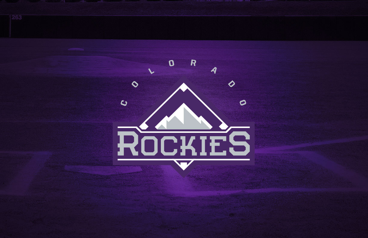
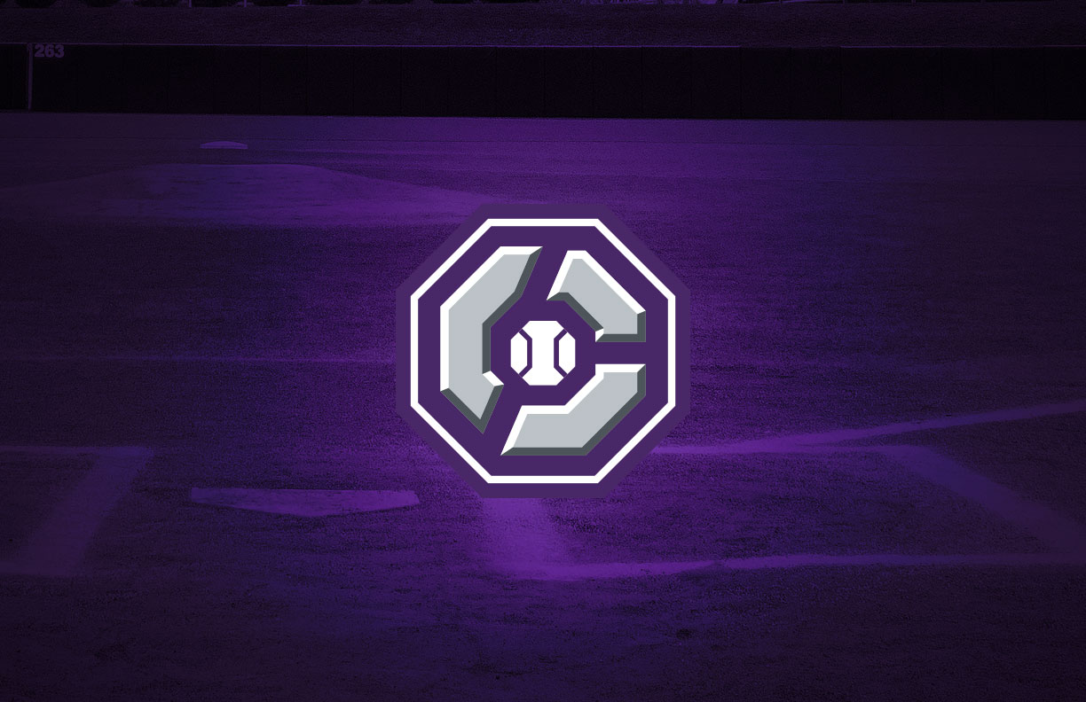
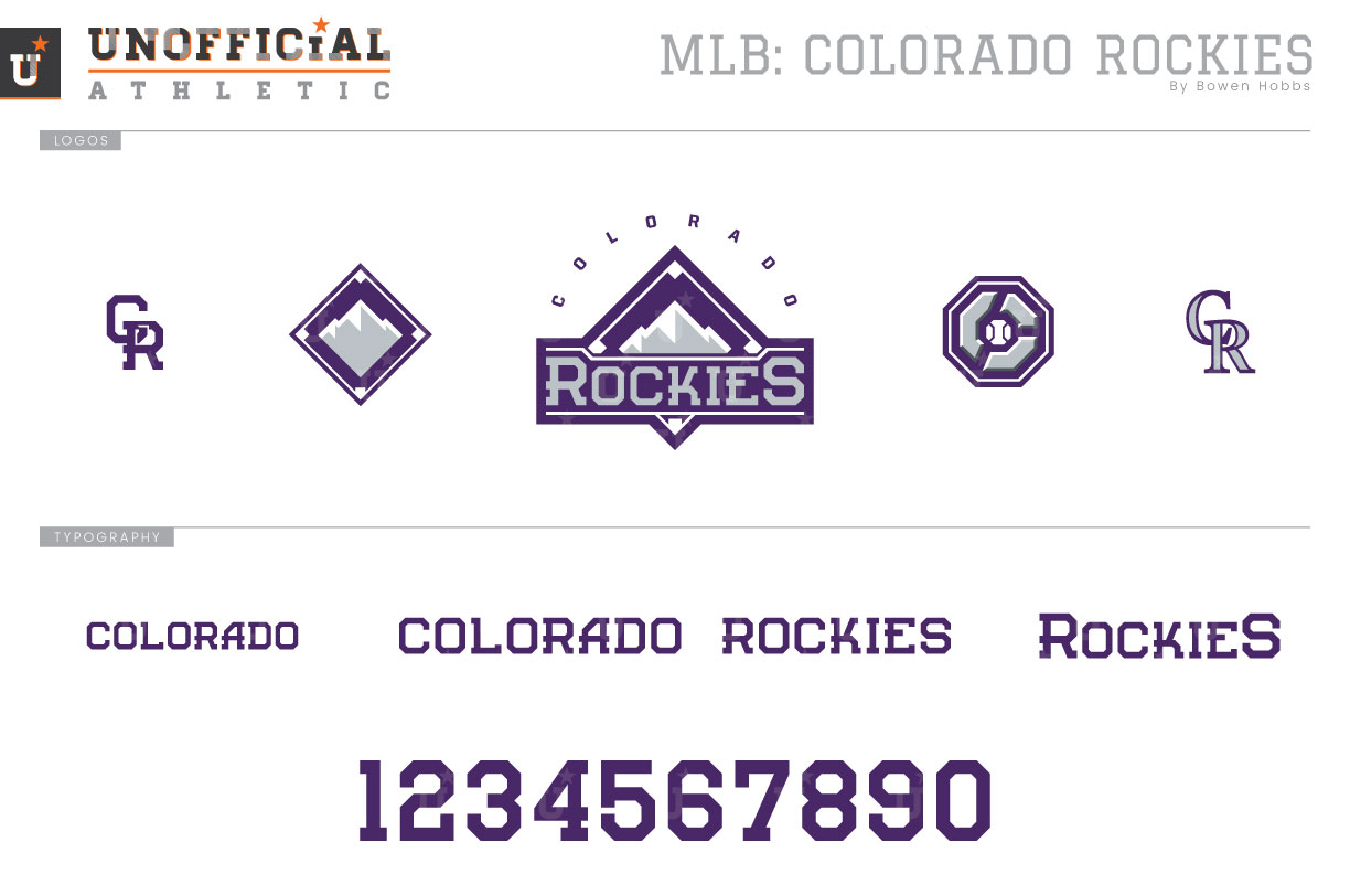
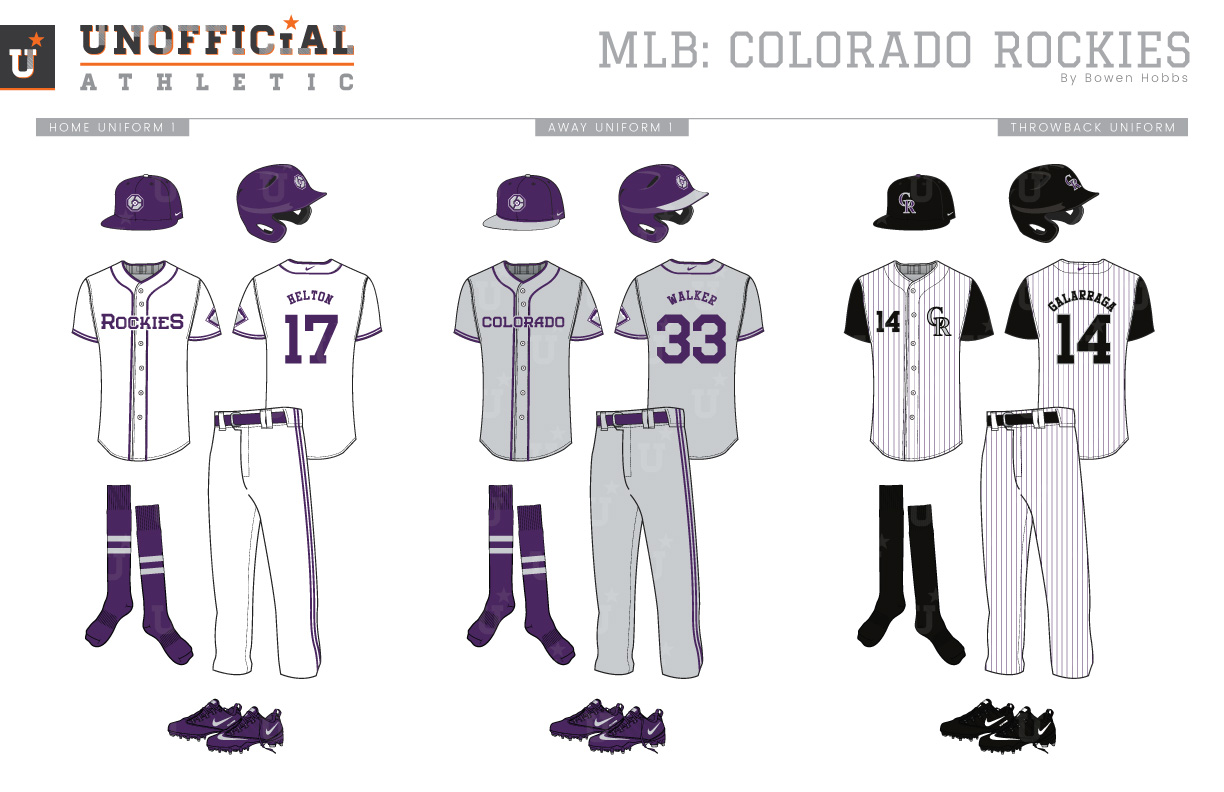
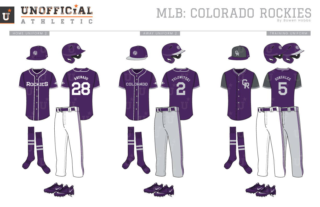
Contrary to the other MLB team born in 1993, the Colorado Rockies have had the same branding elements since their inception, only switching their CR cap logo to primary logo status before the 2017 season. The Rockies’ color palette has been just as consistent with the team only editing the shade of purple to make it brighter prior to the 2017 campaign. The Rockies lettering features a black serif typeface with silver accents on the logos and home uniforms while a purple serif type treatment with a thin white outline is used on their grey road uniforms. The uniforms have been relatively consistent as well, although the team has tried different designs for their grey uniforms and alternates. With that type of brand consistency for a young team, there are not many historical markers to look back on. But there are also many possibilities to craft the look into something distinctly Rockies. When concepting this Rockies rebrand, I started with the team’s signature color: purple. Other teams (the Diamondbacks and Rays) have worn it, but the imperial shade has taken root in the mountains of a matching hue. With a color pallet focusing on purple, silver, and white while eschewing black, I developed a primary logo of a mountain against a baseball diamond and the team name front-and-center. The cap logo consists of a C rendered in the style of boulders encapsulating a baseball. To complement those marks, the primary logo breaks down into a diamond-mountain icon used as a sleeve patch, the classic CR monogram is used on throwbacks, and a refreshed CR monogram was developed in the new block serif typeface. The home uniforms start with a purple cap with a white squatchee (the button atop the cap) and the Boulder-C logo. The white jerseys and pants are accented with purple collar, headspoon, sleeve, and pant piping, as well as purple type. The socks keep with the purple theme but add two silver stripes. The away uniforms keep the Boulder-C on a purple cap, but opt for a silver/grey bill and squatchee on the headwear. The away jerseys and caps use a neutral grey base to showcase the purple lettering and trim. The throwbacks replicate the team’s home alternate vests from 2005 to 2011, with purple pinstripes, black sleeves and caps, and the CR monogram on the left chest in black and silver. Much like the primary home uniforms, the home alternate jerseys focus on purple and white, but with purple jerseys featuring white type and trim, while the away alternates place silver type and trim against a purple jersey. Lastly. the batting practice gear adds charcoal grey accents to the purple with a charcoal-fronted cap and a charcoal sleeved jersey.
Date
March 20, 2019
Category
Baseball, MLB

