Indiana Pacers

Indiana Pacers
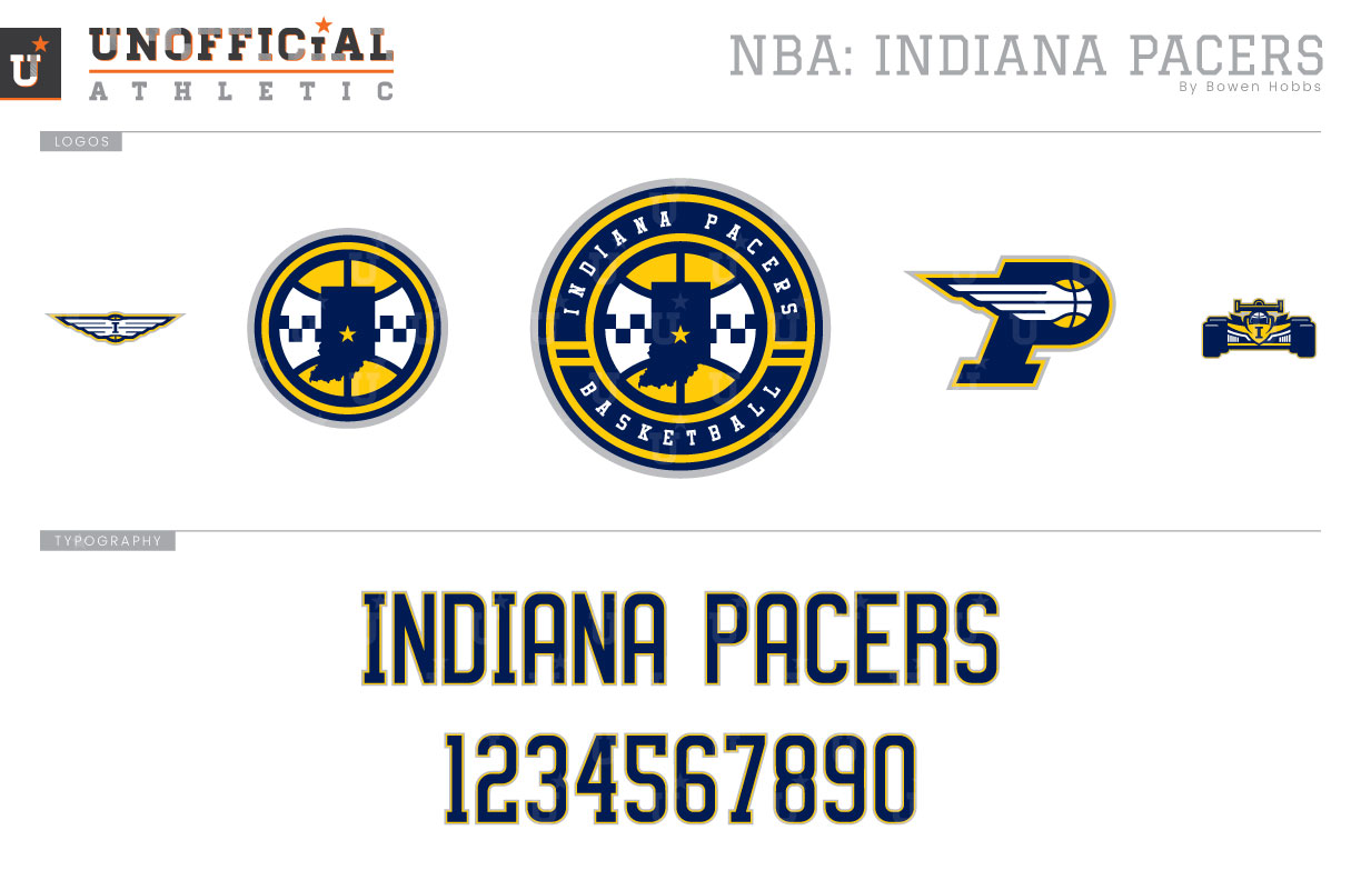
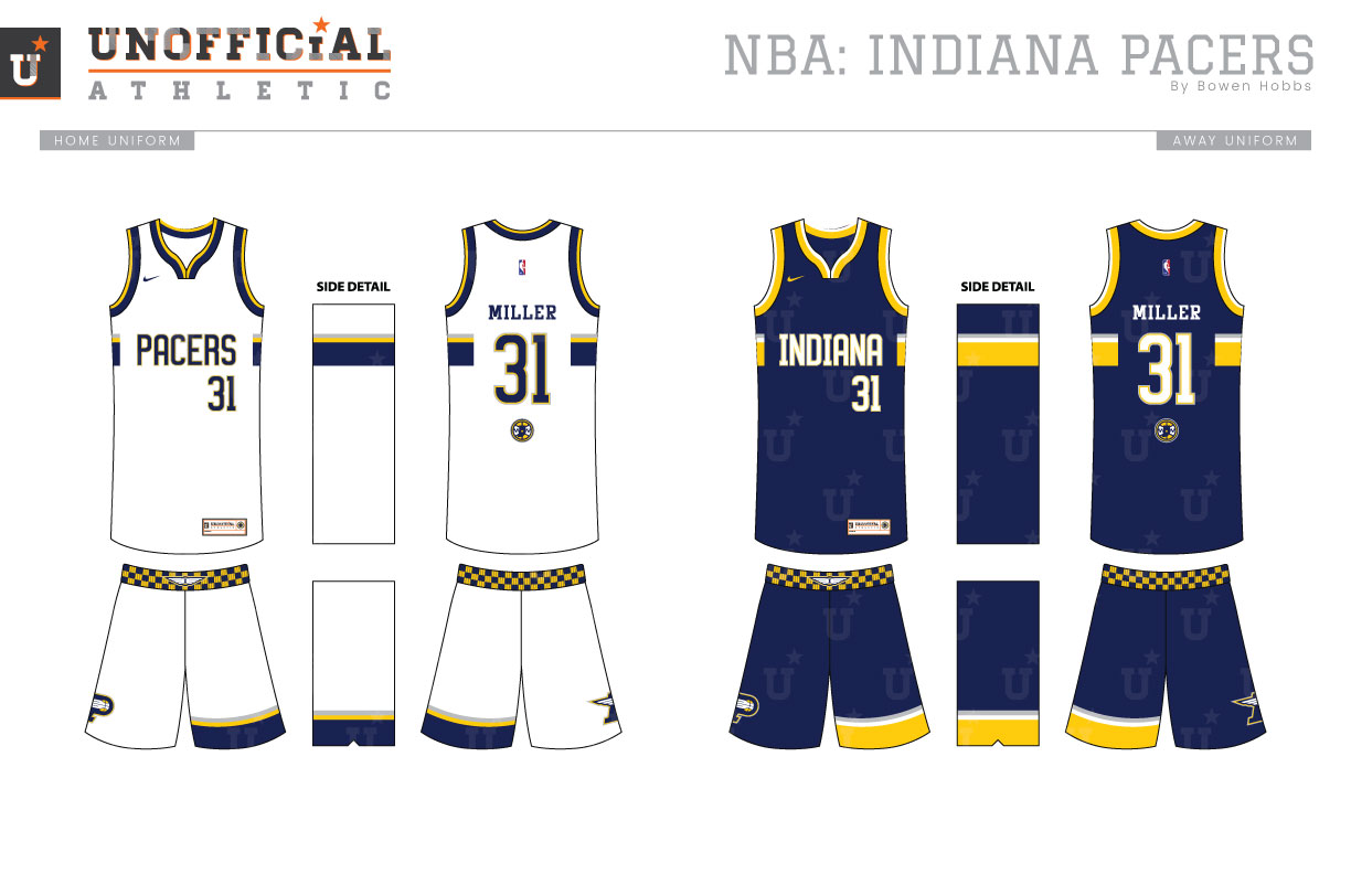
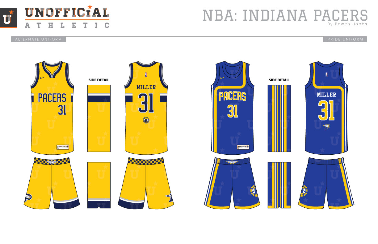
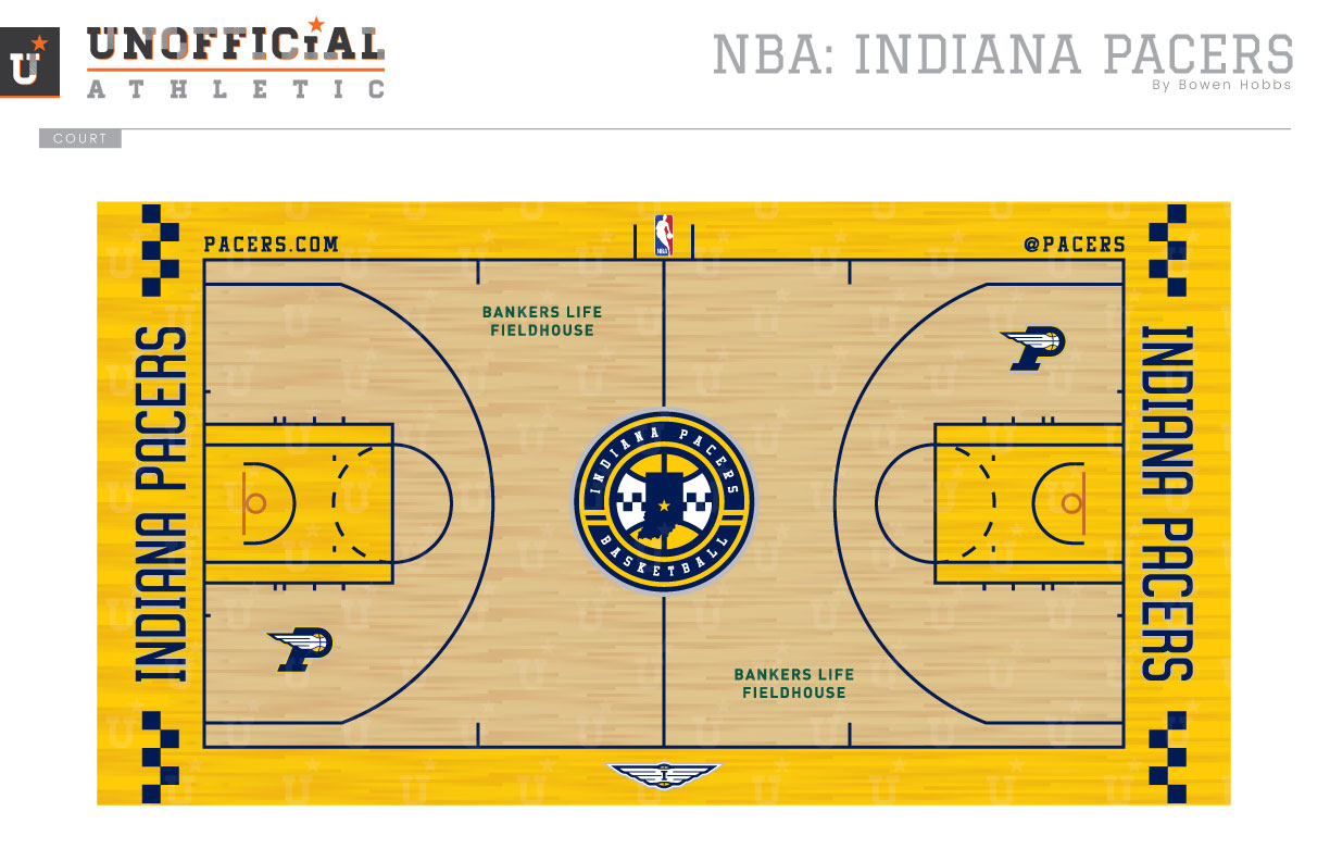
Since their days in the ABA, the Pacers have vacillated between uniforms that push the envelope and more classic designs. Throughout all the changes, however, the logo has been very consistent, featuring a basketball inside a capital P. While the original mark featured a hand dunking inside the P, the current version focuses on a speeding basketball inside the letterform. My concept places a renewed focus on the team name, adding a racing feel throughout. The primary logo is a roundel with a checkered basketball and the state of Indiana inside. Along the outside, INDIANA PACERS BASKETBALL complements a pair of stripes. The checkered basketball is also used without the text and is accompanied by a modified P-Logo that places a wing on the ball, a winged ball with an I, and an Indy Car mark. The typeface blends a uniform stroke weight with clean curves for a look that is both modern and timeless. The Icon, Association, and Alternate uniforms feature a partial stripe that breaks around the team name and player number for readability. The stripe also makes an appearance at the bottom of the left leg, while the P-Logo appears on the right leg. The waistbands add an extra racing flair with a checkered pattern and the winged basketball. The Pride uniforms recall the Pacers’ ABA days with an asymmetrical design, while the typography is updated for the era. The court features an athletic gold stain instead of paint to let the hardwood texture through. Each baseline features INDIANA PACERS accompanied by checkers, while the roundel appears at center court.
Date
September 4, 2017
Category
Basketball, NBA

