Iowa Hawkeyes
Iowa Hawkeyes
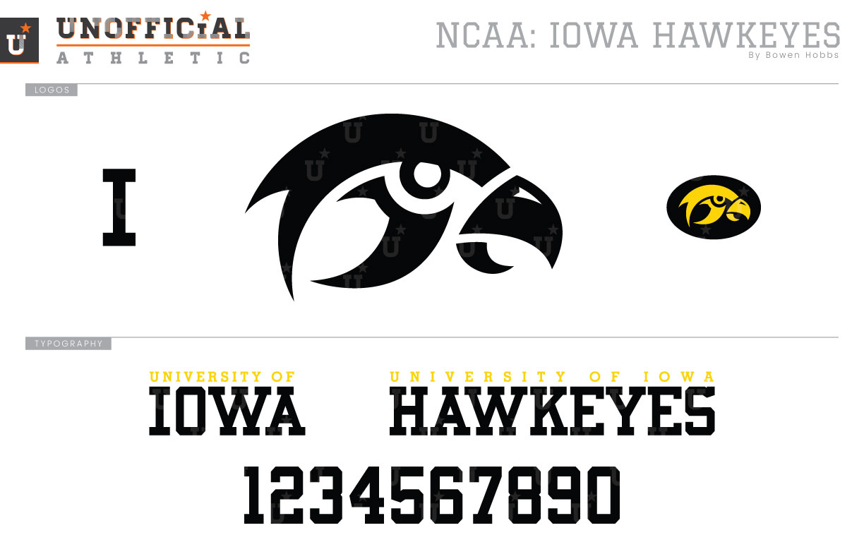
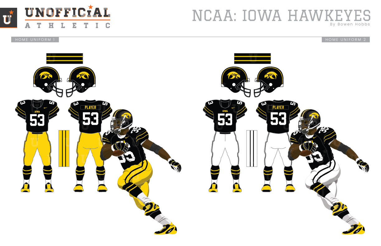
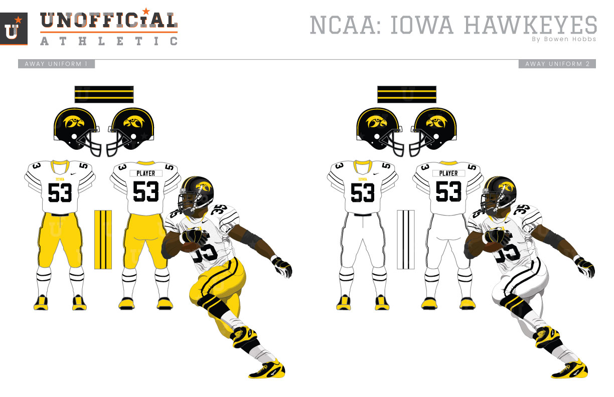
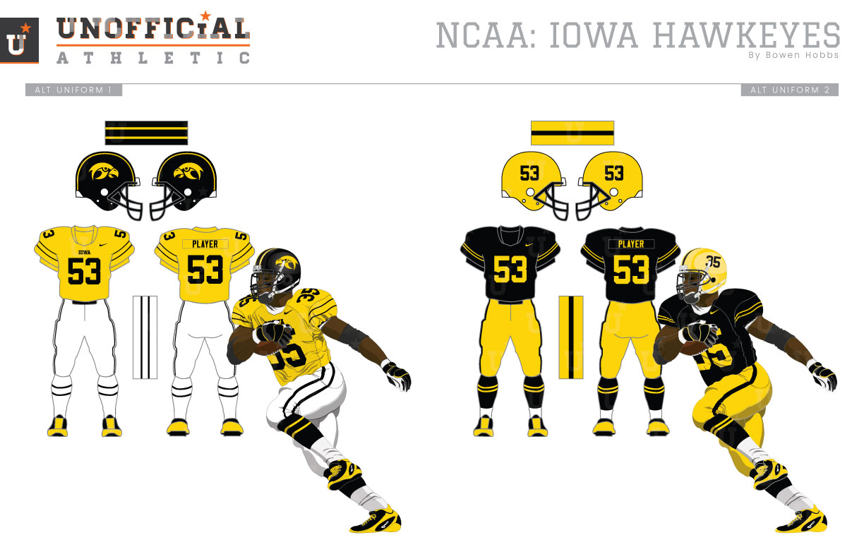
The Iowa Hawkeyes are a standard for tradition, having not made any noticeable changes to their uniforms since adopting a look similar to the NFL’s Steelers in 1979. The only edits have been updating the uniform template and fabrics as per the manufacturer standards. That said, the “hawkeye” does seem to look a bit like a chicken. Nothing against chickens, but my concept seeks to put the HAWK back in HAWKEYE. Updating the logo with cleaner lines and a pupil eye help create a meaner, more determined hawk. The hawk head primary logo is complemented by a version encased in an oval and an I-monogram. The typeface is a custom block font with strong slab serifs and a notch in the S that mimics the five in the number set. The home and away uniforms feature updated striping that is more conducive to the ever-shrinking sleeves of football jerseys. That double stripe is applied throughout the uniform so that the helmets, pants, and socks match the jerseys, which now features the IOWA wordmark just below the neckline. An additional set of white pants allows the team to mix and match elements while maintaining a classic look and complements the athletic gold alternate jersey. A throwback uniform referencing the 1958 team rounds out the uniform set with gold numbered helmets atop an all black-and-gold look.
Date
July 19, 2017
Category
Football, NCAA

