Jupiter Hammerheads
Jupiter Hammerheads
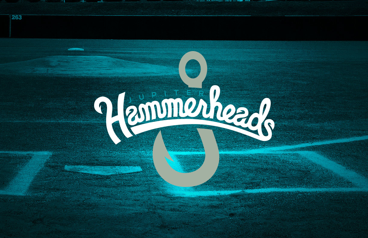
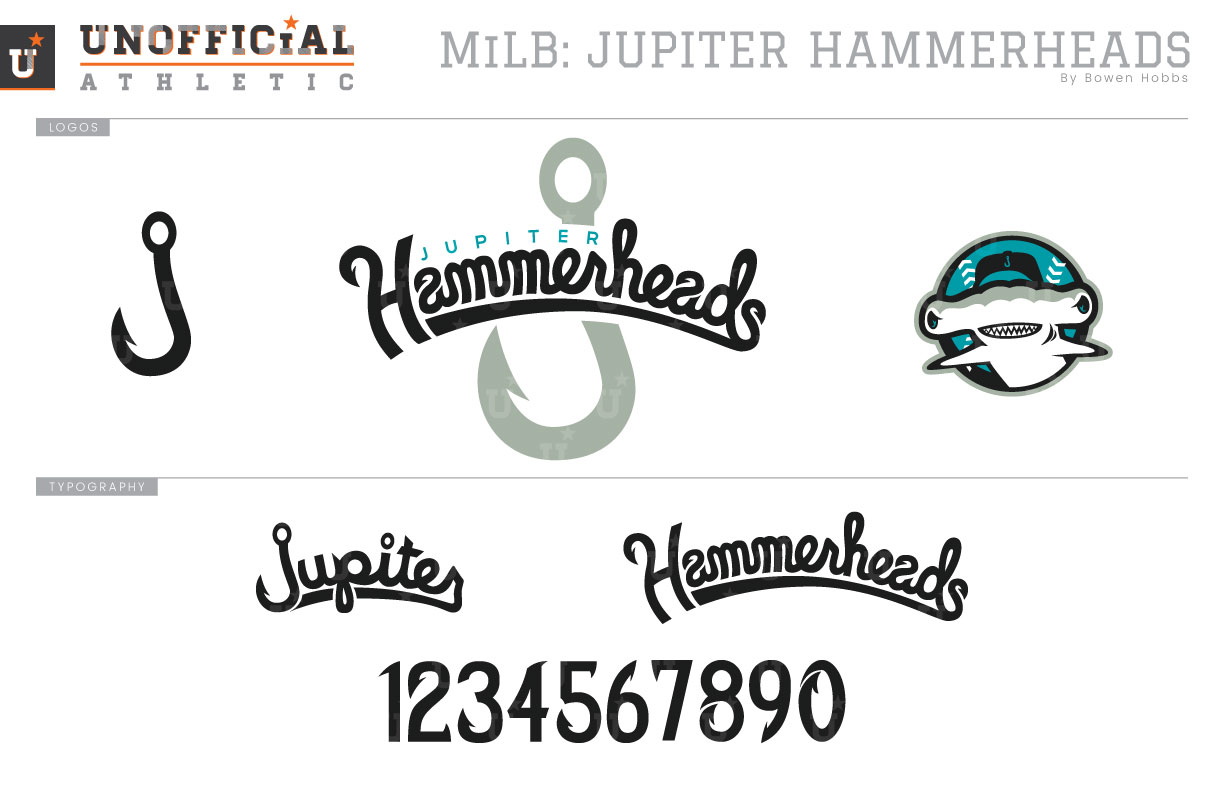
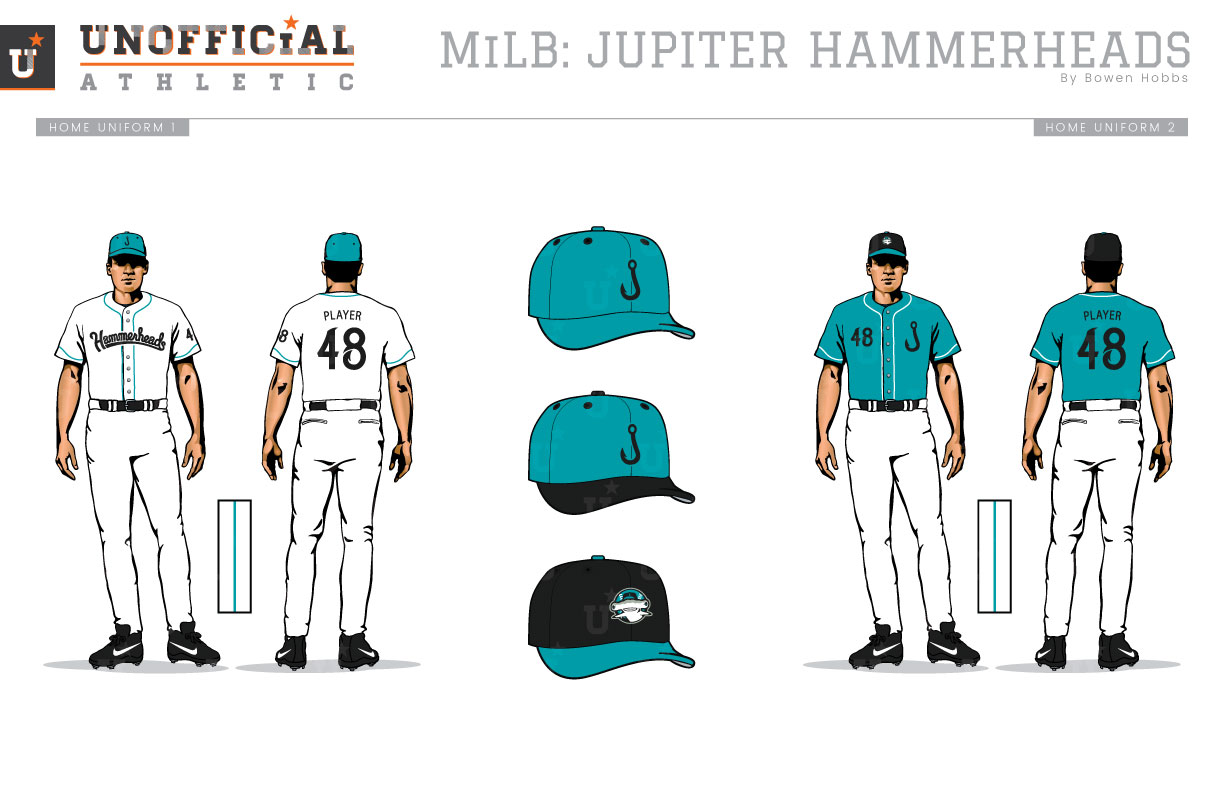
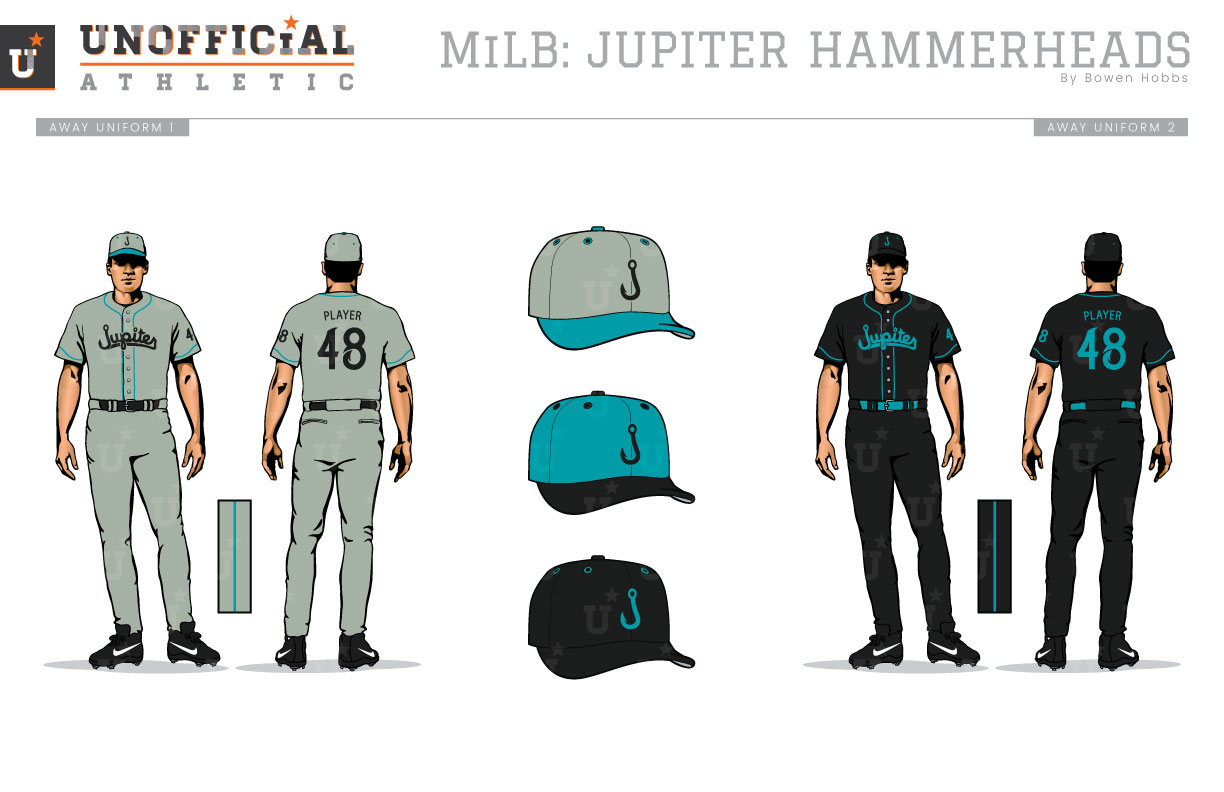
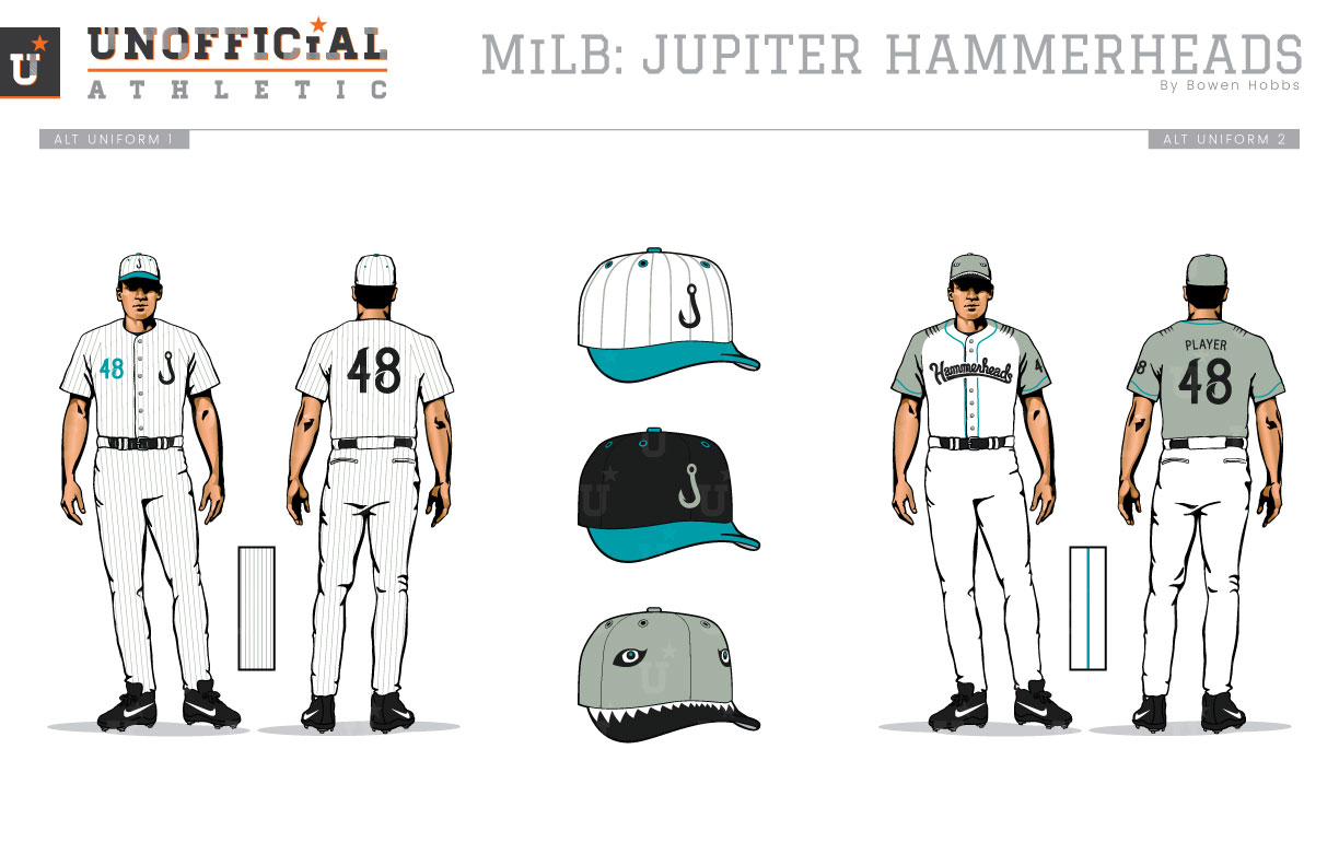
As the Class-A Advanced affiliate of the Miami Marlins, the Hammerheads currently seem to be sporting a black-and-orange jersey with a hat that uses carolina blue and red against a black crown and bill. To confound the strange color choices, the logo itself lacks a focal point with a fishhook-J, a shark, and a lighthouse juxtaposed together, all of which are similar in size. My concept brings in the classic Florida Marlins black and teal, and simplifies the primary mark to the fishhook-J and the custom script typeface I developed for the project. The hammerhead shark appears in its own emblem against a teal baseball, while a standalone fishhook-J completes the logo set. The custom script features barbs throughout to stay in rhythm with the fishhook-J. The home uniforms are stark with teal piping that waves on the sleeves and solid black type. In addition, there is an option consisting of a teal jersey with the J and the player number over the chest. On the road there is an all-grey set and an all-black set with JUPITER displayed proudly. A pinstriped faux-back is available for Sunday games, while an alternate uniform designed to mimic a shark, complete with an eye-and-mouth cap gives the team plenty of options.
Date
August 3, 2017
Category
Baseball, MiLB

