Kansas City Royals
Kansas City Royals
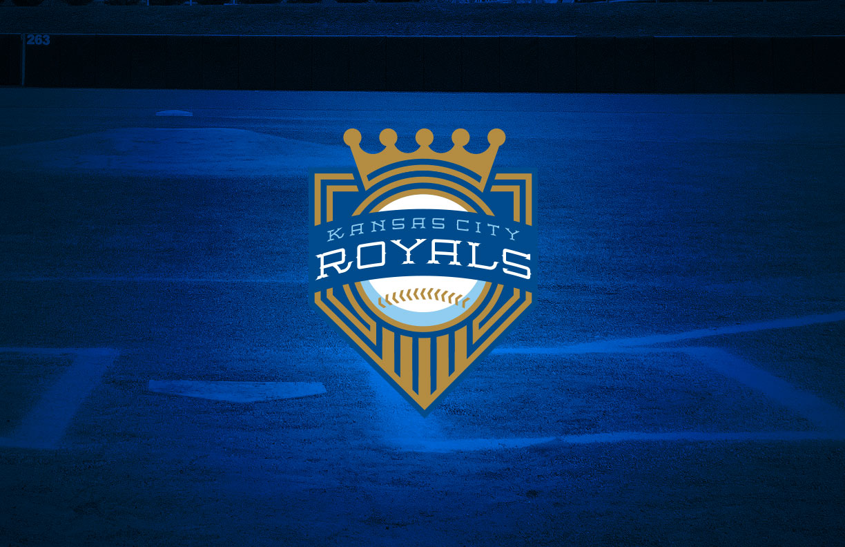
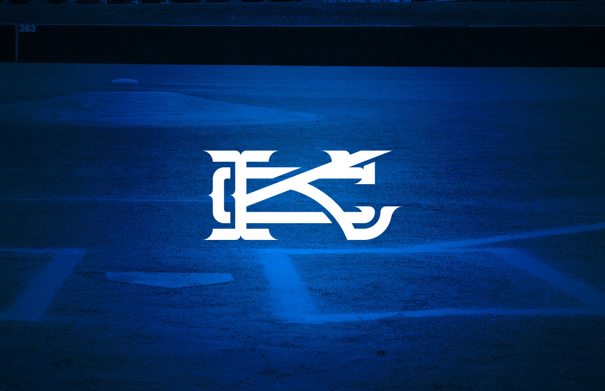
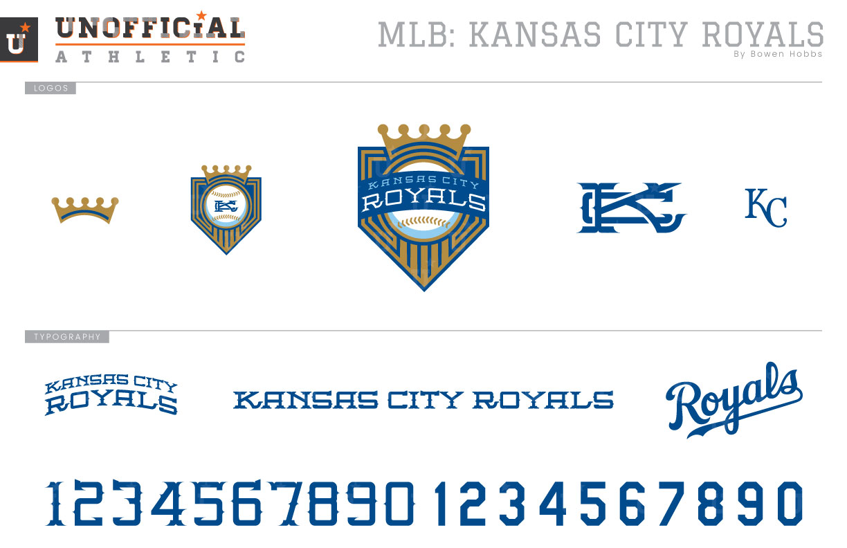
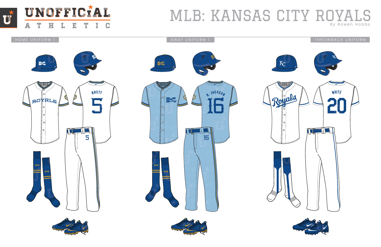
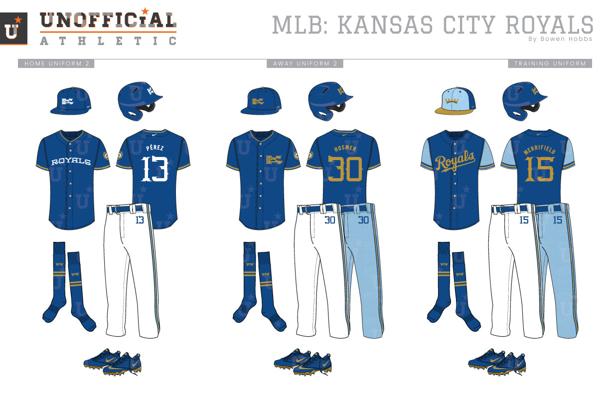
Upon joining Major League Baseball in 1969, the Kansas City Royals have been a model of branding consistency. The primary logo has been tweaked over the years but has also continued to employ a gold crown over a blue banner. The original version featured a large R with the KC cap logo in the banner, as well as bright gold accents and a gold serifed ROYALS at the bottom of the mark. The next iteration changed the gold ROYALS to match the team’s home jersey script. Over time, the Royals script would get larger and the gold would morph into a more metallic shade. In 2002, the primary logo would lose the R for a simpler KC shield, while black was added throughout the scheme. The primary logo was revised once more prior to the 2019 season dropping the black and the Royals script for a simple KC Crown & Banner mark. The team’s home uniform always featured the Royals script on the chest, although the trim on the neck and sleeves has been periodically updated throughout much of the team’s history. Powder blue away uniforms are one of the hallmarks of Kansas City’s on-field identity, as the team wore the sky hue on the road from 1973 through 1991. From 2002 through 2006, the Royals added black to their color scheme in the form of drop shadows, two black alternate jerseys, and the undershirt of their grey away vests. The more common motif at Kauffman these days is a combination of royal blue, metallic gold, and powder blue, with the team wearing powder blue alternate uniforms and a gold trimmed white home alternate uniform. My Royals rebrand reimagines the team with a vintage Tuscan typeface that evokes the rich baseball history of KC. The new typeface is on display against a baseball, crown, and banner to create the new primary logo. A version of the Crown-Baseball-Banner mark with the team name replaced by a KC monogram is used as a sleeve patch, while the Tuscan-KC monogram is used as the identifier on the team’s home and away caps. The crown appears in a standalone capacity as an alternate mark, while the traditional KC is used on the throwback uniforms. The home uniforms start with a royal blue cap with a white Tuscan-KC and a metallic gold squatchee (cap button) on the crown. The home jerseys and pants are white with royal and gold trim with the new ROYALS wordmark across the chest. The player number appears not only in its usual spot on the back of the jersey but also smaller on the player’s left hip. The socks are royal with two gold stripes and the gold crown mark above those stripes. The away uniforms opt for a metallic gold Tuscan-KC mark on a blue cap to complement the all-new flannel patterned powder blue away uniforms. The powder blue jerseys place KC over the players’ hearts and royal-and-gold trim around the collar and sleeves. The throwback uniforms blend the most recent streamlined Royals script with the single-line trim style and stirrups from the inaugural uniforms. The classic KC is used on the throwback caps. The home alternates place white type on a blue jersey with ROYALS across the chest. The away alternate opts for a metallic gold KC on the left chest and can be worn either at home or on the road. The batting practice uniforms combine a tricolor cap in royal, powder blue, and gold featuring the crown icon on the front with a royal jersey containing powder blue sleeves and gold type.
Date
March 23, 2019
Category
Baseball, MLB

