Los Angeles Angels
Los Angeles Angels
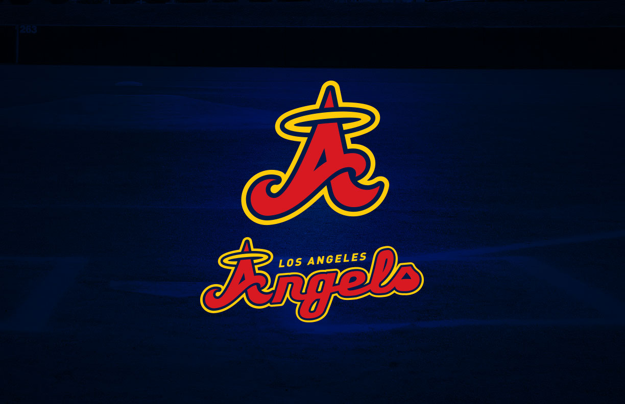
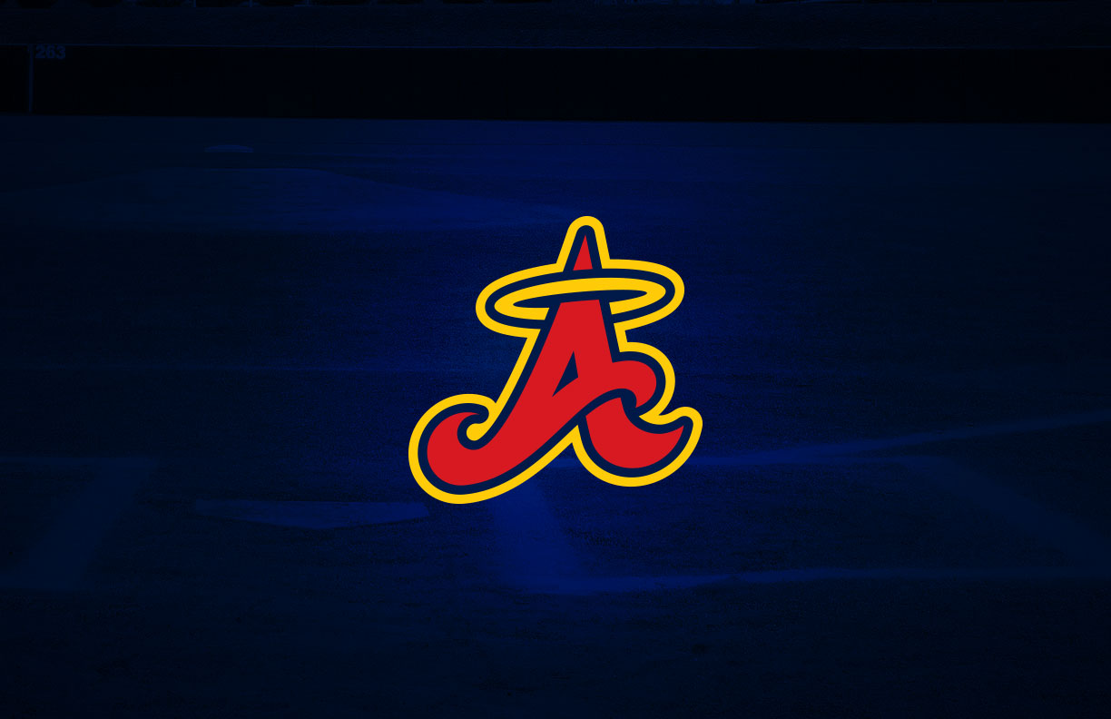
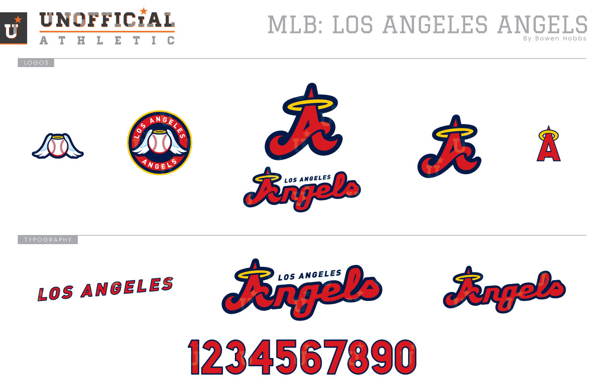
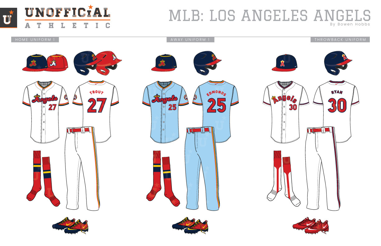
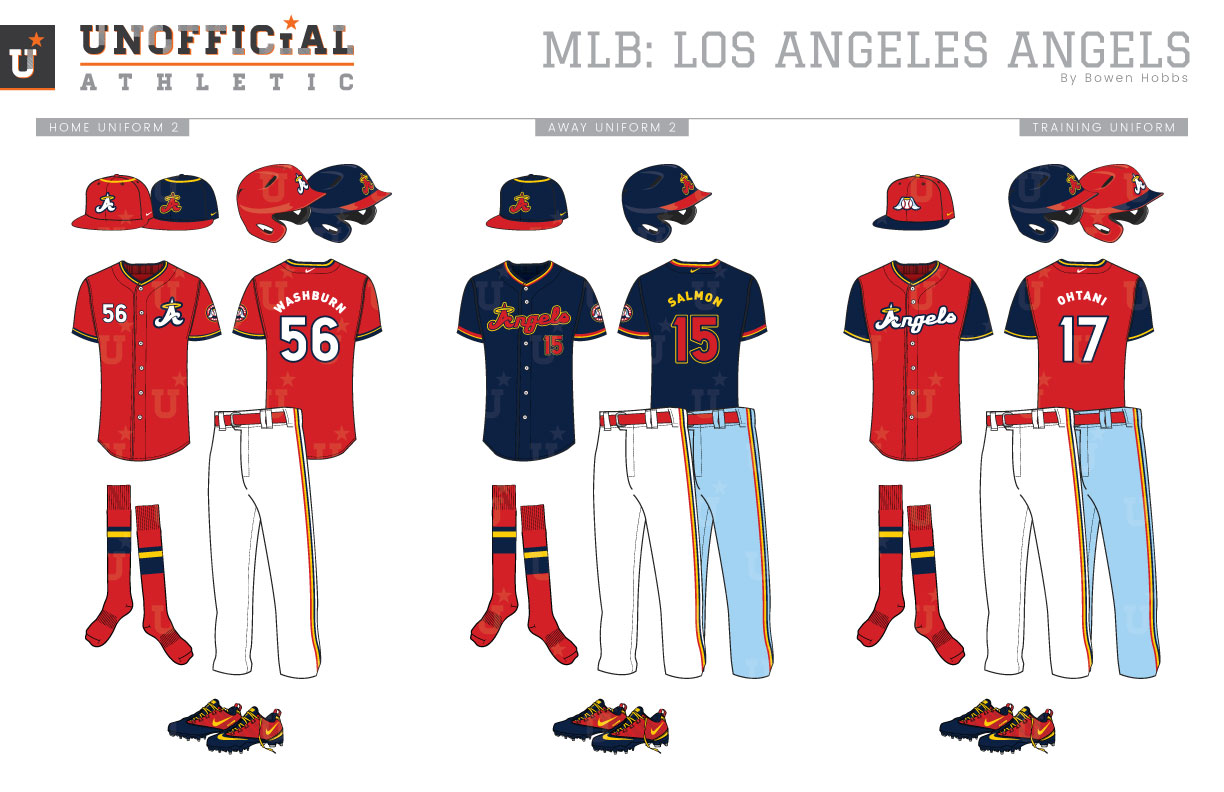
First taking the mound in 1961, the Los Angeles Angels quest for the right geographic identifier has come full circle. The team played its first season at Los Angeles’s Wrigley Field before moving to Dodger Stadium until Angels Stadium opened in 1966. During those first years the team wore navy caps with red brims, a red LA in a Tuscan font, and a silver halo. During that 1966 move across the county line to Anaheim, the LA became a CA and the Los Angeles Angels became the California Angels. In 1971, the Halos would put away their silver halo’d caps and Tuscan typeface for more modern look with a lowercase sans serif A sporting an athletic gold halo. A year later the A was once again capitalized. This sunnier look lasted until 1993, when the athletic gold was jettisoned in favor of a return to silver accents. Then came the Disney Era. The Angels chose to focus on Anaheim, becoming the Anaheim Angels and opted for a navy, red and periwinkle scheme. Five years later, Disney sold the team and a new red-centric color scheme was introduced, pairing scarlet and navy with maroon and silver accents. While the red-dominant branding has remained since, the team has gone from the Anaheim Angels to the Los Angeles Angels of Anaheim to the Los Angeles Angels in that span. My Angels redesign seeks to bring back the fun of the team’s 70s and 80s scheme, focusing on a color palette of navy, red and sunny athletic gold. The Big A is reimagined in a charismatic red script with an optimistic upward tilt. The new A is paired with the team name to create the primary ago, while the A stands by itself as the cap logo. A secondary icon of an angel-winged baseball is used both by itself and as a roundel sleeve patch, while the classic halo’d-A is used on the throwbacks. The Angels script is complemented by a LOS ANGELES wordmark and a number set rendered in a fun and chunky sans serif typeface. The home uniforms place red type outlined in navy on a white uniform with navy-gold-red trim and red accessories. The home uniforms primarily use a navy cap with a red A , red brim, and a gold halo, but also have an option for a red cap with a white A and gold halo. The away uniforms stick with the red type, tri-color trim, and red accessories, but opt for a powder blue base over grey as a nod to the Disney Era. The throwbacks recall shades of Nolan Ryan with the classic cap and sans serif type. The home alternate jersey adds a splash of red to the Angels’ options with a red jersey featuring a white A and type and is primarily [aired with the red cap, although the navy cap is also an option. The alternate navy jersey, however, is only paired with the navy cap, but can be worn at home or on the road. The spring training / batting practice jerseys are red with navy sleeves and athletic gold trim and are paired with a red cap with a navy brim and the winged baseball.
Date
February 12, 2019
Category
Baseball, MLB

