Minnesota Wild

Minnesota Wild
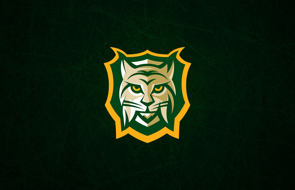
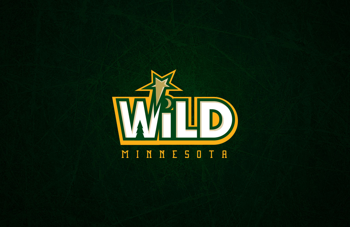
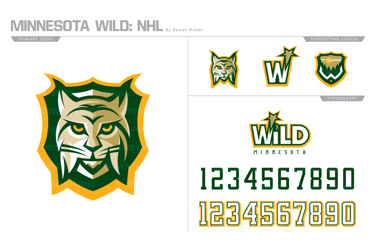
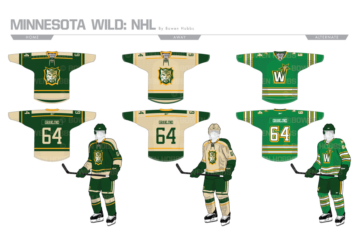
The NHL returned to Minnesota in 2000 after seven season away from the State of Hockey. The new team was christened the Wild in reference to the vast expanses of wilderness in the Gopher State. The team’s current logo was designed to be an ambiguous animal, which some say is a bear and other a big cat. Inside the mark is a depiction of nature that blends seamlessly with the animal head around it, complete with the river forming the mouth and the shooting star doubling as the eye. I eliminated red from the color palette, focusing on forest green, athletic gold, metallic gold, wheat, and white. For the primary logo, I chose a single animal, the lynx, and placed it on a plaque to honor the game hunting of the Land of 10,00 Lakes. A standalone lynx head, a shooting star-W and a W-wilderness badge fill out the logo set. The wordmark uses a sans serif typeface with a shooting star in reference to the departed North Stars, in addition to a pine tree and a moon worked into it. The numerals are a block serif with corners that are more squared off than the typical athletic font. The home and road uniforms focus strong on the juxtaposition of forest green and wheat with athletic gold accents mixed in. The thirds, however, heavily reference the uniforms the North Stars played in from 1975 through 1978.
Date
July 3, 2017
Category
Hockey, NHL

