New York Jets
New York Jets
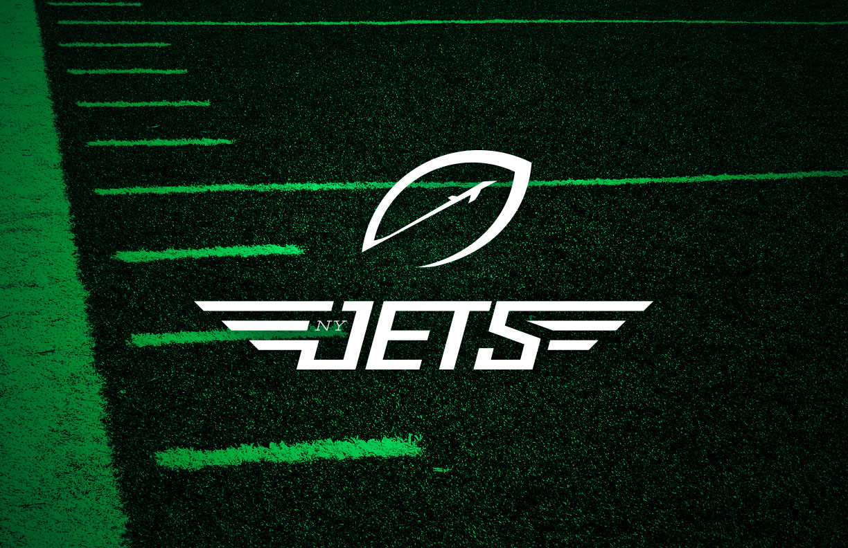
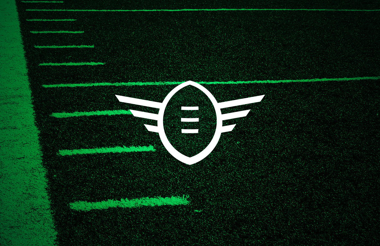
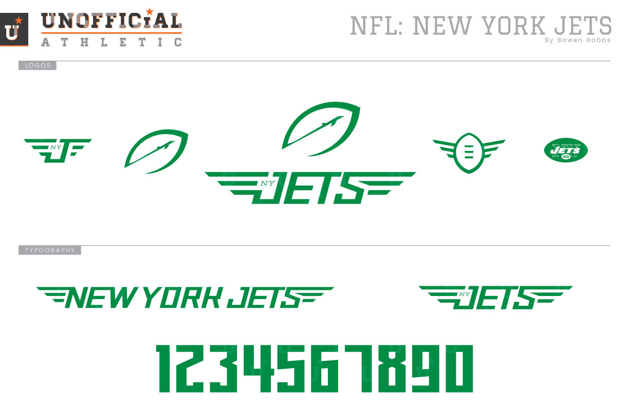
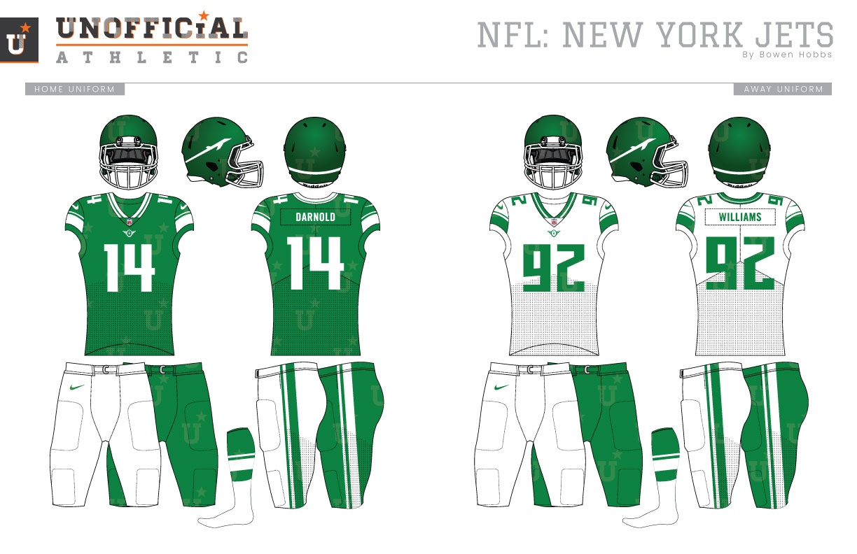
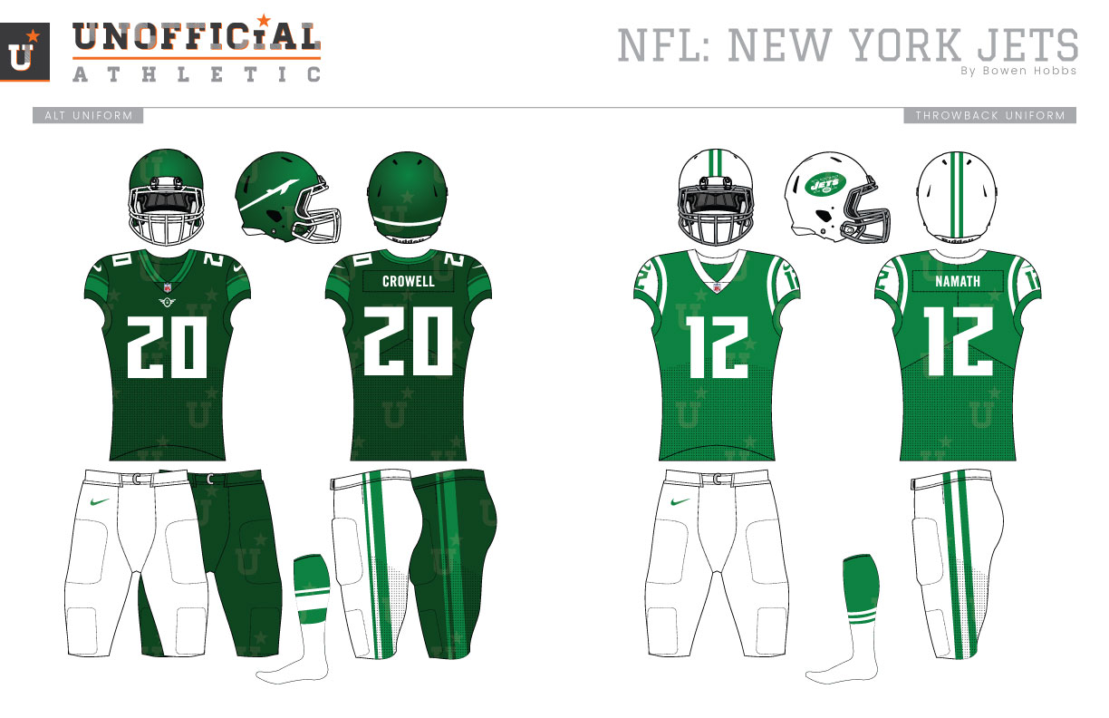
The AFL was born in 1960, with New York as one of its flagship franchises. The Big Apple’s AFL team would not be called the Jets until 1963, however, as they were originally named the Titans of New York. The team would become the Jets after three seasons when they were renamed by the new ownership group. While the Titans donned navy blue and old gold, the team would switch to a green and white scheme to complement the new Jets moniker. The team would use a jumbo jet with JETS written across it as their logo in 1963 before implementing a version of their classic NY-JETS-and-a-football-inside-another-football logo the following year. The classic football-inception logo and white helmets would last through the 1977 season. The following year, the team would rebrand with a new logo, a JETS wordmark with a plane streaking over the top. The uniforms would retain the simple green-and-white scheme with two contrast-color stripes on each sleeve and a single stripe down the pants. Black trim would be added to the logo, facemask, striping, and numbers for the 1990 season and last through 1997. The 1998 season would represent a return of the football-inception logo, but with a more 90s-appropriate color scheme of forest green and white. The team still uses this scheme, but shrinking sleeves and manufacturer changes have rendered the uniforms more difficult to produce than it years past. My Jets redesign takes the team in a brand new direction with a primary icon of a tilted football and a jet streaking upward through it. The primary icon is paired with a mechanical italicized wordmark that features pilot’s wings to create the team’s signature. The alternate logo contains an upright football with pilot’s wings. Adding to the logo set is a winged-NYJ coach’s cap mark and the classic football-inception throwback logo. The new font is angled and mechanical, clearly displaying the team name and evoking the speed of the team’s name. The numbers are rendered in a condensed version of the typeface and are not italicized. I took a hard look at the helmets and decided that a satin kelly green finish would add dimension to the green and white color scheme. The streaking jet from the primary logo is placed in white against the rich green helmets. The home jerseys feature an asymmetrical striping pattern on the sleeves that blends the Namath era and the 80s Jets. That striping pattern also appears on the neck trim and pants. The secondary logo is placed just below the collar ready for takeoff. The away jersey swaps the white and kelly green of the home jersey. Both the home and away can be paired with white or kelly green pants. The alternate jerseys take on a darker look with a forest green base, kelly green stripes, and white typography. The alternates can be paired with the white pants or forest green pants for Color Rush. The throwback inspired uniforms bring back the kelly green Namath era design with the football inception logo on white helmets.
Date
December 10, 2018
Category
Football, NFL

