New York Mets

New York Mets
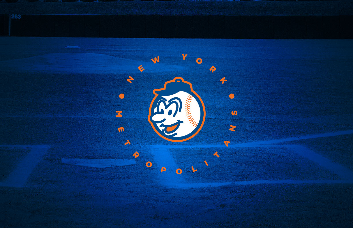
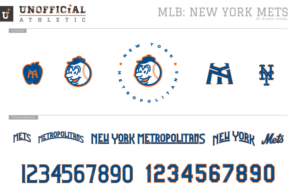
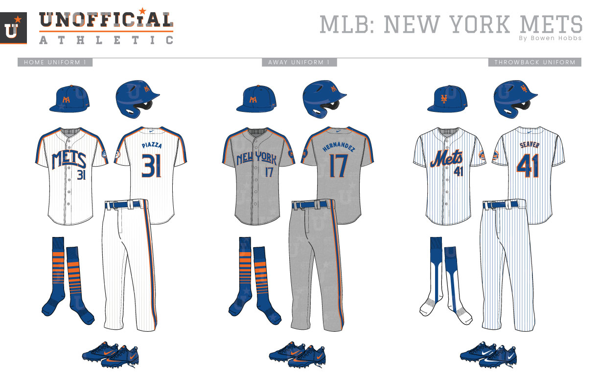
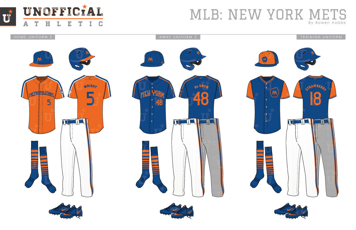
In 1962, the New York Metropolitans began play in Queens in an effort to reestablish the National League’s presence in the Big Apple after the departure of the Dodgers and Giants following the 1957 season. Their classic caps were also born out of this concept, borrowing the Dodgers’ blue base and the Giants’ orange NY monogram. The inaugural home uniforms were white with blue pinstripes and a Mets script across the chest, with the road greys featuring royal headspoon piping and NEW YORK in Tuscan letters. Both jerseys contained the team’s skyline logo on the left sleeve. The away uniform would switch to the Mets script on the chest for the 1974 season. The next edit would be in 1978, when both uniforms introduced blue-and-orange collar and sleeve trim and the roads dropped the headspoon piping. The 1980s would be a decade of change for the team, as the racing stripe away uniforms would be unveiled alongside a blue alternate jersey in 1982, while the racing striped and pinstriped home uniform would be unveiled the following season. While the royal jersey only lasted three seasons, the greys would go five years before the team started tinkering with different fonts for a NEW YORK wordmark on the chest. In 1993, however, the racing stripes were gone in favor of a royal-pinstriped home uni with a revised Mets script that featured a tail as well as a new grey uniform with simple sleeve trim and a script New York on the chest. The tail on the Mets script would be removed prior to the 1995 season, while the road uniforms were also updated with simple headspoon piping and a return to the Tuscan NEW YORK. While 1997 saw the use of a white cap with the home uniform, 1998 would see the largest shift the Mets’ brand had ever seen. Black drop shadows were added to all the typography on the uniforms to complement the team’s now black logo, caps, and alternate jerseys. The Dark Ages lasted until the lead up to the 2012 season, when the home and away uniforms would ditch the black. The black alternate jerseys were taken out of circulation the following offseason. The current Mets branding now closely resembles their inaugural sets with additional royal alternate jerseys for home and road games. My Mets redesign focuses on the team’s mascot, Mr. Met. I illustrated an icon of Mr. Met’s baseball head and placed it within a circle that states NEW YORK METROPOLITANS to make the primary logo. The cap logo features a revised NY monogram angled to look taller and more monumental. A standalone Mr. Met head icon, a version of the NY contained in an apple, and the original Tuscan NY compete the logo offerings. The new typeface uses tall letterforms and subtle serifs to mimic the Art Nouveau stylings of NYC. There are four cap options total: An all royal cap with the new NY in orange, a royal cap with an orange brim and the revised NY, the classic Tuscan NY cap, and a royal BP cap with an orange front and the apple logo. The home uniforms start with the all royal Nouveau NY caps above a white uniforms with royal and orange racing stripes and grey pinstripes that fade out around the waist. METS and the player number appear on the front of the jerseys, while the socks are royal with graduated striping in orange. The away uniforms are grey with a sublimated flannel texture, racing stripes along the shoulders and pants, and NEW YORK across the chest. The throwbacks retain the Mets’ classic style with royal pinstripes and the classic Mets script. The home alternate jersey is orange with METROPOLITANS across the chest and pairs with the orange-brimmed cap. The second alternate jersey is royal with NEW YORK across the chest and can be worn at home or on the road. The BP jersey is royal with orange sleeves, and the apple logo on the left chest. It pairs with the orange-fronted apple logo cap.
Date
May 18, 2019
Category
Baseball, MLB

