Oakland Athletics

Oakland Athletics
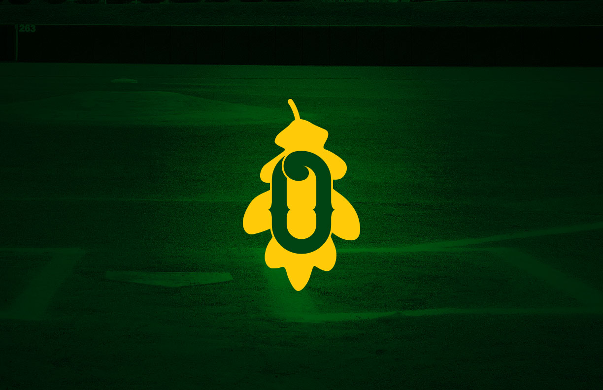
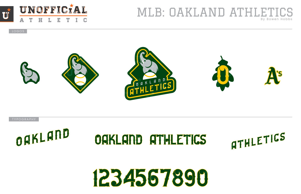
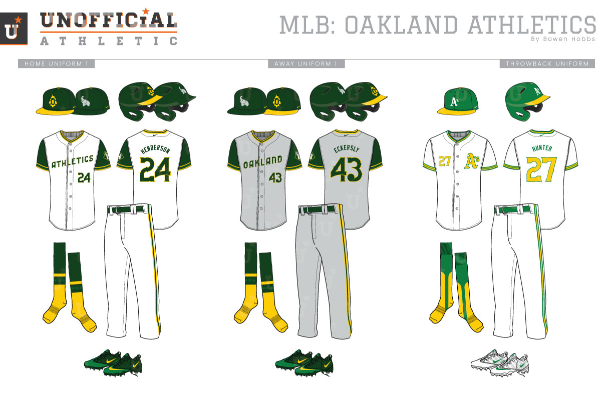
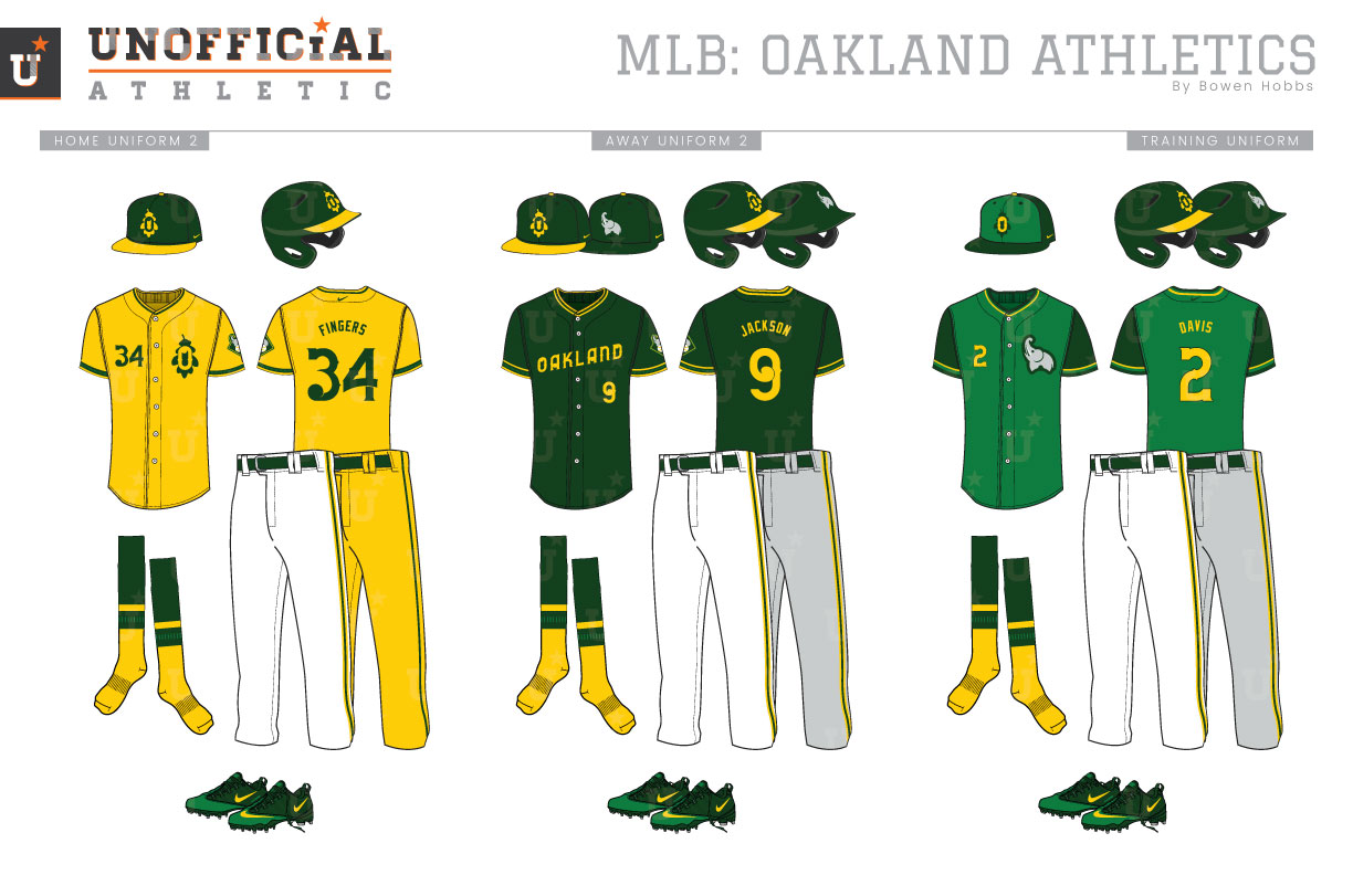
The A’s were born in 1901 on the other side of the continent as the Philadelphia Athletics. Throughout their early history they typically wore blue as a contrast to their crosstown rivals in the National League. The team’s first two decades saw them wearing either an A in either royal or navy. In 1920, the team adopted its elephant mascot and wore green for the first time. The next year would be a return to blue while the A returned to the chest in 1928. However, red would start to creep into the team’s logo set in 1939 while the uniform would see its first hints of the hue in 1954. The next year, the team would move west to Kansas City. During those first six seasons west of the Mississippi the A’s wore navy caps and socks with red type on their jerseys. The beginning of the 1960s saw the team start to experiment more with their uniforms. In 1963, the Athletics would make a design change that has shaped the aesthetic of the organization to this current day. They would unveil athletic gold uniforms with kelly green caps, sleeves, and typography. The new color scheme stuck, but a white uniform was added the following year. Vests with green undershirts would mark the team’s first half-decade in Oakland and were replaced by the kelly green, white, and athletic gold pullovers that marked the championship teams of the 1970s. The 1980s saw the green darken to forest and the reintroduction of button-down jerseys. The home and away uniforms have remained consistent since then, but the team has added a number of alternate jerseys. A forest green alternate jersey has been a staple since the 90s before the Athletics experimented with a black jersey in the aughts before embracing their colors and adding athletic gold and kelly green alternate jerseys within the past decade. My Oakland A’s rebrand pays homage to the team’s unique mascot by placing it back into the team’s primary logo. The elephant returns to its perch on a baseball against a diamond with the team name grounding the mark. The cap logo is a Tuscan Style-O against an oak leaf rendered in green and gold. The primary logo breaks down into a textless sleeve patch and a standalone elephant used on caps. The classic A’s logo completes the logo set. The new Tuscan typeface blends old and new styles for a modern classic feel. With the A’s being the only green team in Major League Baseball, I wanted to give the vernal hue a front seat on the new uniforms. The A’s return to vests with green undershirts and green-and-gold trim. ATHLETICS appears on the chest tilted upward. There are two cap options: a forest green cap with a gold leaf and brim that is typically worn at home, as well as an all-forest cap with a grey elephant that is primarily used on the road. Speaking of the road, the team’s primary away uniforms feature grey vests and OAKLAND across the chest. The throwbacks recall the championships of the 70s with gold type and kelly green caps. The home alternate jerseys are athletic gold with the O-Leaf logo on the left chest and the player number on the right chest in forest green. The gold jerseys pair with the gold-brimmed cap and either white pants or gold for a monochrome look. The forest green alternate features OAKLAND across the chest in gold and can be worn at home or away from it. The spring training uniforms add kelly green to the forest green and gold with a forest green cap that features kelly green front panels and kelly green jerseys with forest sleeves and gold type.
Date
March 2, 2019
Category
Baseball, MLB

