Seattle Mariners
Seattle Mariners
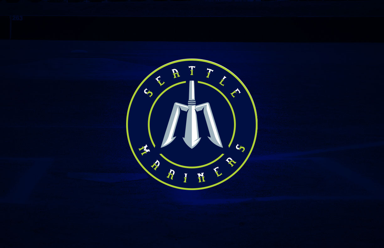
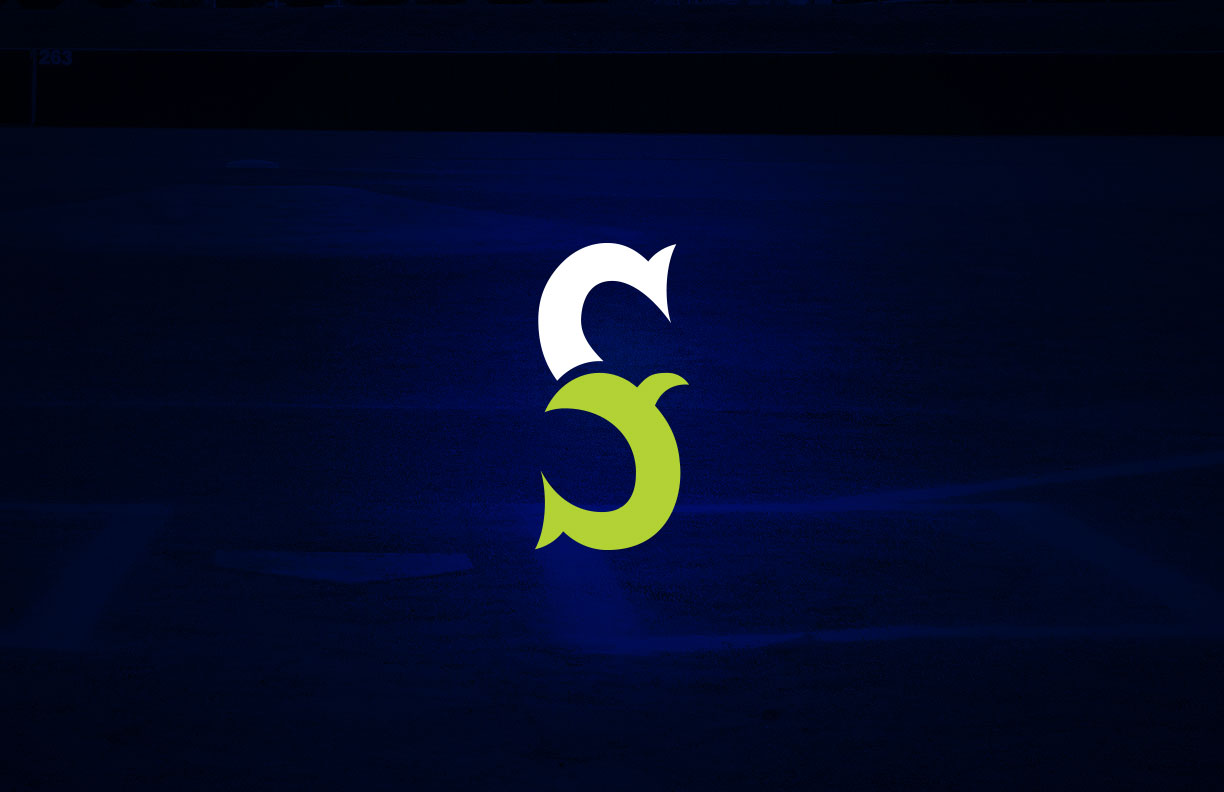
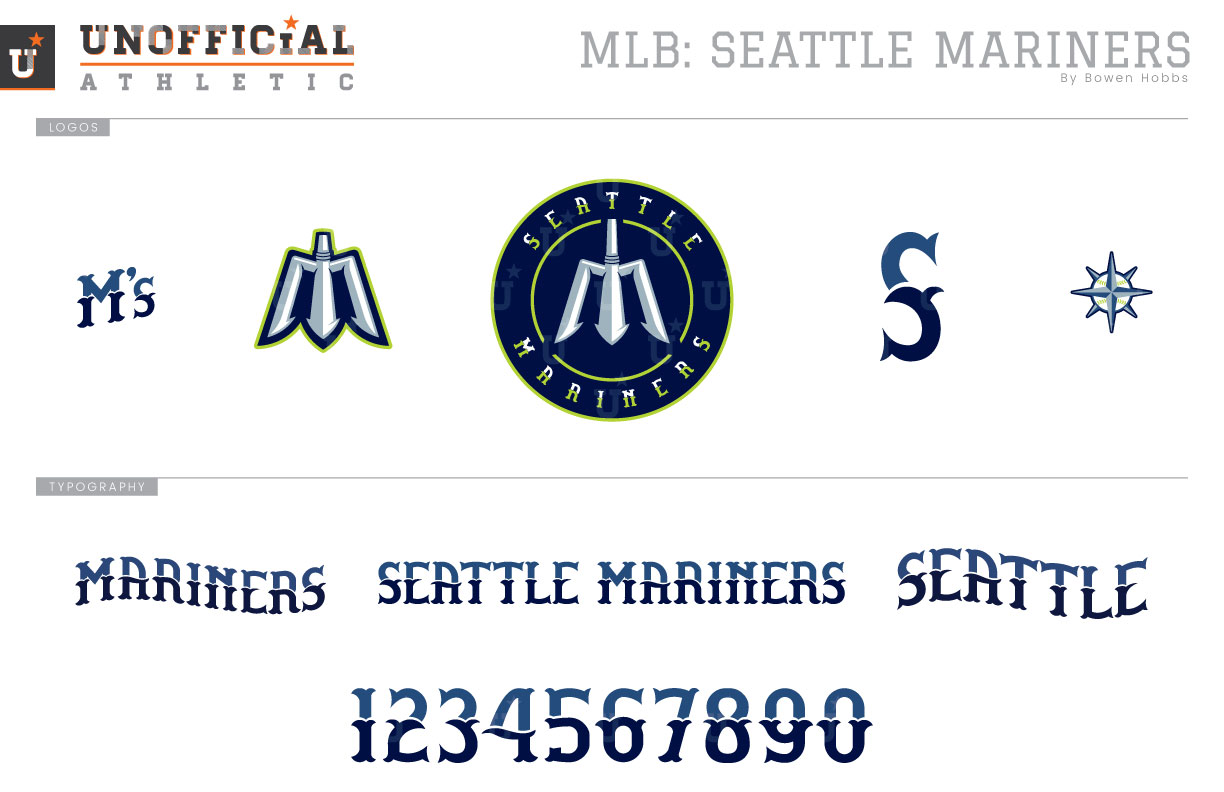
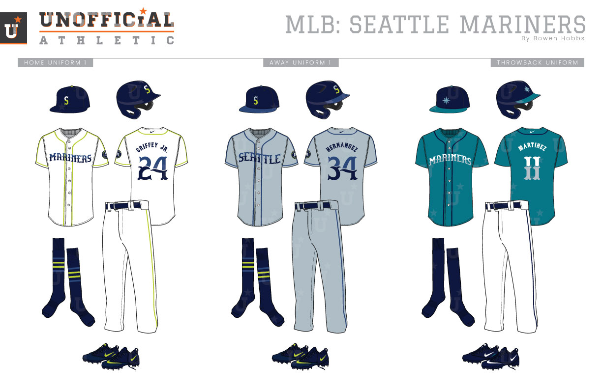
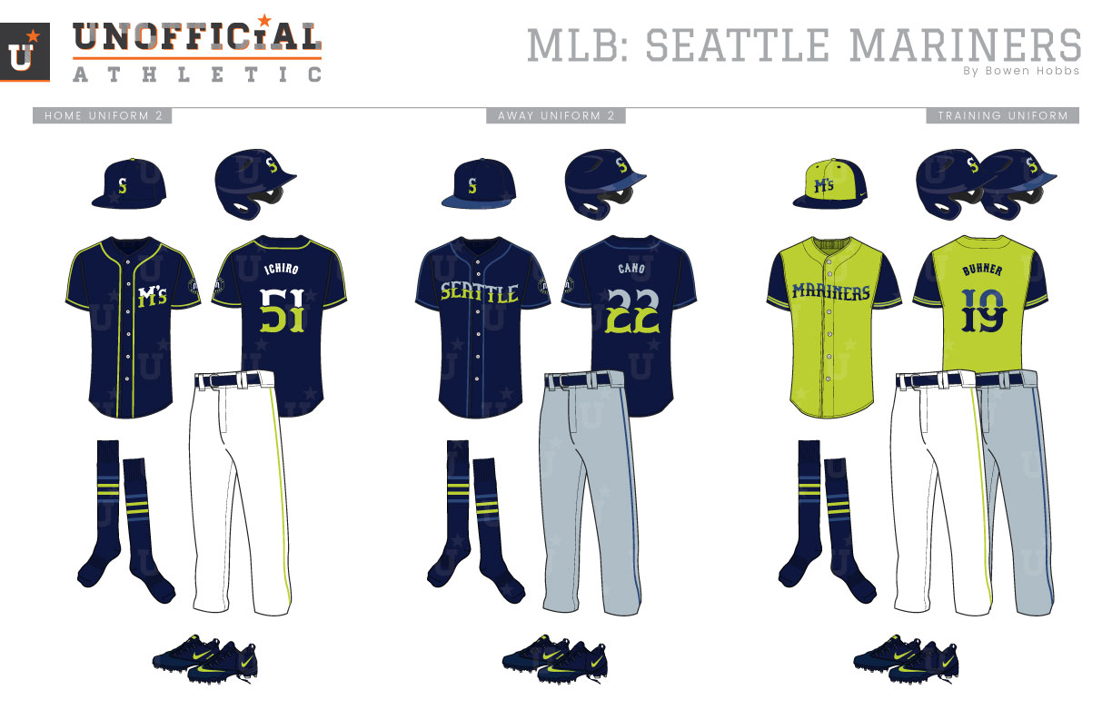
The Mariners are actually Seattle’s second MLB team. The Emerald City’s first team was the Seattle Pilots, who after just one season became the Milwaukee Brewers. When the Mariners were born, as well as in that lone 1969 season, a color scheme of royal, athletic gold, and powder blue on the road was used for the franchise. While the team’s primary logo displayed the city and team name in a circular gold patch, it was a piece of that mark that most fans remember: the Pitchfork-M. The original Pitchfork-M had a uniform stroke weight and was rendered in athletic gold with a white outline on a blue cap. Prior to the 1981 season, the M’s would adopt a more dynamic redesign of their Pitchfork-M that was used as the 1979 All-Star Game logo, complete with a star holding shape. That look would last until 1987, when Seattle would retire the Pitchfork-M for a 3-D slab serif-S and a toned-down scheme. The franchise’s biggest aesthetic change would occur in 1993 when the team changed its color scheme from royal and athletic gold to navy, teal, and silver. The slab serif S would become a sharply serifed-S with a baseball/compass rose in the center of it. In 2015, the team unveiled a “throwback” look that combined the current fonts and logos with the royal and athletic gold color scheme, with cream added as the uniform base color. My redesign brings back a version of the Pitchfork-M, beveled in white and silver and placed in a navy roundel with lime green accents. The caps feature an S still, but rendered in a new typeface (more on that later). A standalone Pitchfork-M and a throwback baseball/compass rose mark join with an M’s logo in a new typeface I created to complete the logo set. This new typeface is a style I call Aquatic Tuscan. It’s a two-tone font, with a lighter top and darker bottom, reminiscent of the deep sea on a cloudy day. The line between the top and bottom of the letterforms also undulates likes waves for an extra sense of movement. The home uniforms feature an all navy cap with a lime squatchee (the button at the top of the cap) and a white and lime S front and center. The jerseys feature a wavy MARINERS wordmark with lime green trim. The away uniforms start with a blueish grey base, and slate blue piping. SEATTLE appears across the chest with a navy/slate blue cap featuring a grey and lime S topping off each combo. The throwback uniforms return the teal jerseys much in the way the team’s current Sunday uniforms bring back royal and yellow: with new fonts and logos. The home alternate features M’s over the heart on a navy jersey with lime piping, while the away alternates stick with SEATTLE across the chest and slate blue piping. The training jerseys opt for lime green with navy sleeve and a cap to match with lime green front panels and M’s displayed.
Date
September 21, 2018
Category
Baseball, MLB

