Seattle Supersonics
Seattle Supersonics
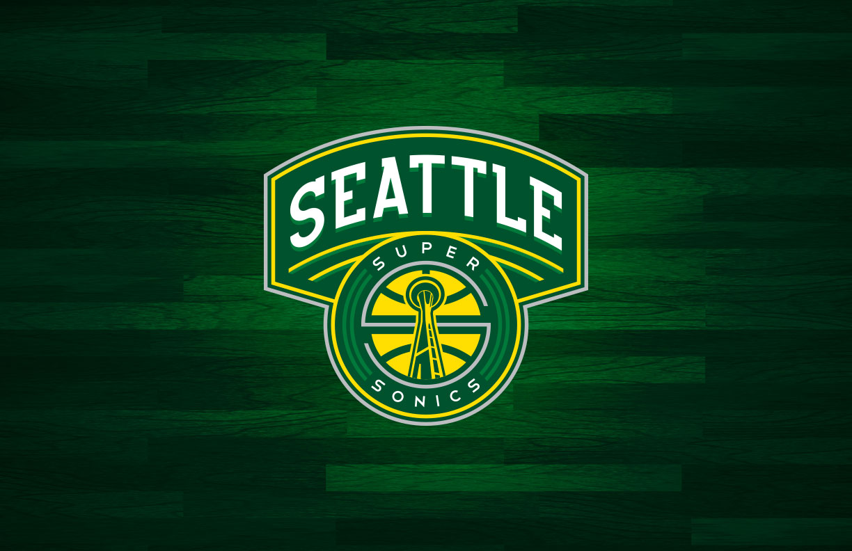
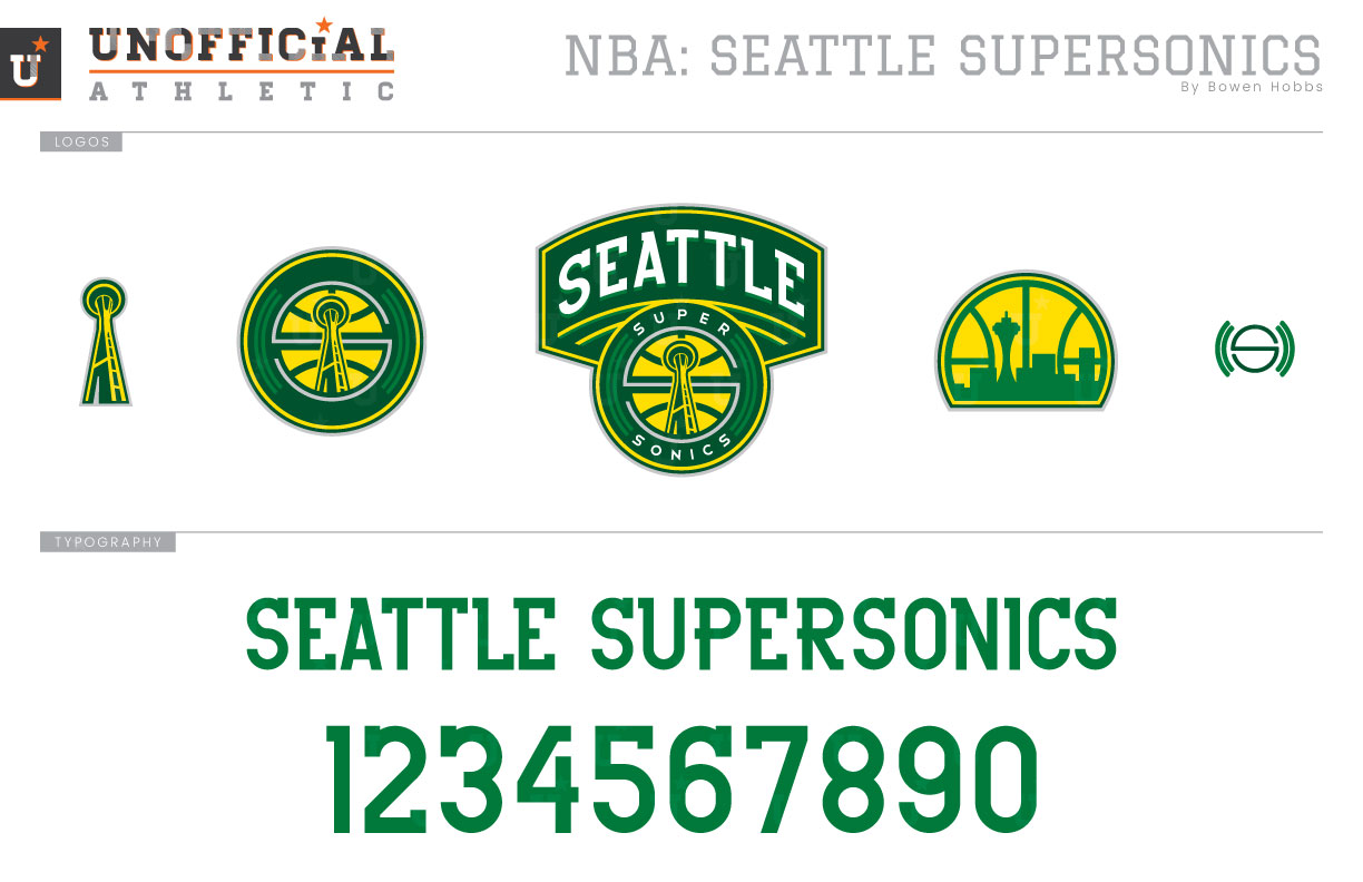
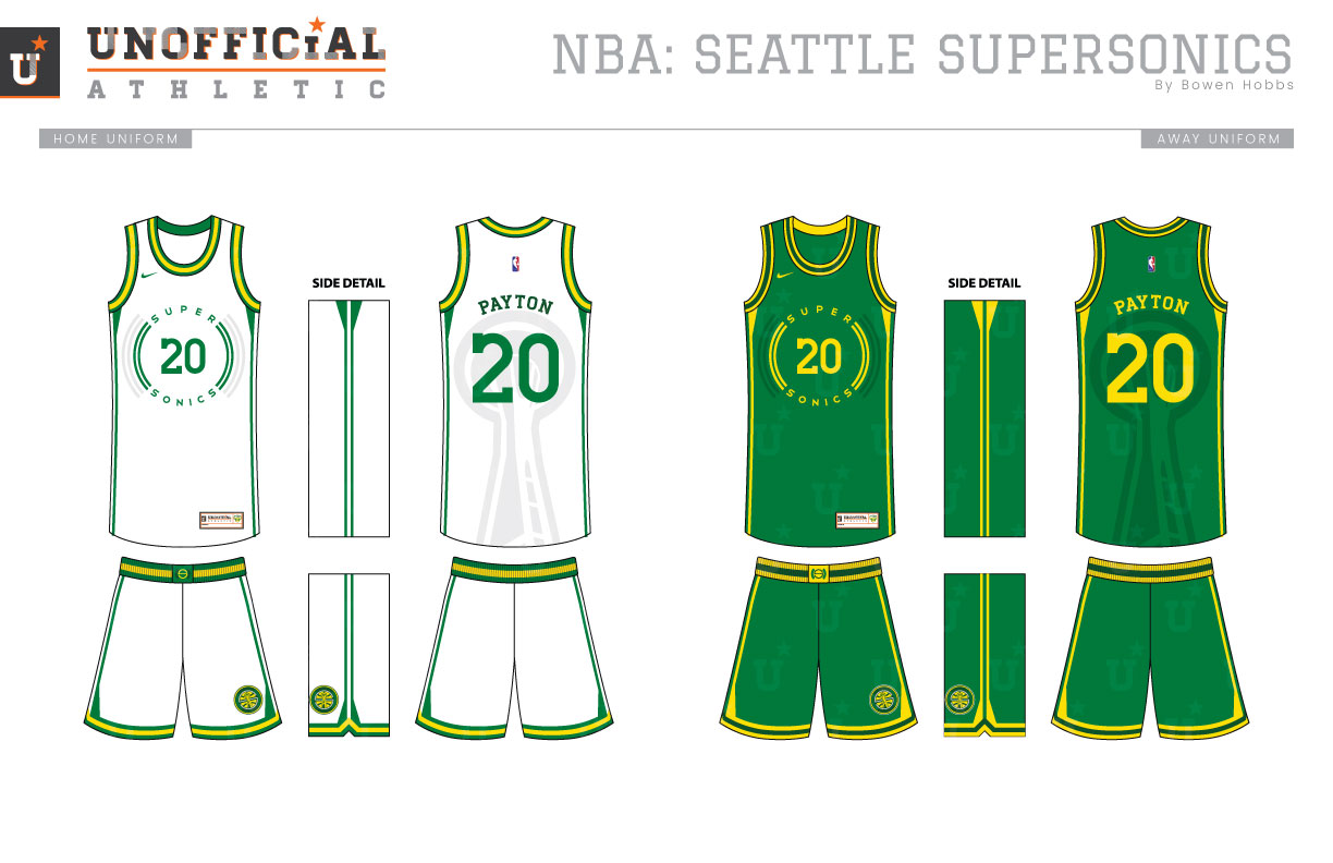
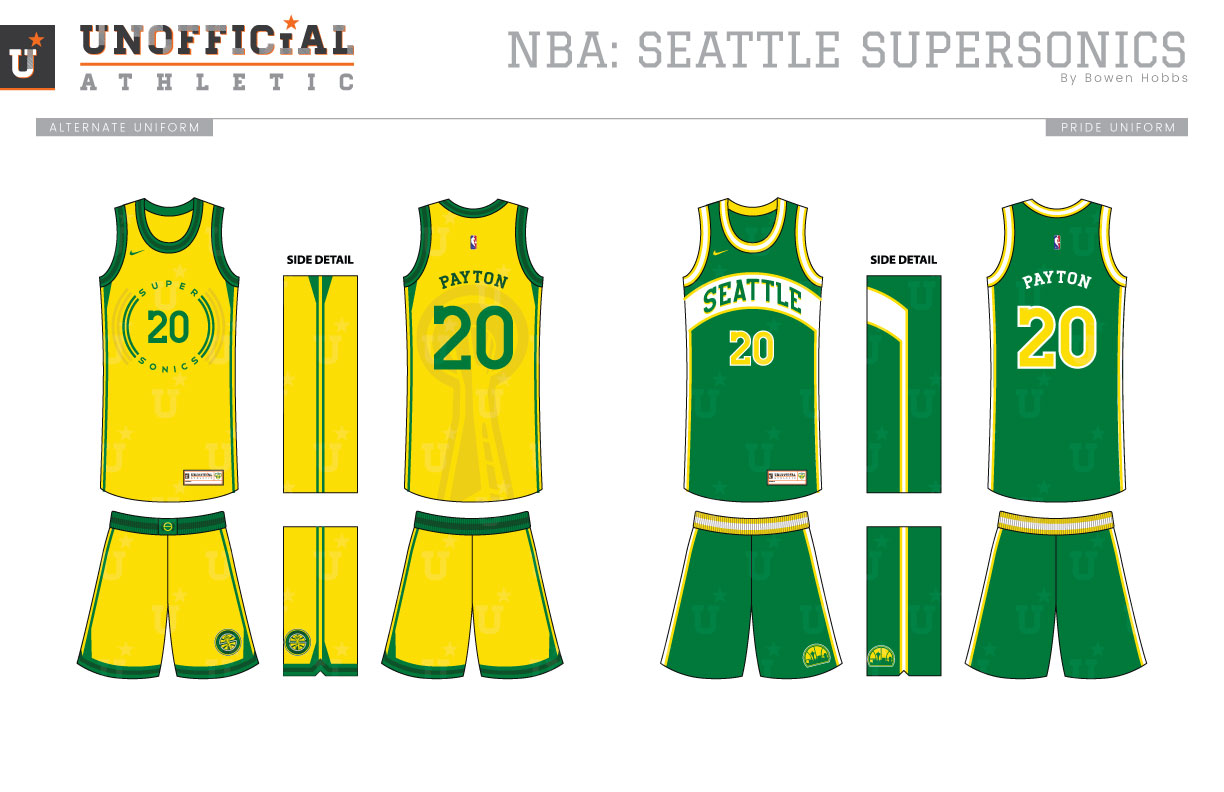
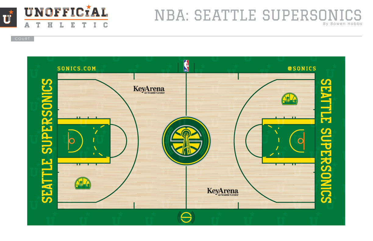
In 2008, the Seattle Supersonics were moved to Oklahoma City by the team’s new owner, Clay Bennett, ending 41 years on NBA basketball in the Emerald City. Since then, Seattle has been in the topic of conversation whenever a team might relocate or if the league decides to expand. The Sonics have toyed with their identity a few times over those 41 years, with the most iconic era being from 1975 to 1995. The primary logo from that era feature the Seattle skyline in green against an athletic gold basketball. The uniforms were marked by an arched chest stripe containing the team name. My redesign starts with a primary logo containing a roundel with the Space Needle, sound waves, an S, and SUPER SONICS placed below SEATTLE arched in a modern slab serif typeface. A textless version of the roundel appears as an alternate logo, along with a standalone Space Needle mark, a modernized throwback logo, and an S with sound waves. The typeface, as mentioned before, combines elements of slab serif and sans serif typefaces. The Icon, Association, and Alternate uniforms all feature SUPER SONICS and sound waves in a circle around the player number on the front of the jerseys, along with a flared two-stripe pattern down the sides of the uniform and the Space Needle sublimated on the back. The Pride uniforms throw it back to the days of Sikma, Payton, and Kemp with a slightly modern twist. The court plays heavily on the Sonics signature color, with emerald green in the paint and out of bounds, forest green used for the lines, and a touch of yellow flanking the lanes.
Date
April 23, 2018
Category
Basketball, NBA

