Spirits of St. Louis
Spirits of St. Louis
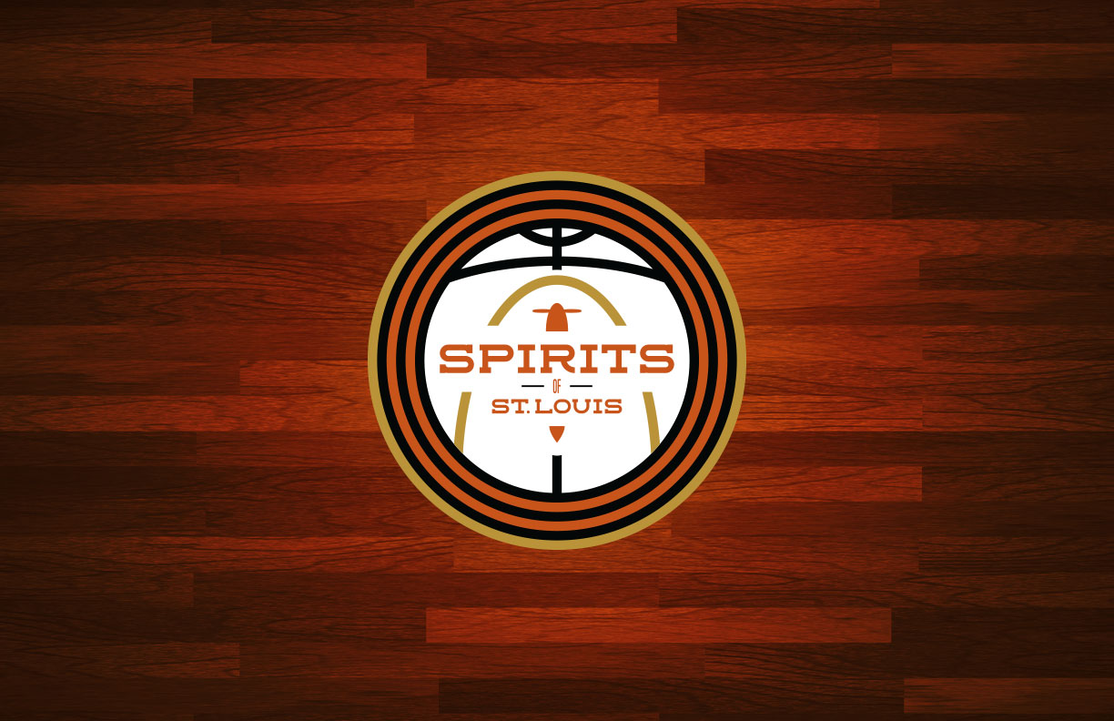
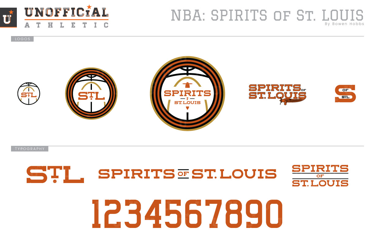
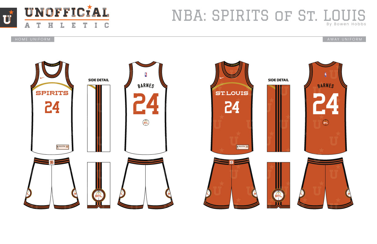
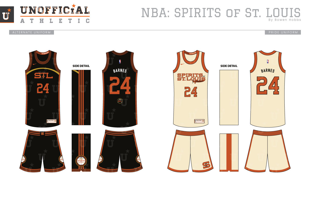
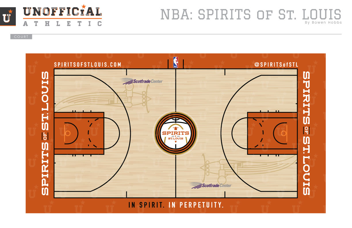
The Spirits of St. Louis were only around for two seasons, but they remain one of the most recognizable ABA teams to this day. From 1974 to 1976 they were equal parts electric and dysfunctional, and wore bright orange and white uniforms the entire time. My concept takes the branding in a more vintage direction, replacing the bright orange with a rust orange, and adding black and metallic gold. The primary logo is composed of a basketball with The Arch and the team name aligned to form an airplane. The secondary logo also features the basketball and arch, but with ST.L replacing the plane and also breaks down into an icon. The old logo was modernized an an alternate option while an S OF ST.L mark offers a typographic logo option to the set. The custom typeface uses a horizontal slab serif with a consistent stroke weight, while the numbers are more vertical to better fit the spaces on an NBA jersey. The uniforms feature a five-stripe trim that offers a barnstorming flair, while a golden arch sits across the chest just above the wordmark. The inside of the collar proudly states IN SPIRIT, IN PERPETUITY as a reference to the fact that the Spirits ownership group still receives 1/7 of the revenue of the four teams that survived the NBA-ABA merger: the Nets, Nuggets, Pacers, and Spurs. The Association jersey is white with rust orange type, while the Icon is rust orange with with white, and the alternate is black with orange type. The Pride uniforms feature a cream-colored base with rust accents and black trim, and the retro-inspired logo on the chest. The court features a relatively classic motif, but with the Spirit of St. Louis ghosted into the hardwood on each end.
Date
April 22, 2018
Category
Basketball, NBA

