Tennessee Smokies
Tennessee Smokies
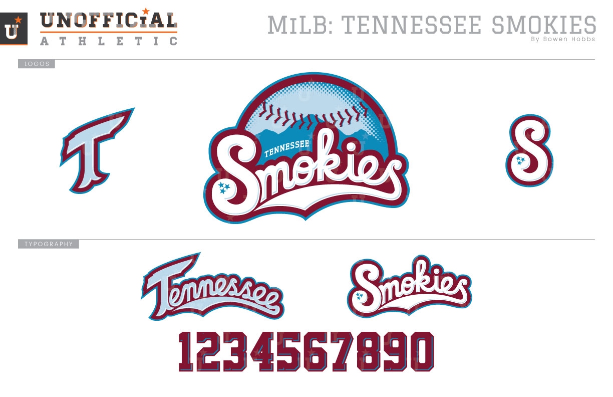
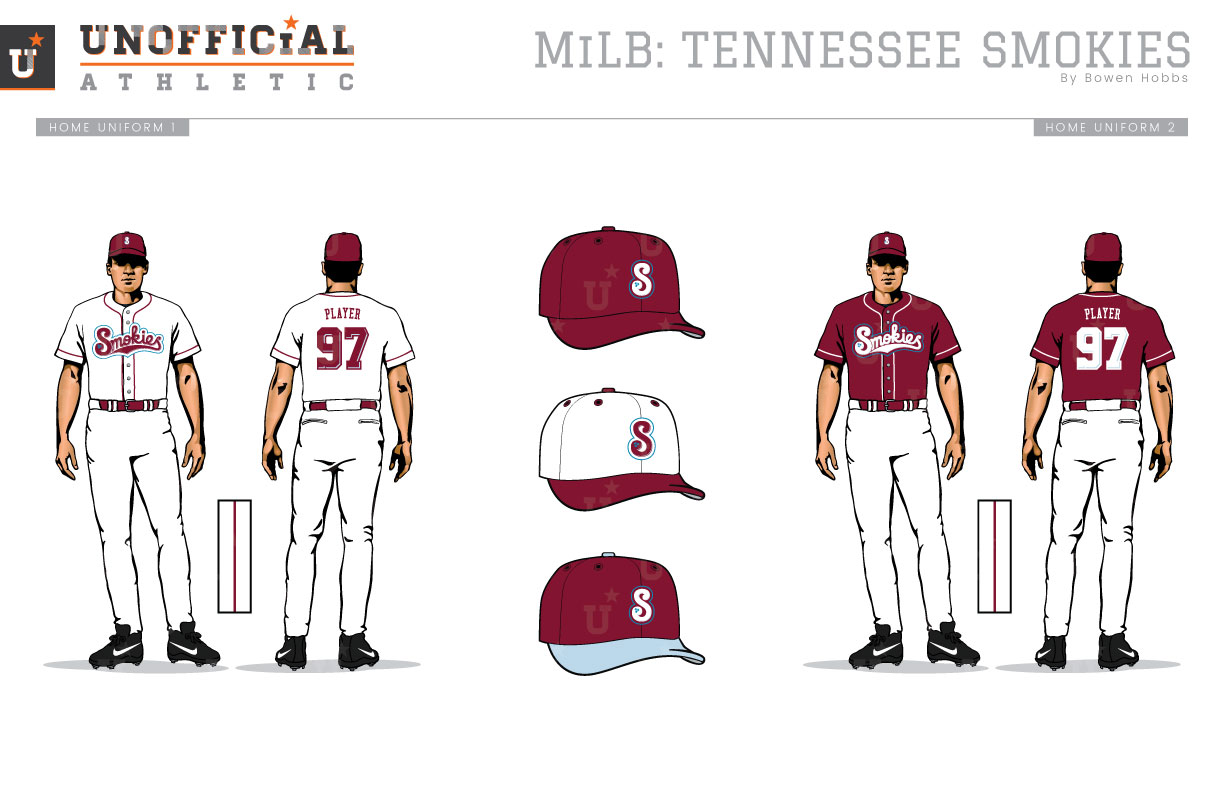
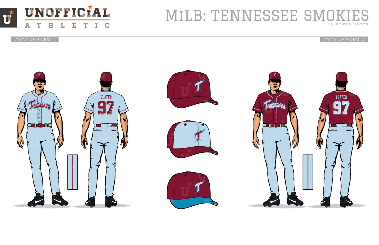
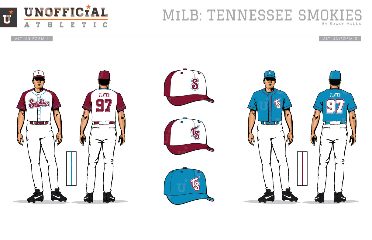
Drawing their name from the Great Smoky Mountains, The Smokies currently show their affiliation to the Cubs with a black bear-centric design. The previous identity focused more on the trees and mountains, which are now utilized as a background element in the current scheme. The mark I developed returns the Smokies to their roots, so to speak, by placing a strong emphasis on the team’s namesake with mountains placed against a halftone patterned baseball with SMOKIES in a bubbly script. The S in Smokies features three stars on its tail, a nod to the Tennessee state flag. The T from the TENNESSEE wordmark also pays homage to the Volunteer State by the shape of its crossbar. The S and SMOKIES script are rendered in white, while the T and TENNESSEE wordmark are rendered in powder blue to denote their use for home and away. The home uniforms play strongly on the interaction of burgundy and white with blue accents throughout, while the aways channel shades of the Mike Schmidt Phillies by combining the burgundy with a heavy dose of powder blue. The first alternate jersey is similar to the primary home set, but with burgundy sleeves to balance out the punch of white on the cap. The second alternate is rendered in a bright blue and combines the T and S marks to display both of the club’s initials.
Date
August 4, 2017
Category
Baseball, MiLB

