Toronto Blue Jays

Toronto Blue Jays
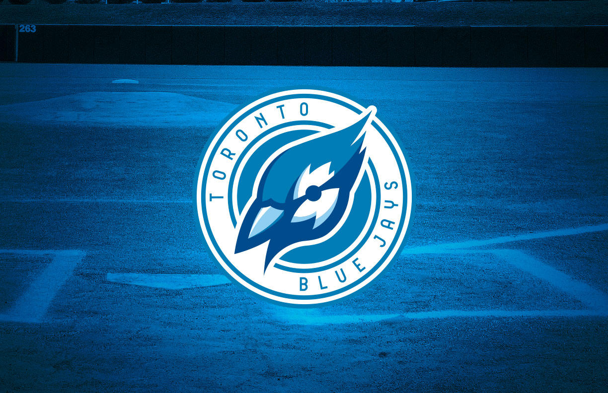
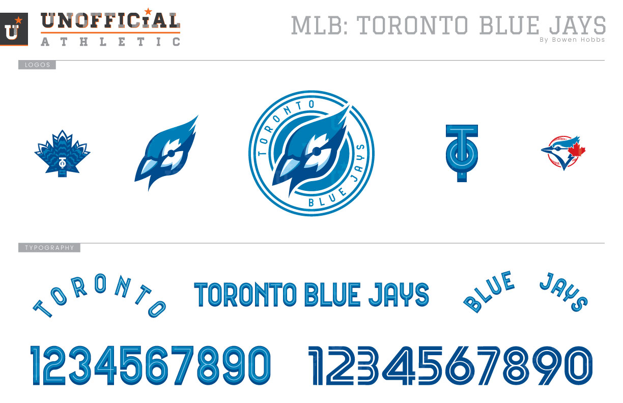
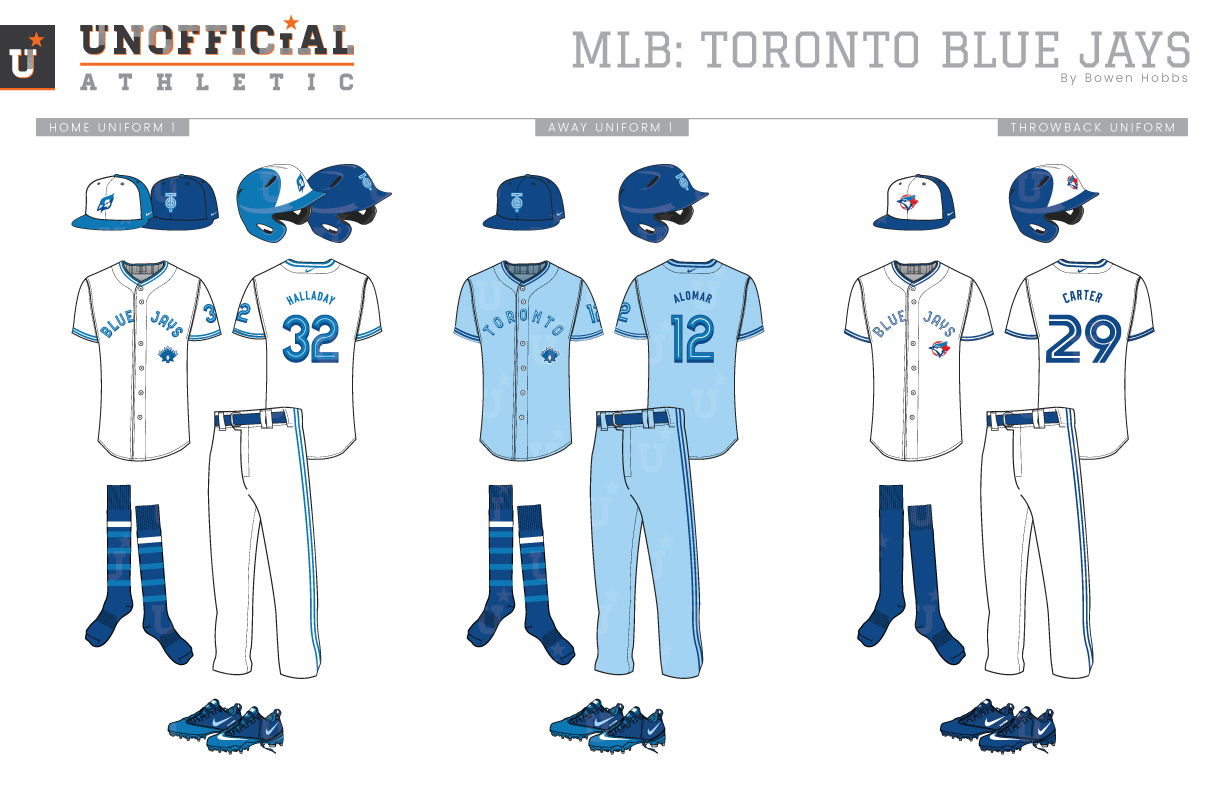
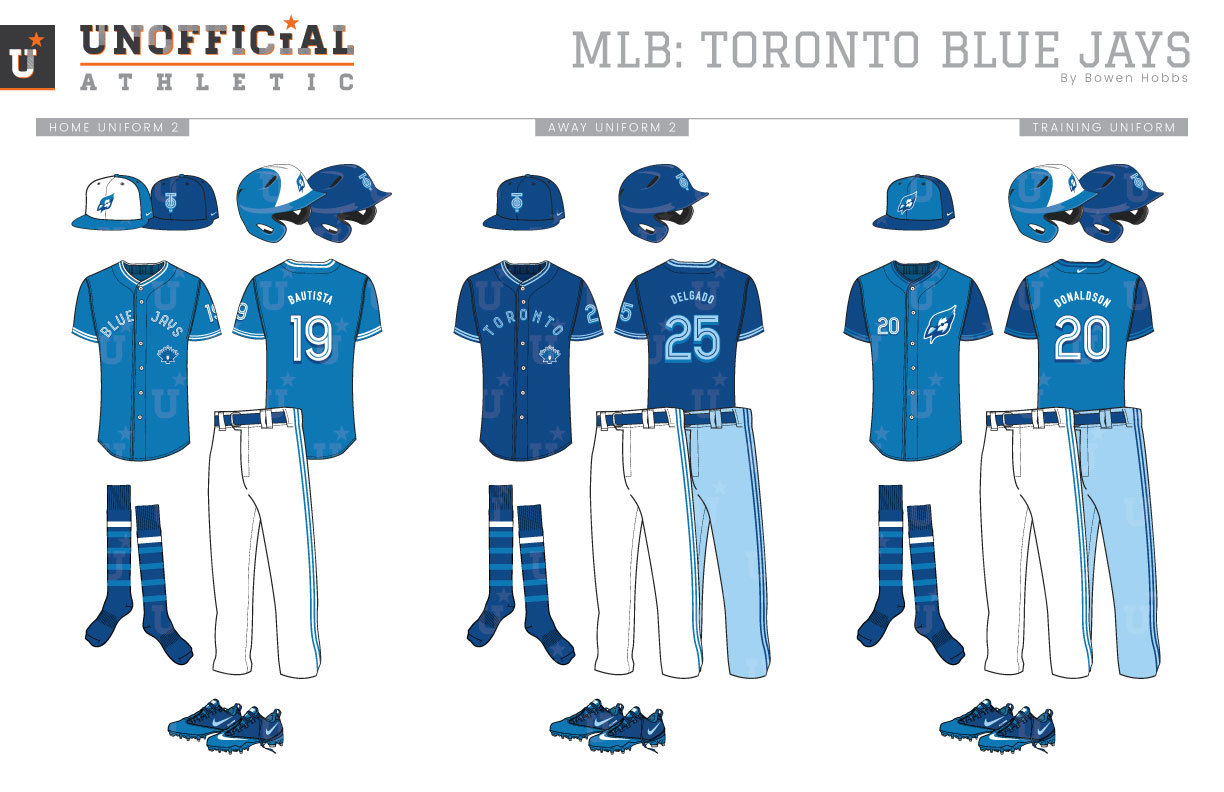
The Blue Jays began play in the American League in 1977, along with the Seattle Mariners. They were Canada’s second MLB team after the Montréal Expos but the only one remaining after the Expos moved to Washington DC. The Blue Jays first logo placed a two-tone blue jay against a red line art baseball with a maple leaf tucked behind the jay’s head and the team name around the outside of the mark. The Blue Jays’ inaugural uniforms featured a royal blue cap with a white front, pullover jerseys, and Sansabelt pants. The home white jerseys paired the team logo with BLUE JAYS above it on the chest. Royal and light blue trim accented the collar, sleeves, waist, and pants. The away uniforms were one of a number of road kits of the time that started with a powder blue base color. Like the home jerseys, the road jerseys placed the team logo front-and-center but with TORONTO in place of BLUE JAYS on the chest. Royal-white-royal trim accented the powder blue pants and jerseys. This inaugural look lasted through the 1988 season. In 1989, the uniforms would move toward button-up jerseys and belted pants. With the new format, the team logo moved to the left side of the jerseys. The road uniform also went through significant changes, swapping the powder blue for a more traditional grey. A second all-royal cap was added to pair with the road greys as well. A few years and two titles later, a royal blue alternate jersey was added, but only for the 1994 season. The Jays’ entire look was updated in 1997, with a revised typeface and an increased use of red to pair with the royal and powder blues. The white-front caps were jettisoned for a singular all-royal cap with the revised logo that promoted a larger maple leaf as the basis of the design. Said logo also moved from the left side of the jerseys to the left sleeve with the player number taking its place. A second cap with a red brim was added in 1999 but removed for the 2001 season along with the road jersey’s sleeves. The vest-with-royal-undershirt look lasted three seasons, the last of which paired the vests with the one-season T-Bird logo. In 2004, the Blue Jays would introduce a complete overhaul of their aesthetic, replacing their royal, powder blue, and red scheme with graphite, black, and Honolulu blue. The home caps were graphite, while the road caps went for black. Blue was used sparingly, much to the chagrin of fans. The Jays returned to their roots in 2012, albeit with a slightly darker color scheme of royal, navy, and red and a modified version of their trademark inline type treatment. My Blue Jays redesign blends a modern aesthetic with an eye toward the team’s history. The primary logo I designed places a blue jay head at a three-quarters angle against a blue jay-blue and white roundel treatment. The caps feature a standalone version of the blue jay head, as well as a TO lettermark in a retro-styled inline typeface. To complement those logos a maple leaf with a pattern that evokes a blue jay’s tail feathers was developed as an alternate mark while the current mark was retained but in the original color scheme. The refreshed typeface complements the inline with a subtle drop shadow. The home caps are honolulu blue with a white front and the jay head logo, while the road cap places the TO mark against a solid royal crown and brim. The home white uniform places BLUE JAYS on the chest with the tail-feather-leaf mark on the left torso. The player number is placed on the sleeve in addition to its usual spot on the back. The collar, sleeves, and pants are trimmed with two Honolulu blue stripes. The socks are royal with stripes that mirror the tail-feather-leaf mark and pair with royal belts and shoes. The away uniforms return to powder blue with royal trim. The throwbacks revive the World Champion teams of the early 1990s. The home alternate jerseys are jay blue with white type and trim, while the away alternate jerseys are royal with powder blue accents. The BP caps are royal with bright blue front panels while the jerseys are two-tone blue with darker sleeves.
Date
April 8, 2019
Category
Baseball, MLB

