Boston Pride Hockey

Boston Pride Hockey
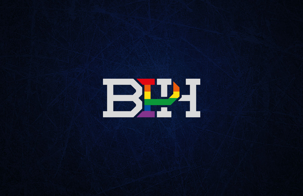
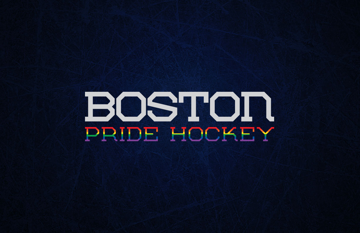
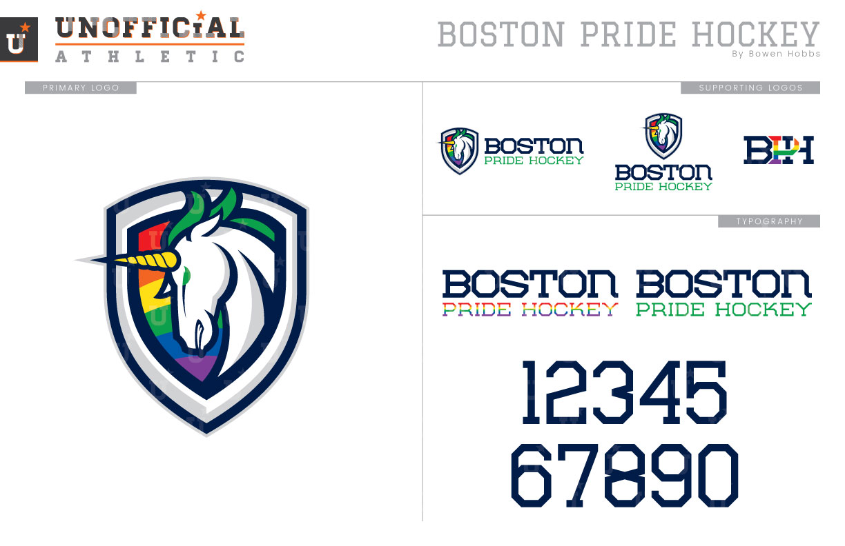
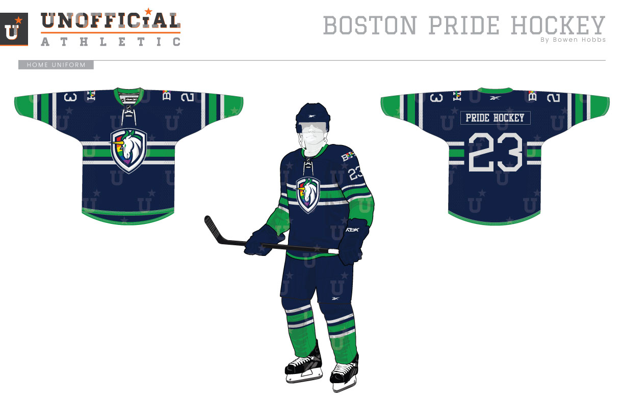
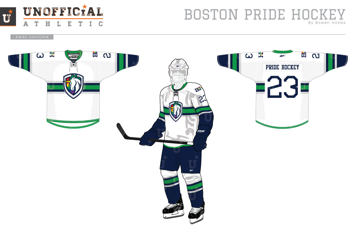
Boston Pride Hockey, not to be confused with the women’s Boston Pride of the NWHL, is a non-profit organization dedicated to providing a safe and welcoming environment for LGBTQ+ people to learn, watch, and play hockey. In September 2018, I was approached by the leadership of BPH to rebrand their organization including their on-ice brand. Together we worked through different icons and color schemes to develop a logo set consisting of the primary crest, secondary shoulder logo, vertical and horizontal team signatures that combine the crest with the team name, and a custom font for the team wordmarks and jersey numbers. The primary logo features a white unicorn against a rainbow shield with a beveled border. The secondary logo places the BPH initials in an interlocking design the the P proudly rendered in a rainbow pattern. The typeface is a stout athletic block that conveys strength and openness. With the logos and typography in place, we moved on to the uniforms. Focusing on a navy, kelly green, and silver scheme that evoked memories of the now-defunct but still loved Hartford Whalers, the home jerseys consist of a navy base with green, navy, and silver striping on the torso and sleeves. The away sweaters are white with the same green-navy-silver striping pattern as the homes. To learn more about BPH, visit bostonpridehockey.org.
Date
January 10, 2019
Category
Clients, Hockey

