Carolina Hurricanes
Carolina Hurricanes
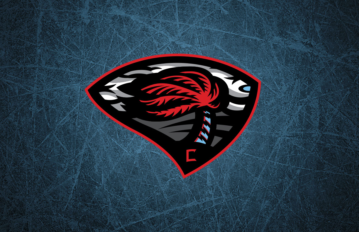
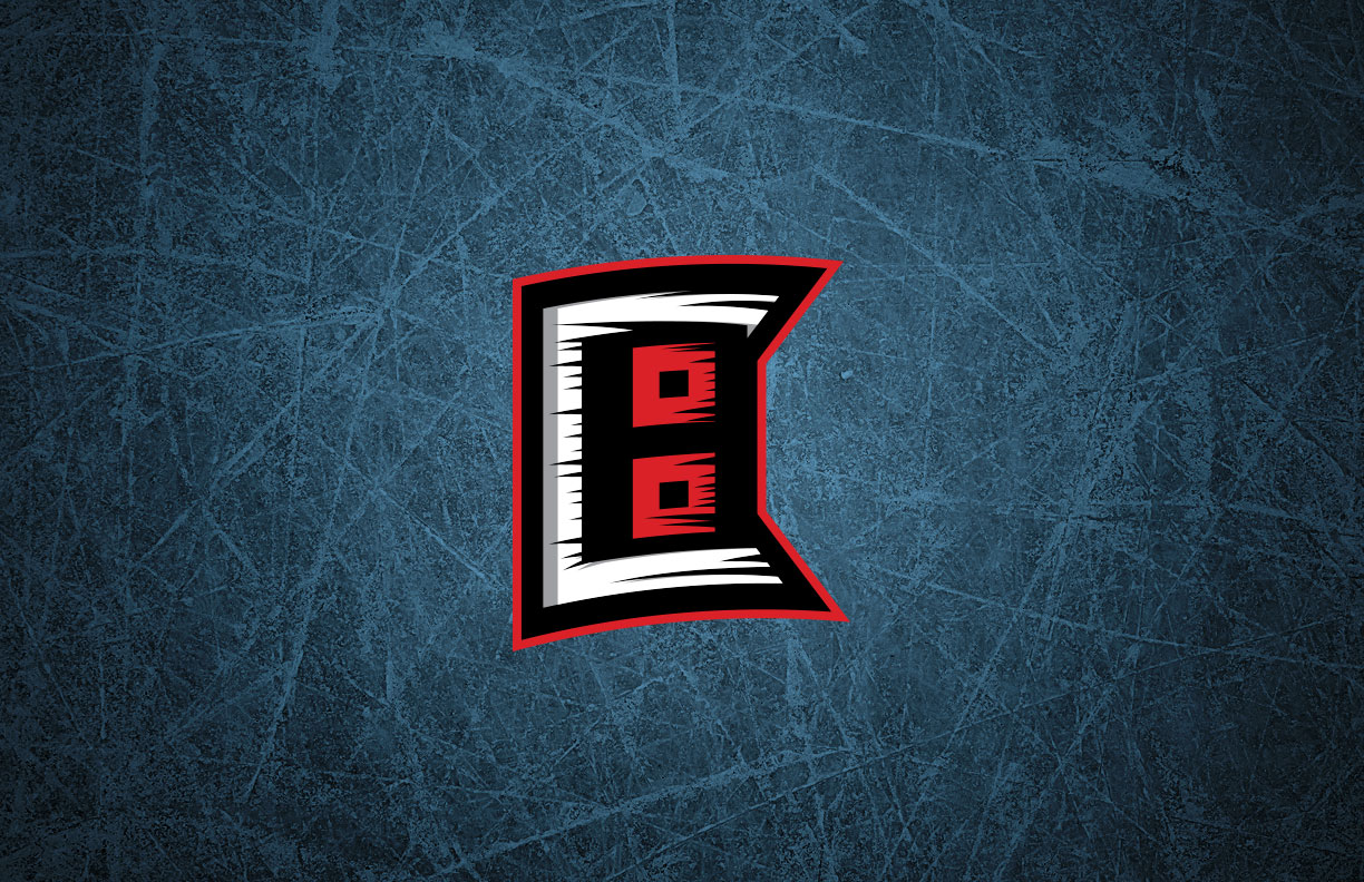
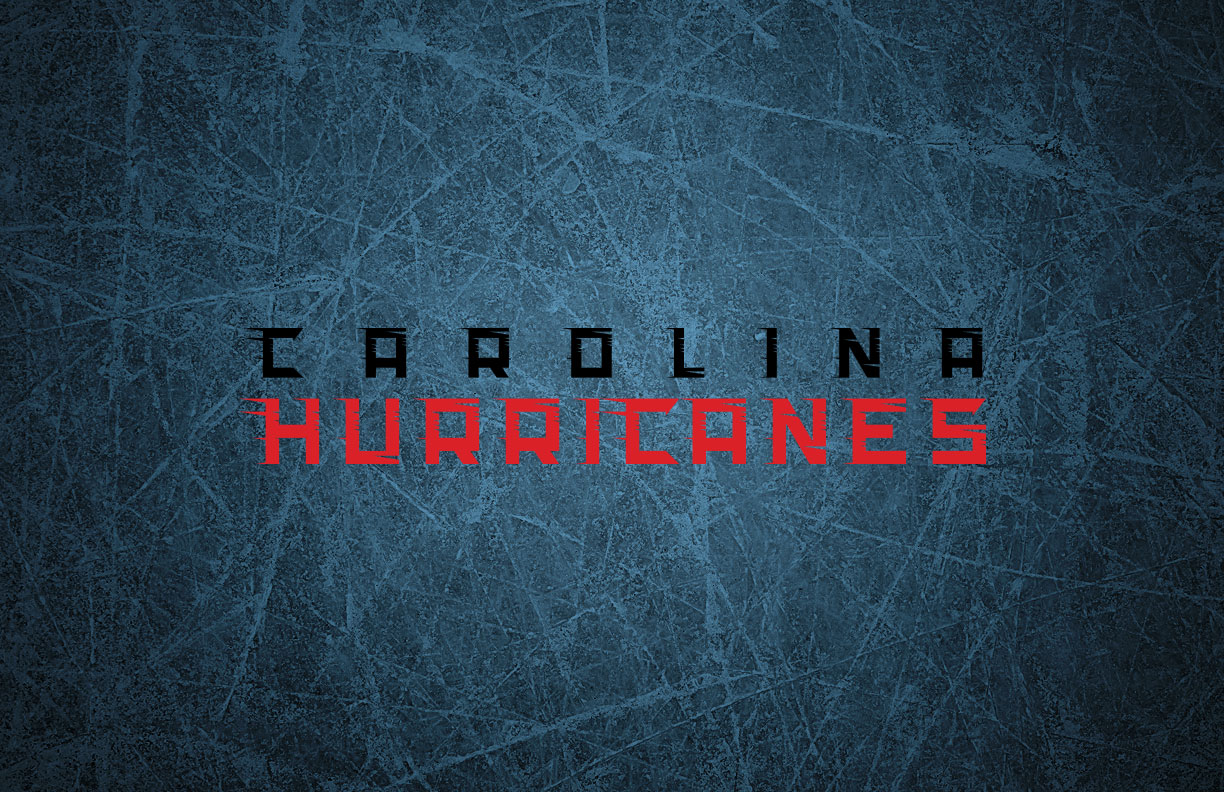
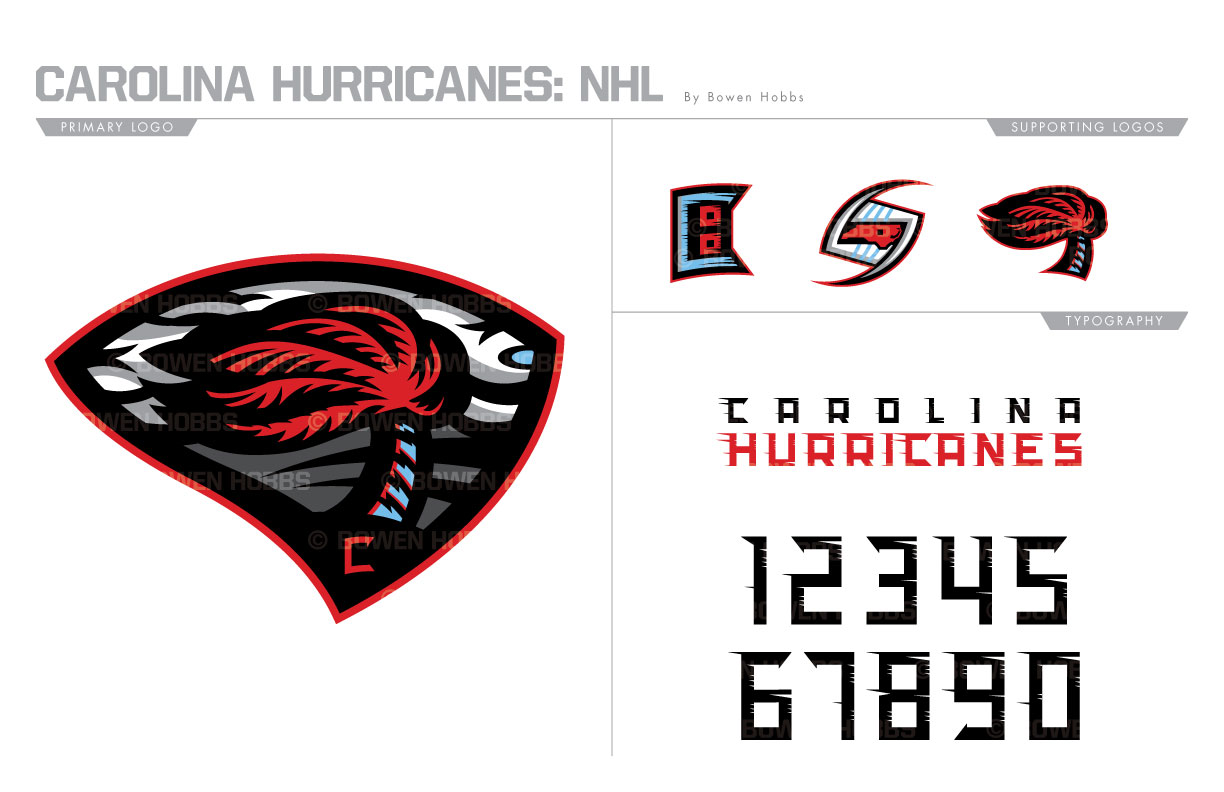
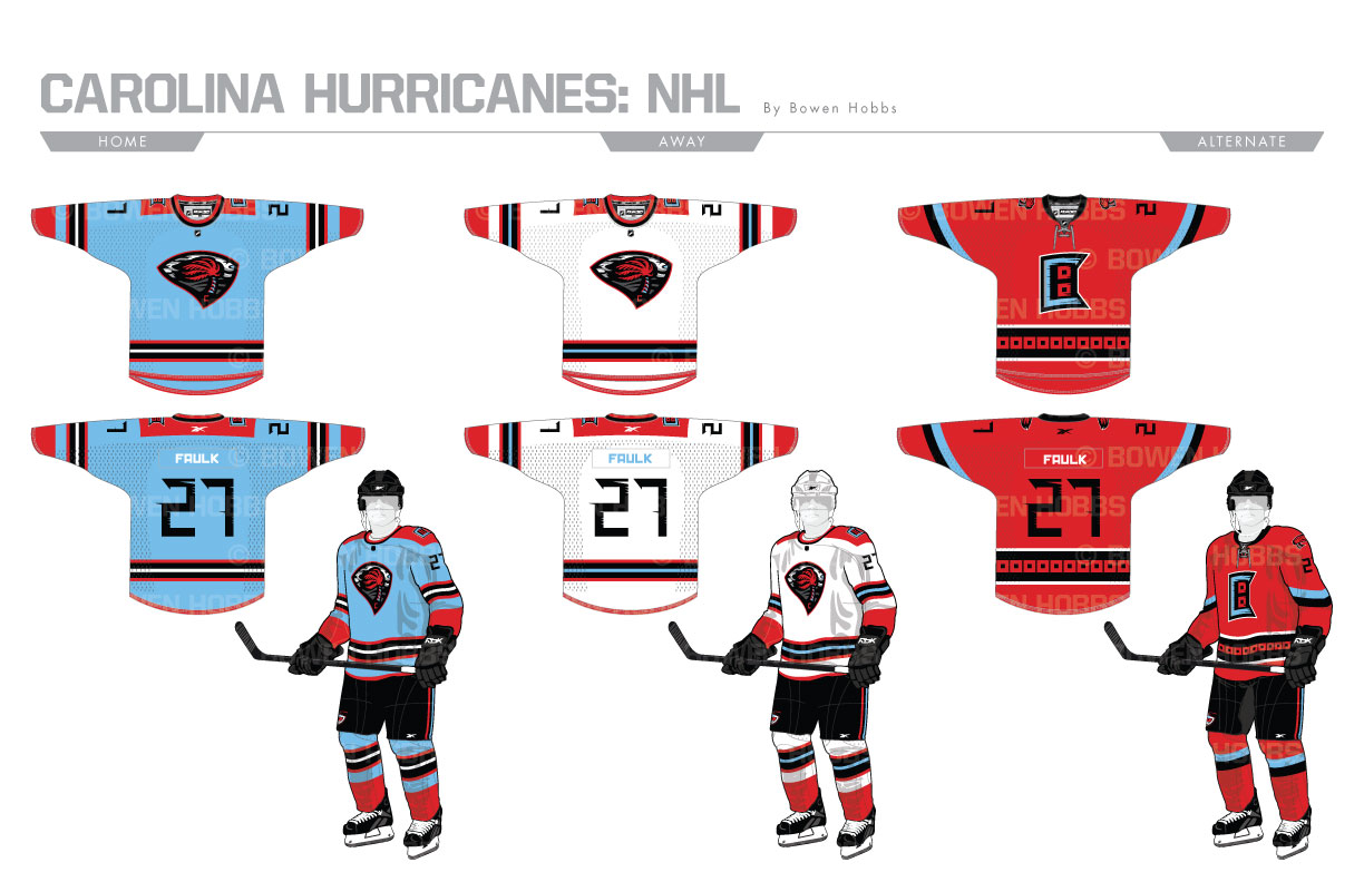
While the current Carolina Hurricanes logo is supposed to represent a puck in the eye of a hurricane system, the level of abstraction it employs leaves fans wanting more. I wanted to show a more tangible representation of the massive storm system, so I developed a primary mark of a palm tree blowing in the extreme wind of the storm crashing in from the east against a holding shape that resembles the combined landmass of North and South Carolina. The secondary combines a C, an H, and the double red flags of a full-blown hurricane, while a standalone palm tree and hockey stick cyclone further articulate the theme. The typeface is squared yet windblown in an homage to the hurricane flags flapping in the storm winds. The color scheme combines caroline blue with the team’s red and black to honor both UNC and NC State. The home and away uniforms employ a fairly straightforward striping pattern with a red shoulder yoke, while the red thirds reference the team’s inaugural uniforms in the form of the hurricane flag hem stripe.
Date
June 30, 2017
Category
Hockey, NHL

