Chicago Blackhawks


Chicago Blackhawks
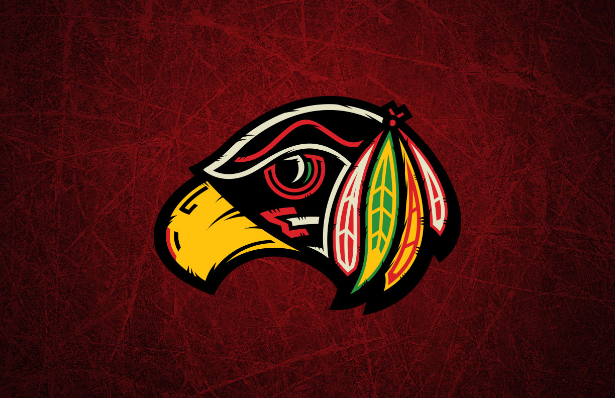
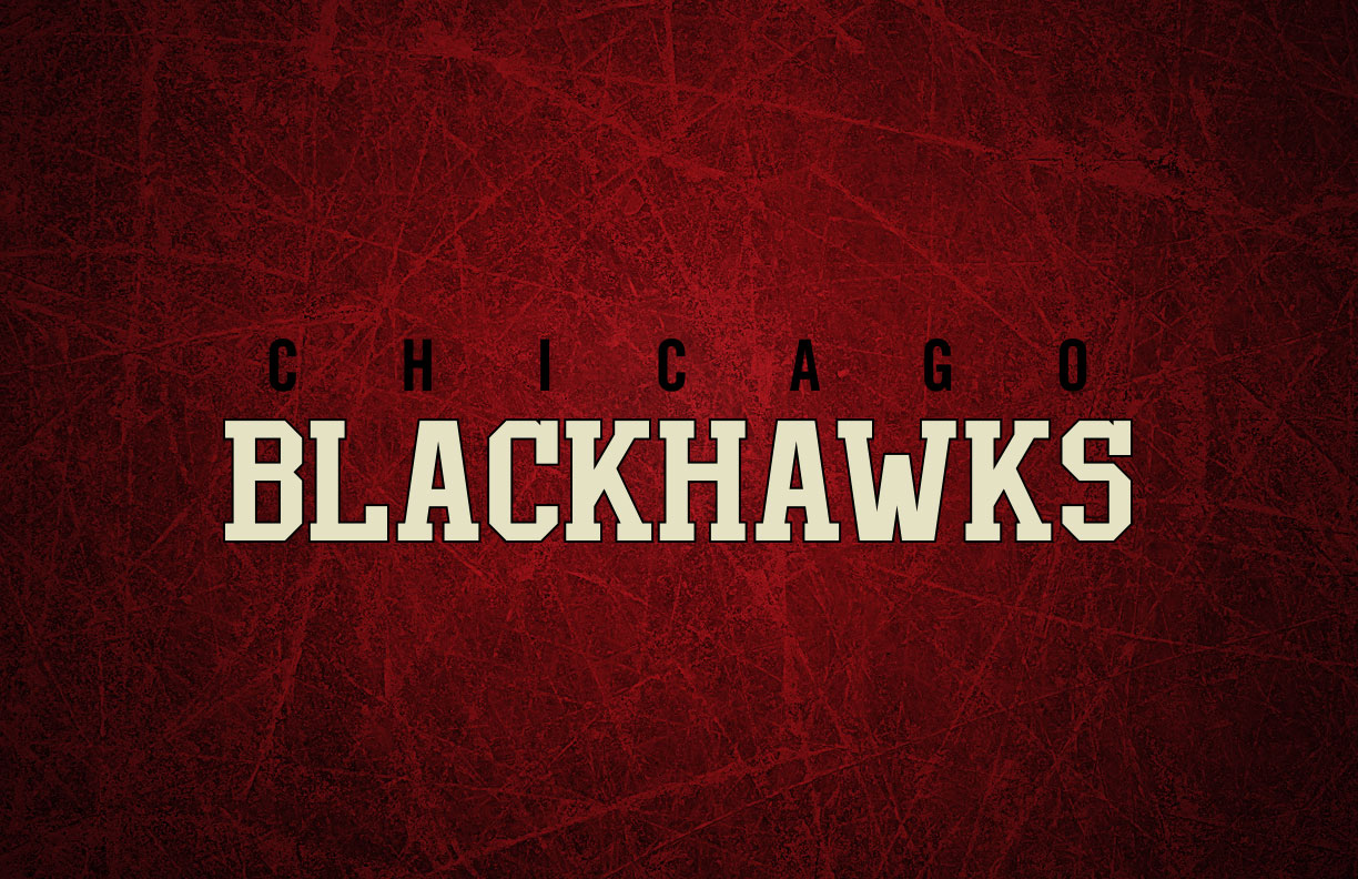
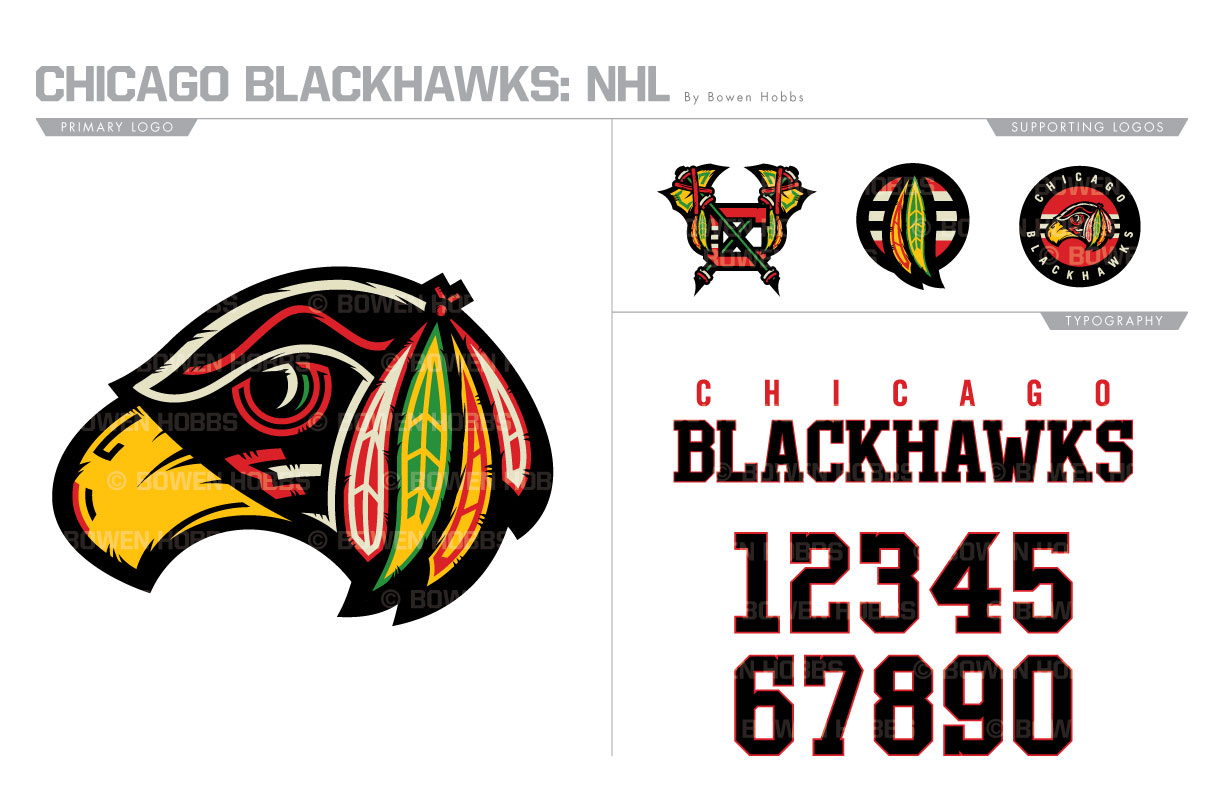
My Chicago Blackhawks redesign is a fresh take on a classic team. Switching out the Native American for a more literal blackhawk, I added a sense of texture lacking in the original. To fill out the logo set, I updated the Tomahawk-C and added a pair of roundels. The typeface uses block serifs and a high x-height for a less-machined feel. The white in the color scheme has been replaced with a cream color to give the concept a more vintage feel. The home and away sweaters are now consistent in their striping, while the alternate is mostly black and cream with small pops of red.
Date
June 29, 2017
Category
Hockey, NHL

