Edmonton Bears
Edmonton Bears
Edmonton’s history with professional football stretches back to 1910, but the current incarnation of the team began playing in 1949. They received their first uniforms from the University of Alberta Golden Bears, which was dormant due to a lack of competition. They’ve kept the green and gold colors ever since. However, one thing Edmonton won’t be keeping is their name. The team’s leadership recently decided to change their racially insensitive name, opting for Edmonton Football Team in the short term while a new more permanent name is decided. With an opportunity such as this, I wanted to blend some of the team’s symbols such as its green and gold color palette and polar bear mascot with another bit of tradition from the University of Alberta by embracing Bears as the team name. So I present to you… the Edmonton Bears.
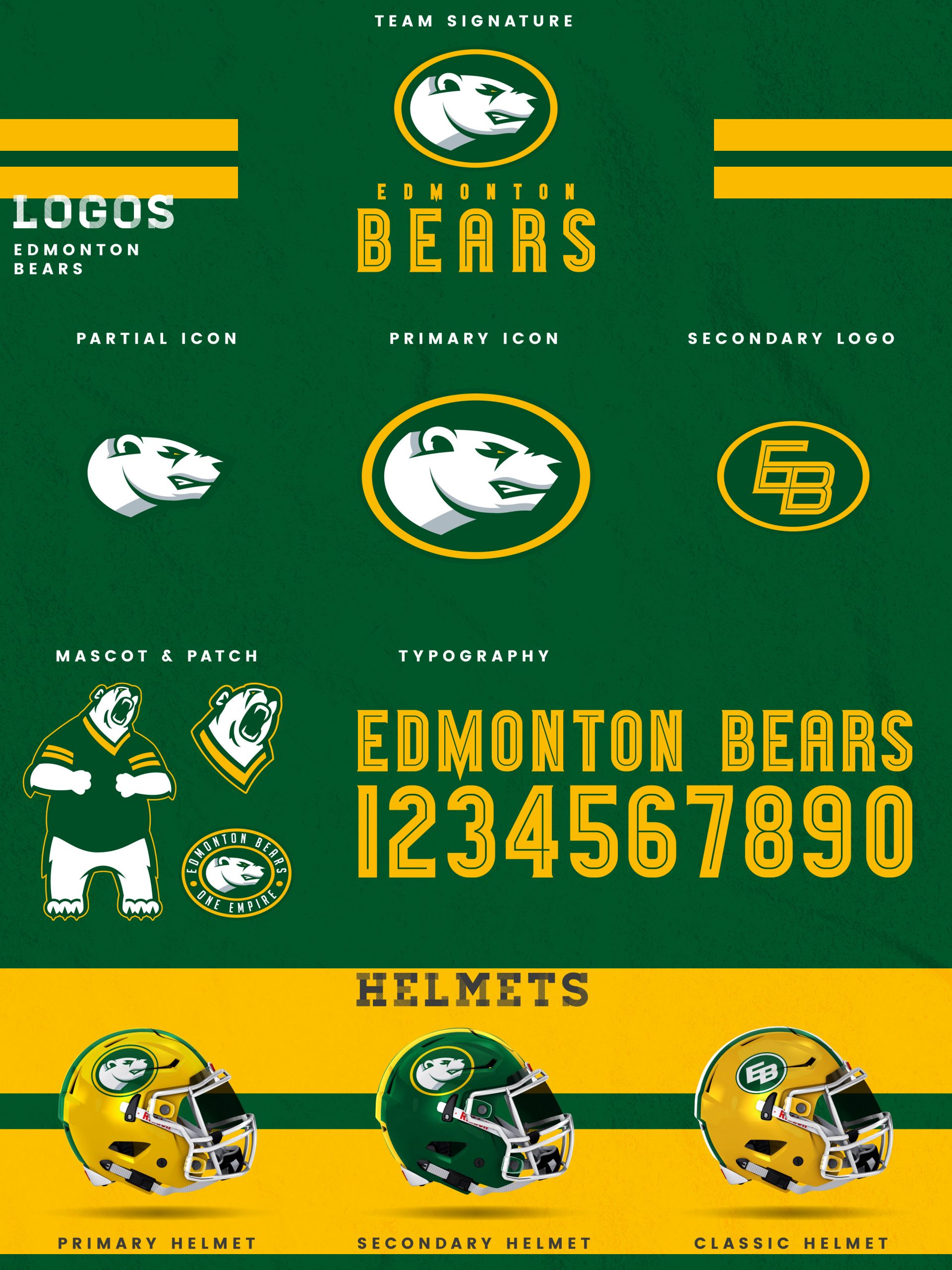
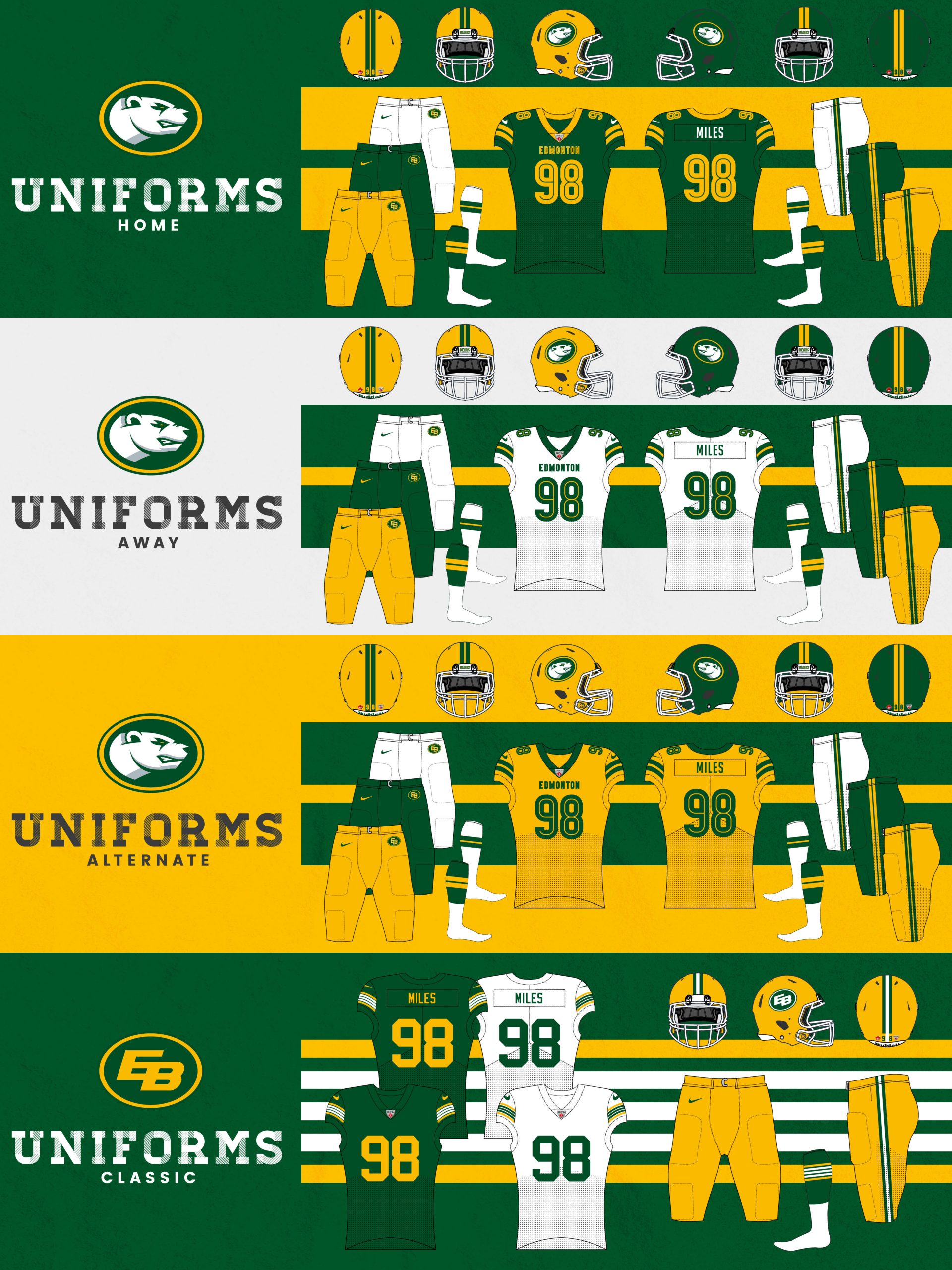
My Edmonton Bears concept places the polar bear front-and-center as the team’s primary icon. That icon is combined with a subtly serifed inline typeface for the team signature. To complete the logo set, I also developed partial icon of the polar bear without the oval, a secondary mark of an EB inside an oval, a patch design built around the new icon, as well as a pair of polar bear mascot marks. The primary icon also appears on the yellow primary and forest green secondary helmets, while the classic helmet contains an EB version of the team’s longstanding EE logo. The home jerseys are forest green with athletic gold striping and numbers and a hint of white. The white away jerseys opt for thick green striping with subtle gold accents. The alternate jerseys go bold with athletic gold as the base color and green striping and type. All three of these jerseys can combine with the primary or secondary helmet and either gold, forest green, or white pants. The classic uniforms, worn for special occasions such as the Labour Day Classic, throw it back to the Warren Moon era, but with the EE logo modified to an EB.
Date
July 28, 2020
Category
CFL, Football

