Los Angeles Kings
Los Angeles Kings
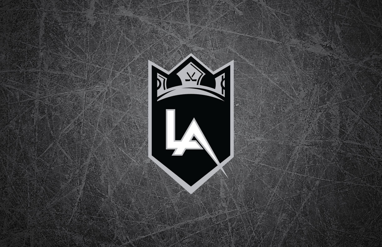
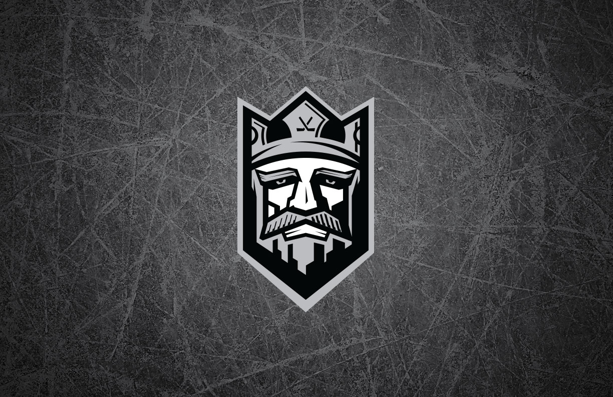
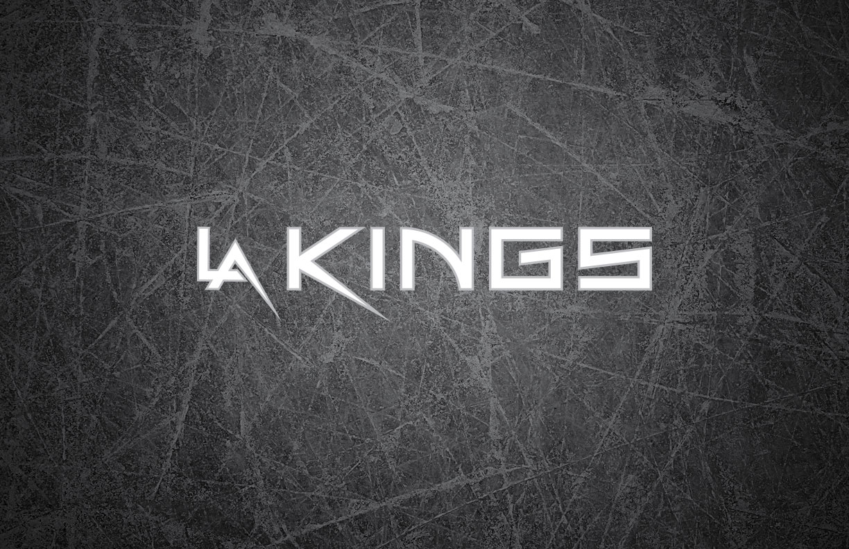
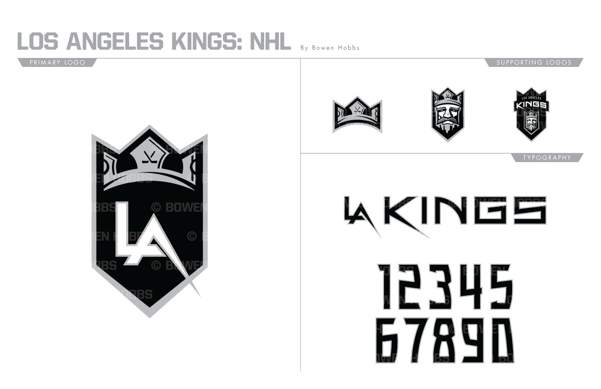
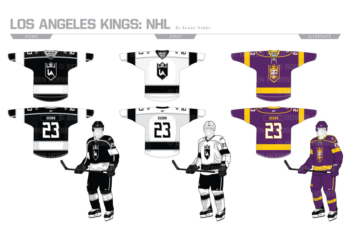
The current Kings logo was unveiled in 2008 but wasn’t promoted to the status of primary logo until 2011, when the team completely removed purple from its color scheme. I looked to continue that trend while constructing an emblem that was less sectioned and more integrated. Gone is the stripe bifurcating the logo, while the crown is larger and placed at the head of the mark. Below it an integrated LA letterform is front and center. The crown can also stand by itself as well as be paired with a king’s head. The typeface is minimal and sleeker than its predecessor without completely losing its edge. The home and away sweater recall the Gretzky Era while the thirds throw it all the way back to the Kings original purple (or forum blue, if you’re a Lakers fan) and gold.
Date
June 30, 2017
Category
Hockey, NHL

