Minnesota Vikings
Minnesota Vikings
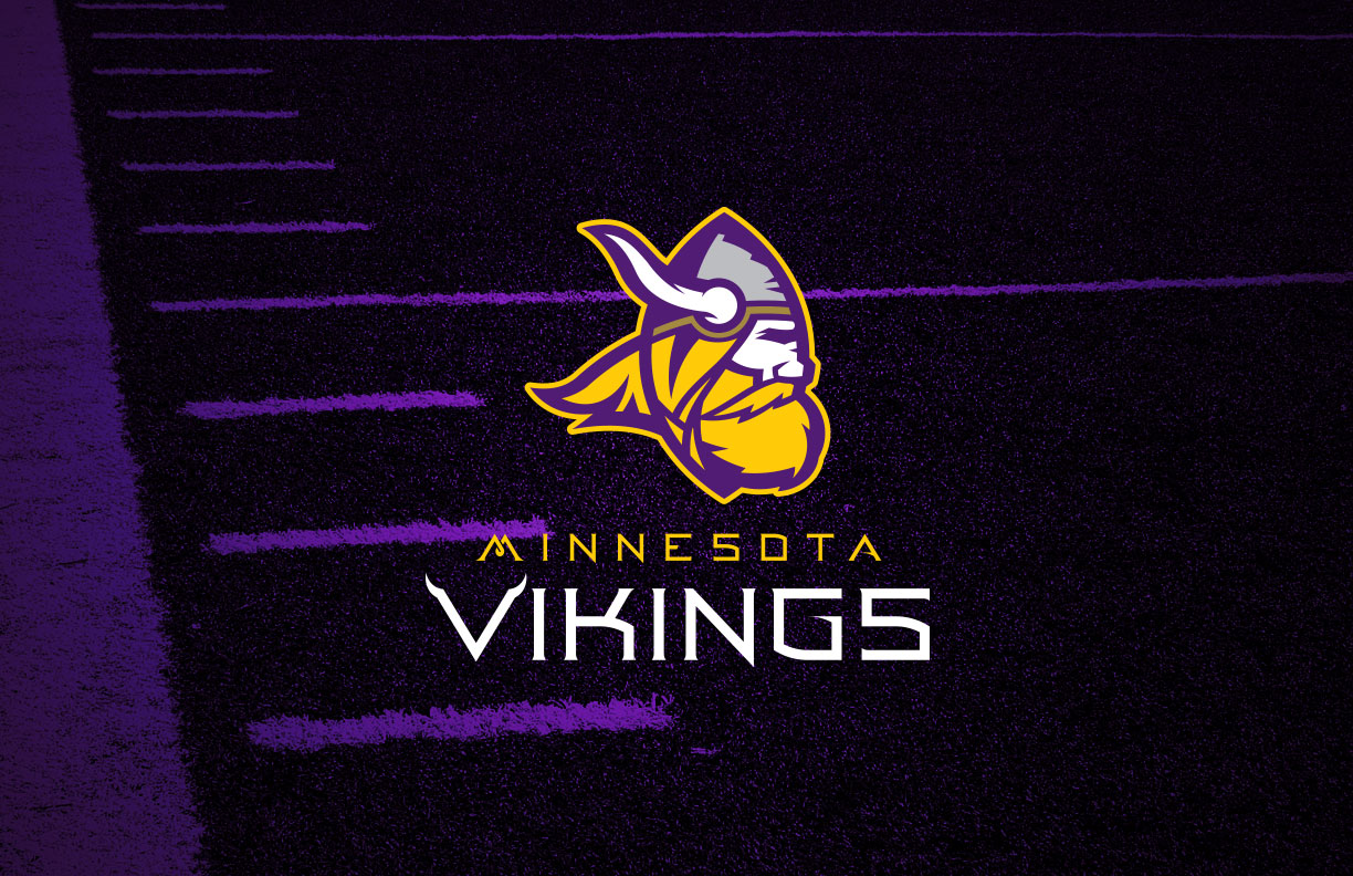
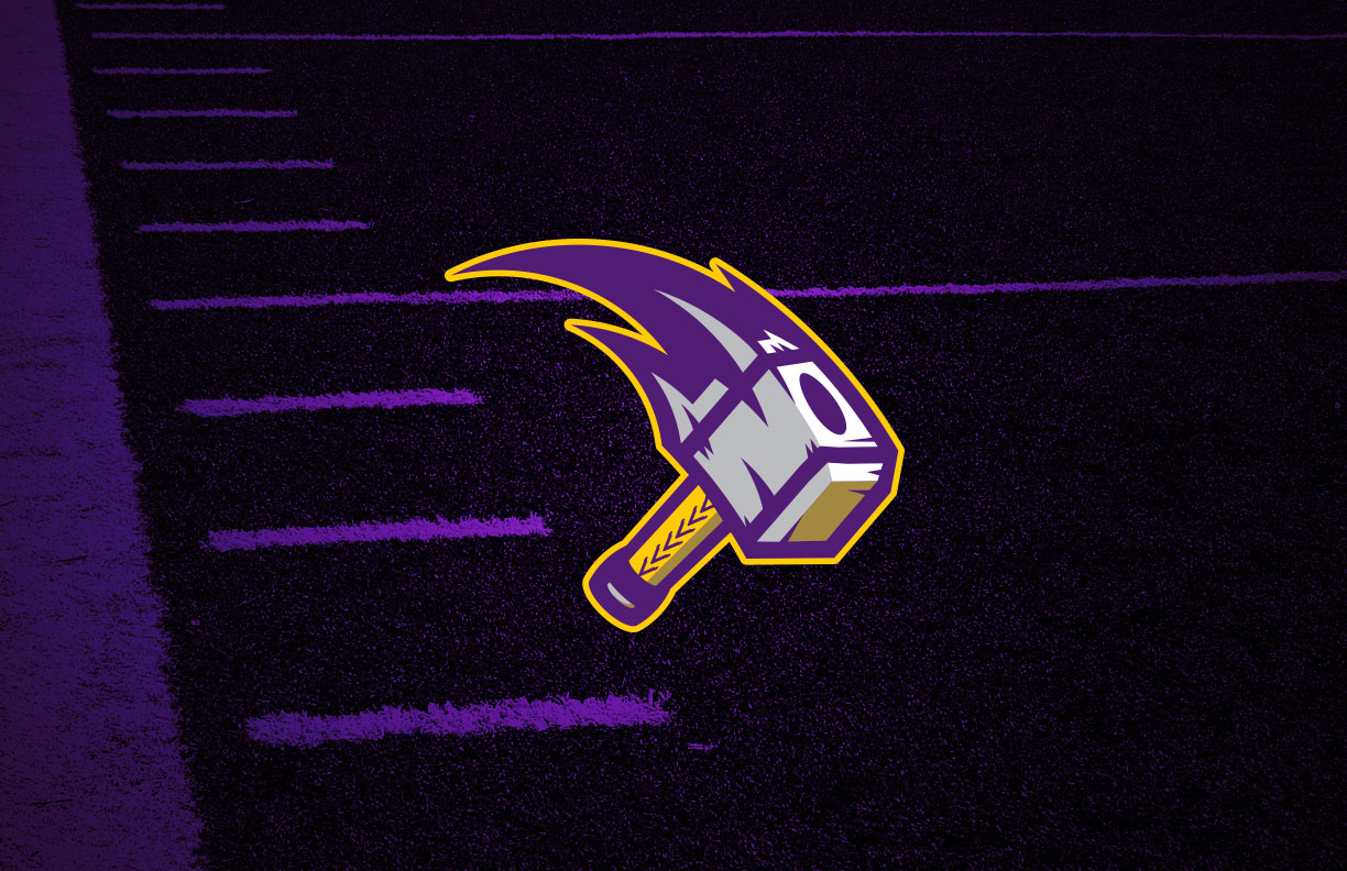
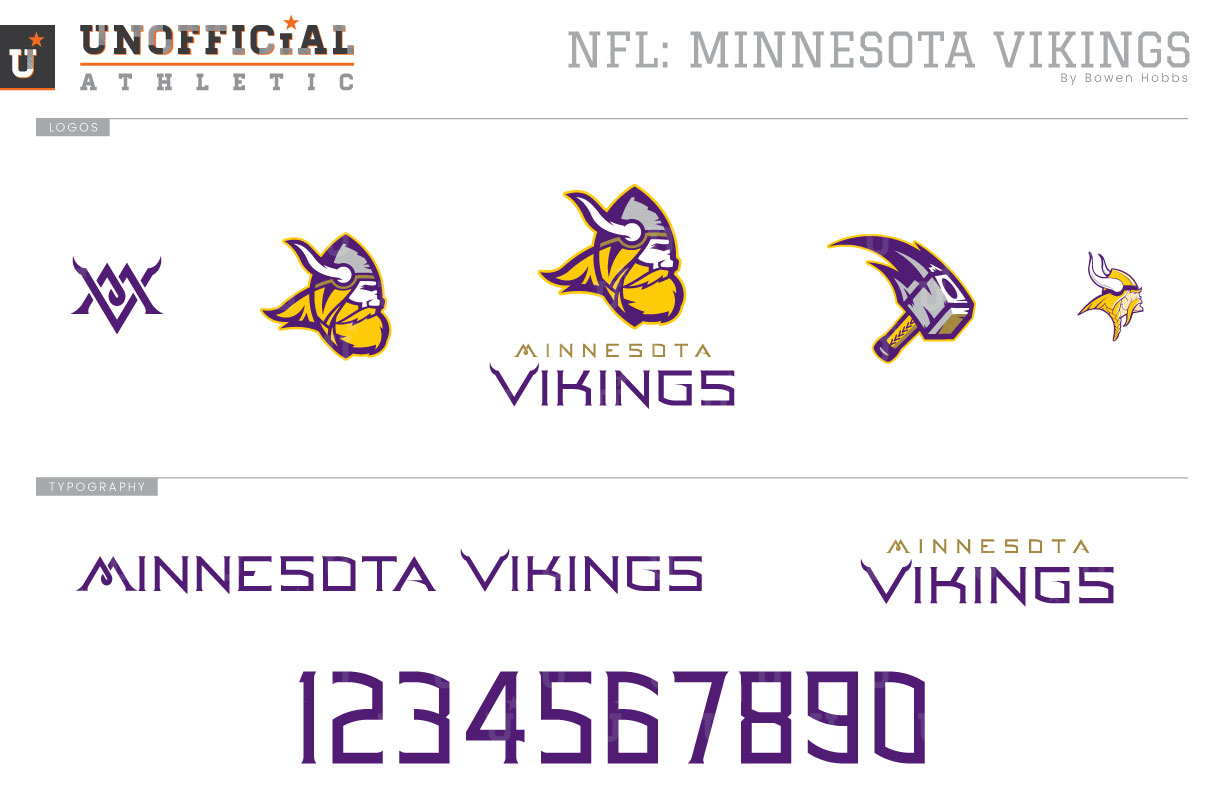
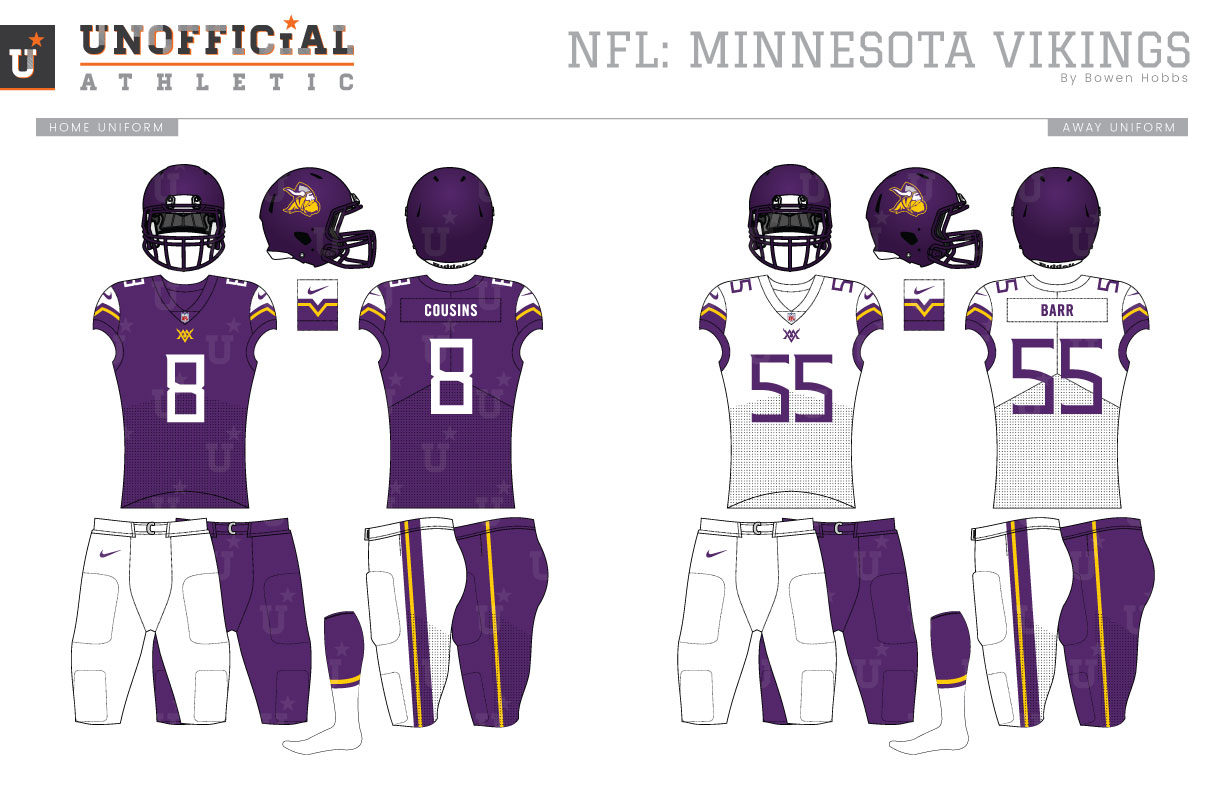
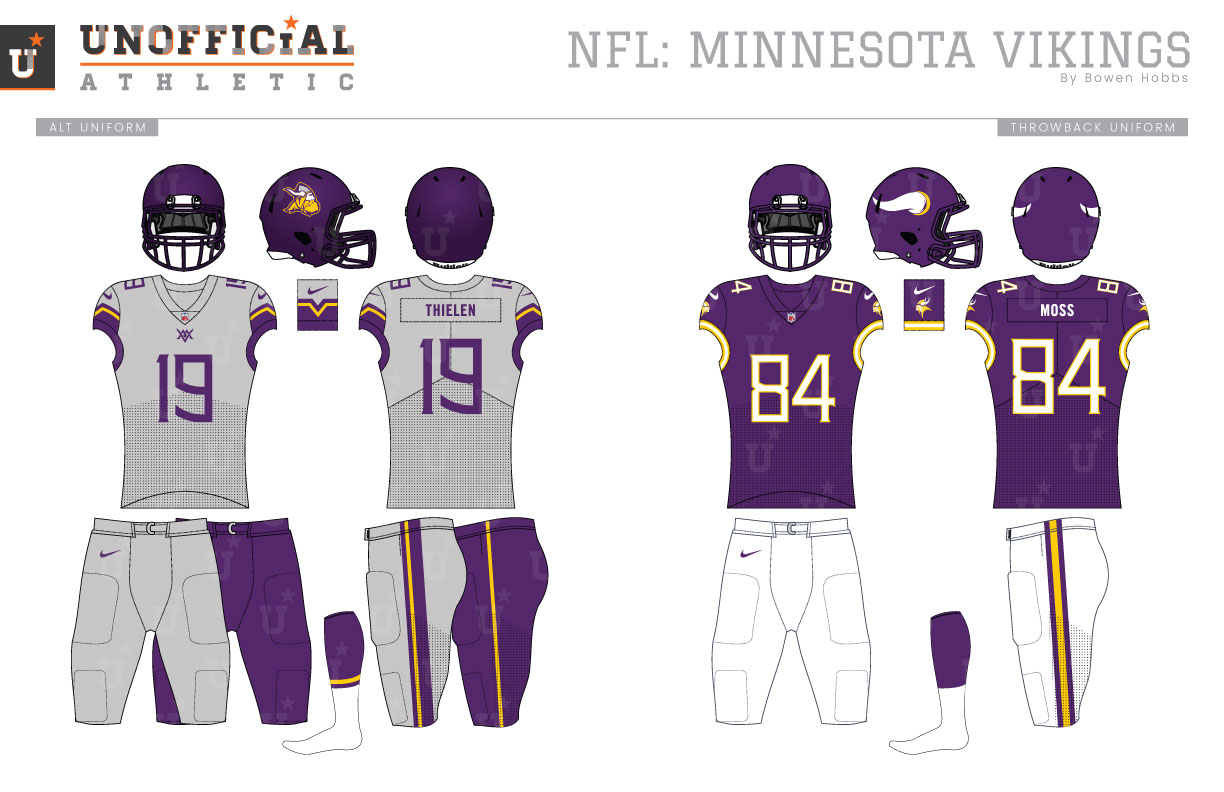
The Minnesota Vikings began play in 1961 and brought purple back to the NFL for the first time since the Portsmouth Spartans wore the hue from 1930 to 1933. While the Spartans would become the Detroit Lions in 1934, the Vikings have stayed in The Land of 1,000 Lakes and continued representing purple in the NFL to this current day. The Vikings not only have had amazing chromatic continuity, but they have also used pretty much the same logos since their inception. With a Viking head representing the team, and just the horns on their purple helmets, they have chosen to update and modernize their brand instead of making wholesale changes. One area that has seen significant edits over the years has been the uniforms below the neck. The Vikes started with a northwestern stripe design trimmed in athletic gold, but added an alternate purple jersey with white numbers and no stripes for much of the 60s and into the 70s. In 1969, the team changed its white road jersey from the Northwestern stripe to a triple shoulder stripe. The Vikings would continue to wear completely different home and away designs for decades, updating their uniforms in 1996. The 1996 update featured the viking head logo added to the sleeves and the TV Numbers moved to the shoulders on both jerseys and revised striping on the home jersey only. The home and away uniforms would finally match in 2006 with the unveiling of a modern design that featured the abstract shape panels and piping of the aughts. The 2006 redesign also brought back the option for purple pants since 1965, but it became obvious that the pants stripe and jersey side panels did not properly line up when the team went all white or all purple. Those uniforms would last seven seasons before being replaced with the current set, unveiled in 2013, which allows for more cohesive mixing and matching, despite the striping patterns differing on the white pants and white jersey. My rebrand evolves the brand by making edits to the viking head logo, giving the viking a beard, a metal helmet, and a bolder treatment that subtly places a football into the mark. The alternate logo adds a striking Thor hammer to the Viking universe, in addition to a revised MV mark that shows the letters interlocking in the style of the viking knot-work. A slightly revised version of the teams original viking head remains for use on the throwbacks. The typeface combines a uniform stroke weight with flare serifs for a sturdy but sophisticated look. The helmets endure significant changes for the first time, with the new viking head placed on each side, a satin finish that is darker toward the bottom, and a deep purple facemask instead of a black one. The uniforms borrow a sleeve treatment from a never-used inaugural design with a v placed into the sleeve stripe. The home uniforms are purple with white type and pair with either white or purple pants. The away uniforms swap white and purple on everything except the sleeves and also pair with either white or purple pants. The alternates are grey and keep the design of the away uniforms intact outside of the white-for-grey swap. The grey third jerseys can be worn with either grey or purple pants. The throwbacks bring back the 1990s design from the Randy Moss era with the striped sleeve cuffs and viking head logo on the sleeves.
Date
January 22, 2019
Category
Football, NFL

