Montréal Canadiens
Montréal Canadiens
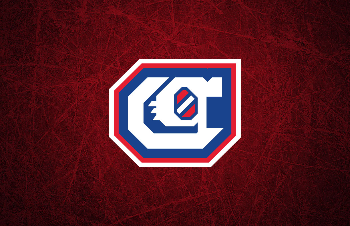
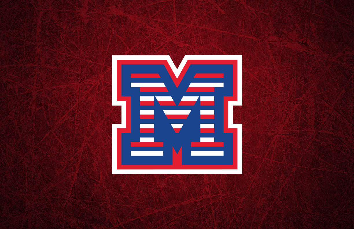
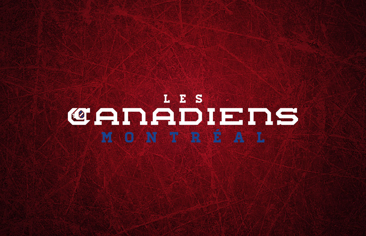
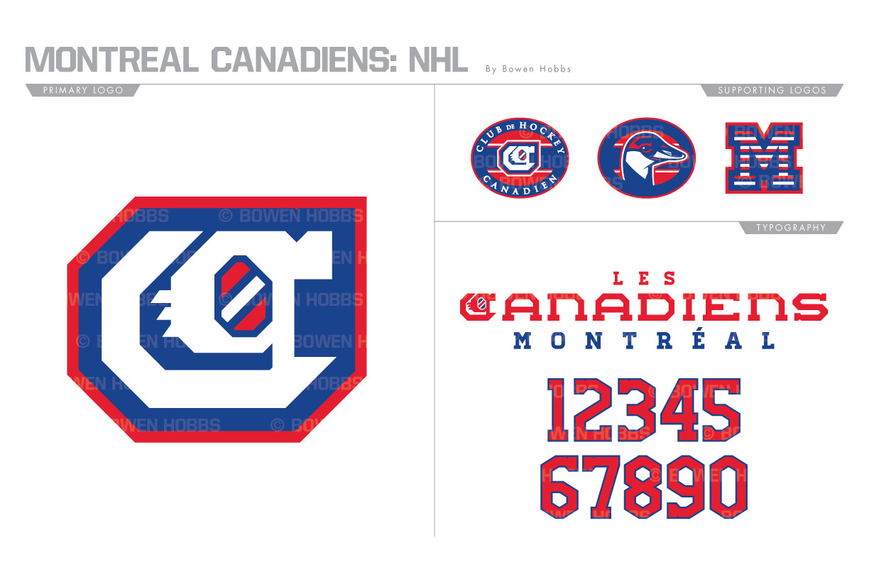
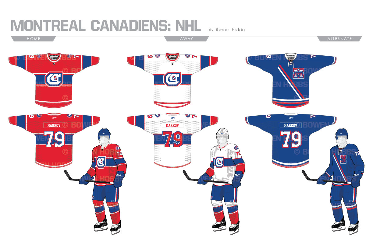
With the most Stanley Cup titles in the history of the NHL, the Montréal Canadiens are synonymous with the history of hockey. While developing this design, I wanted to create a very classic look. I started with an Olde English C with a subtle red-white-red striping pattern contained within the letterform. I paired two oval badges with the mark, one of which contains the C against the team’s ubiquitous chest stripe. The other badge features a Canadian Goose against the stripe. To complete the logo set, I developed a block-M filled with the barber pole striping from one of the Habs’ throwback sweaters. The primary typeface is a wide and short block serif capped with the Olde English C, complemented by a secondary slab serif. The home sweater features only minor revisions outside the logos, while the away version was revised more heavily to be consistent with the iconic reds. The blue alternate borrows a diagonal stripe from the Canadiens’ storied history, paired with the barber pole-M.
Date
June 29, 2017
Category
Hockey, NHL

