New York Knicks
New York Knicks
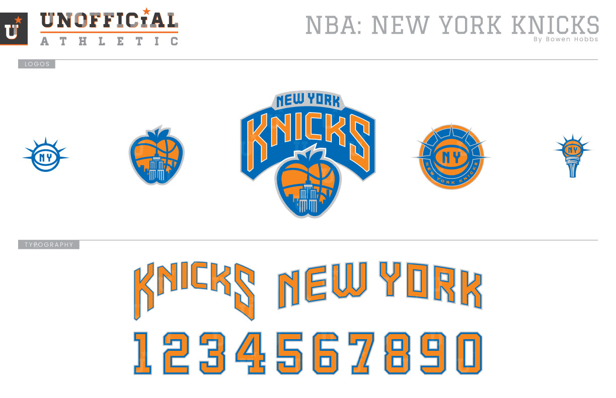
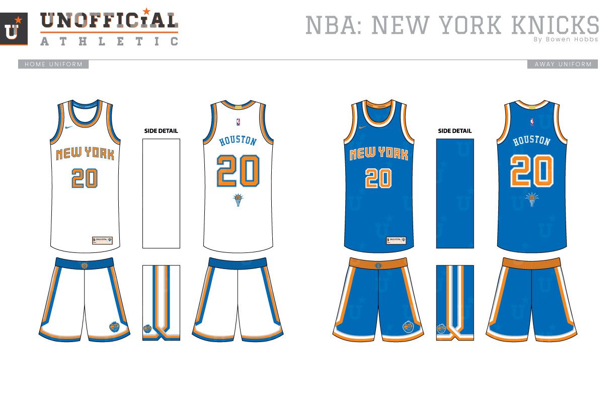
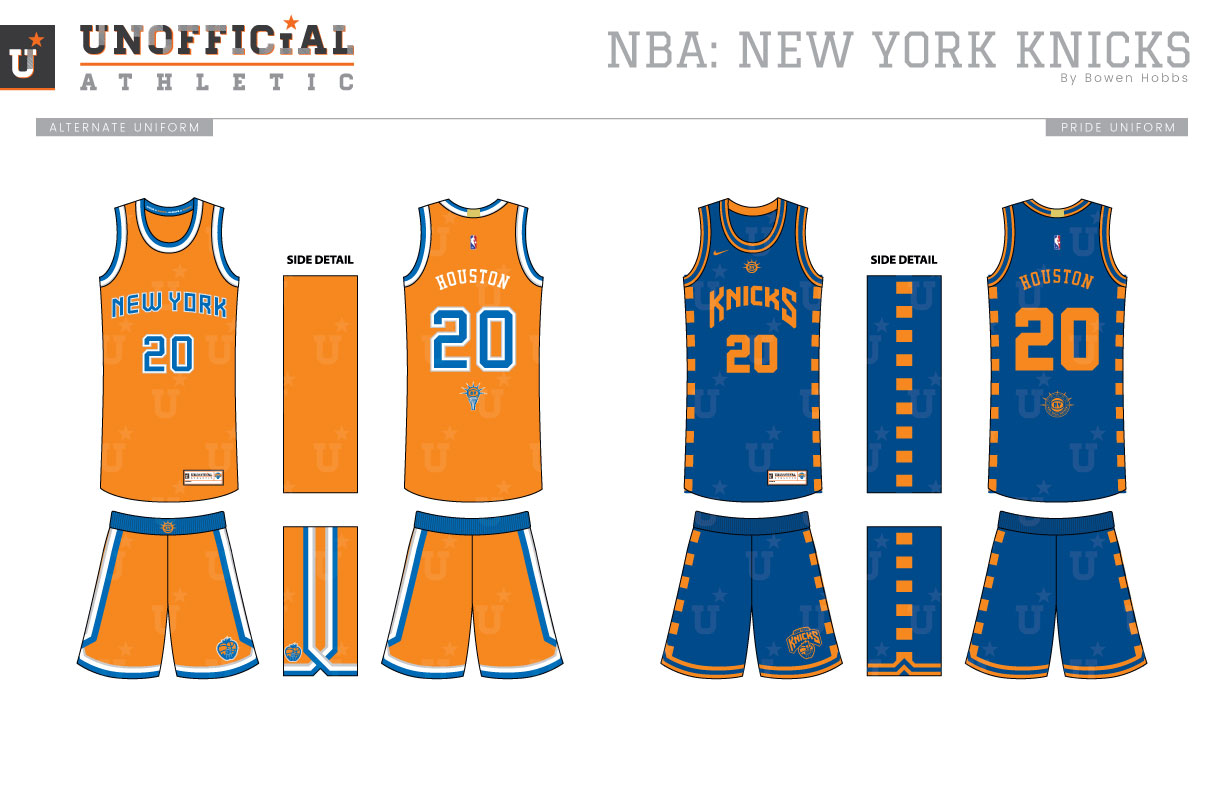
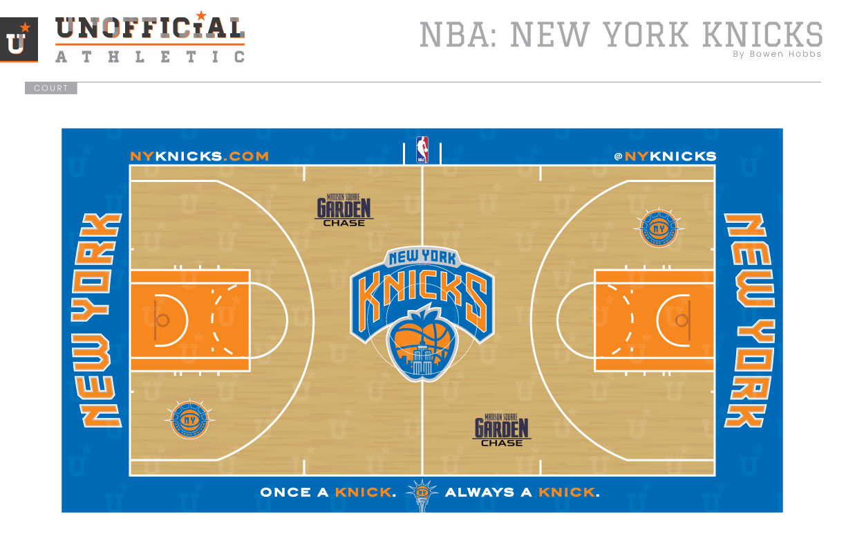
The Knicks began play in Gotham in 1946 and haven’t looked back. Over the decades, the uniforms have changed, but the blue and orange have remained. My concept reminds everyone exactly where the Big Apple is by placing part of the iconic New York skyline inside an apple/basketball hybrid. That Big Apple-Ball mark appears under a refined KNICKS script to form the primary logo. The secondary mark places an NY-Ball inside a roundel lined with the crown of the Statue of Liberty. The Liberty-Ball mark also appears on the Statue’s torch, and as a standalone one-color icon. The Knicks typeface refines the existing KNICKS script, while the NEW YORK wordmark is comprised of an art deco-inspired block typeface. The numerals are crafted in the form of a block serif font with slight modern touches. The Icon, Association, and Alternate uniforms feature relatively simple jerseys for a timeless look paired with shorts that feature subway-inspired striping. The Pride uniforms opt for the KNICKS script in just orange against a darker royal uniform with checkered side panels. The court returns the use of orange in the lane, with NEW YORK along each baseline. The primary logo is placed at center court.
Date
August 30, 2017
Category
Basketball, NBA

