Pittsburgh Pirates


Pittsburgh Pirates
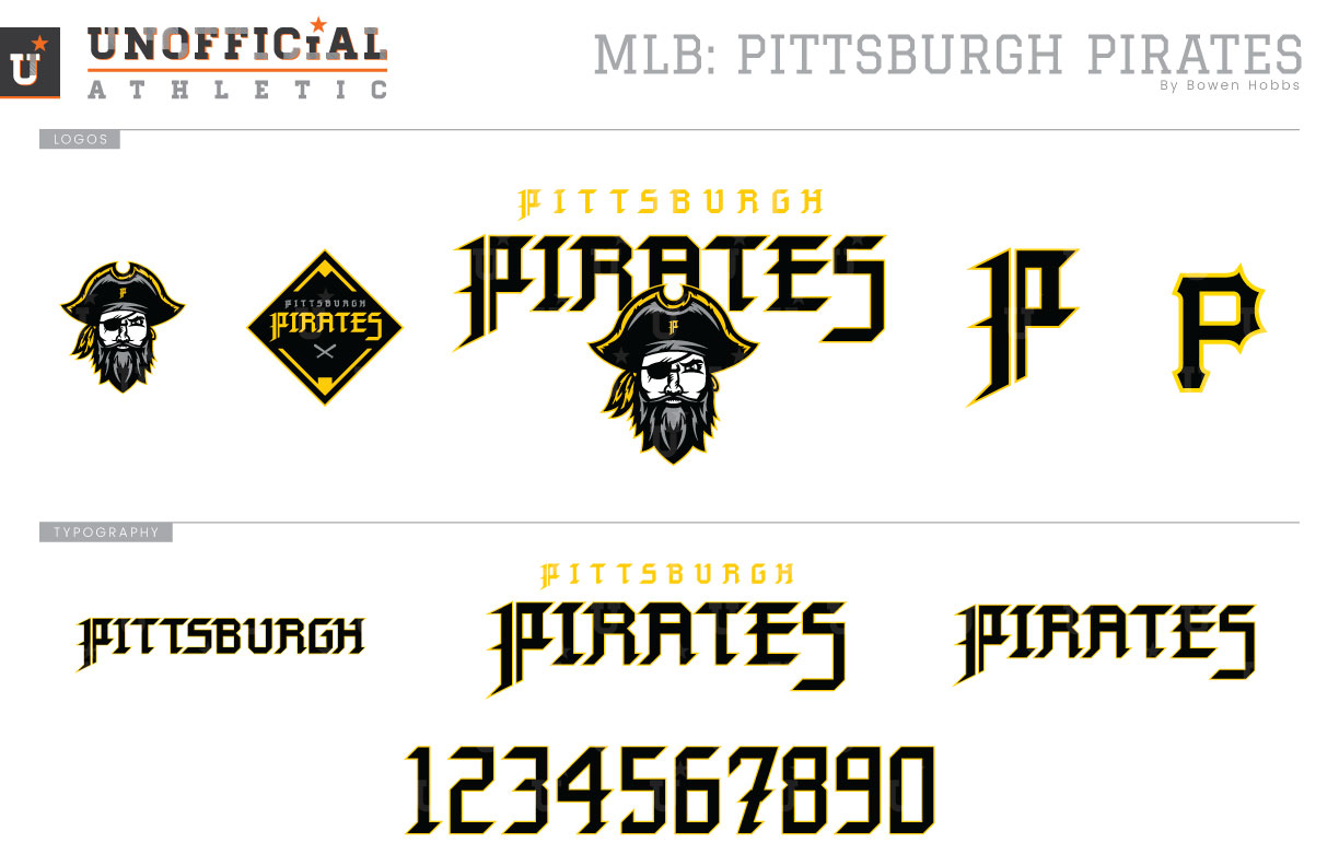
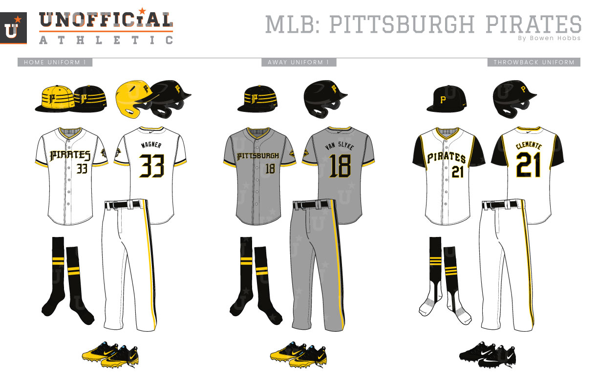
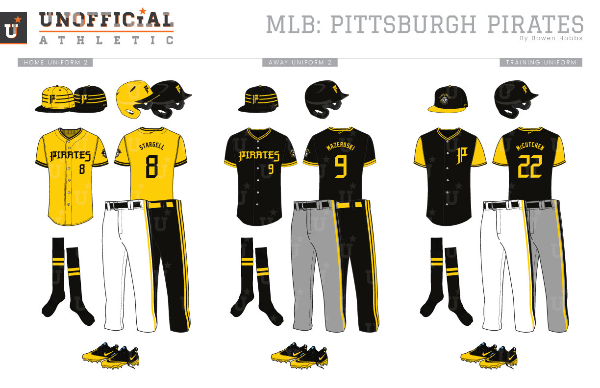
Born in 1876, the Pirates have used a plethora of typefaces for their P logo, usually rendered in navy and/or red throughout the early years. In 1948, the Bucs settled on a variation of their current P in black and gold. Since then, the team has tinkered with the serifs and shade of gold, even adding red from 1997 through 2008. Over many of those years, the team has also used a pirate head mark to complement the brand. My primary logo brings back the pirate head idea, with the team last using a pirate logo in 2013. The head appears below PITTSBURGH PIRATES in an angular blackletter-inspired signature block typeface, and by itself as a sleeve patch. The cap logo is the standalone blackletter-P. A second sleeve patch with PITTSBURGH PIRATES against a black diamond is used on the road steel gray uniforms. While the roads greys are steel with black pillbox-inspired caps and typography, the home whites have an option for athletic gold caps with the classic horizontal stripes. The throwback uniforms revive the Roberto Clemente era with white vests and black undershirts and the classic-P, while the alternate uniforms allow for some classic Wille Stargell-era combinations. The home alternate uniforms feature an athletic gold jersey that can be mixed and matched with either a gold or black cap as well as options for black or white pants. The black away alternate jerseys are paired with a black cap and either steel or black pants. The spring training attire features a back cap with a gold brim and the pirate head logo, along with a lightweight black jersey with gold sleeves and the Blackletter-P on the chest.
Date
June 13, 2018
Category
Baseball, MLB

