Saskatchewan Roughriders


Saskatchewan Roughriders
The Saskatchewan franchise dates back to 1910, when it was a rugby club, but in the end, three-down football won the hearts and minds of Canadians. In 1924, the Regina Rugby Club officially adopted the name Roughriders, after Ottawa’s club dropped it for Senators. In 1948, the Riders became provincially-owned after Moose Jaw and Saskatoon folded and switched to their green-and-white color scheme. That chromatic simplicity would continue until the late 1980s, when Saskatchewan would add silver pants and black trim. As the years wore on, silver would be retired, then black uniform trim, as the Riders got back to their core: green and white.
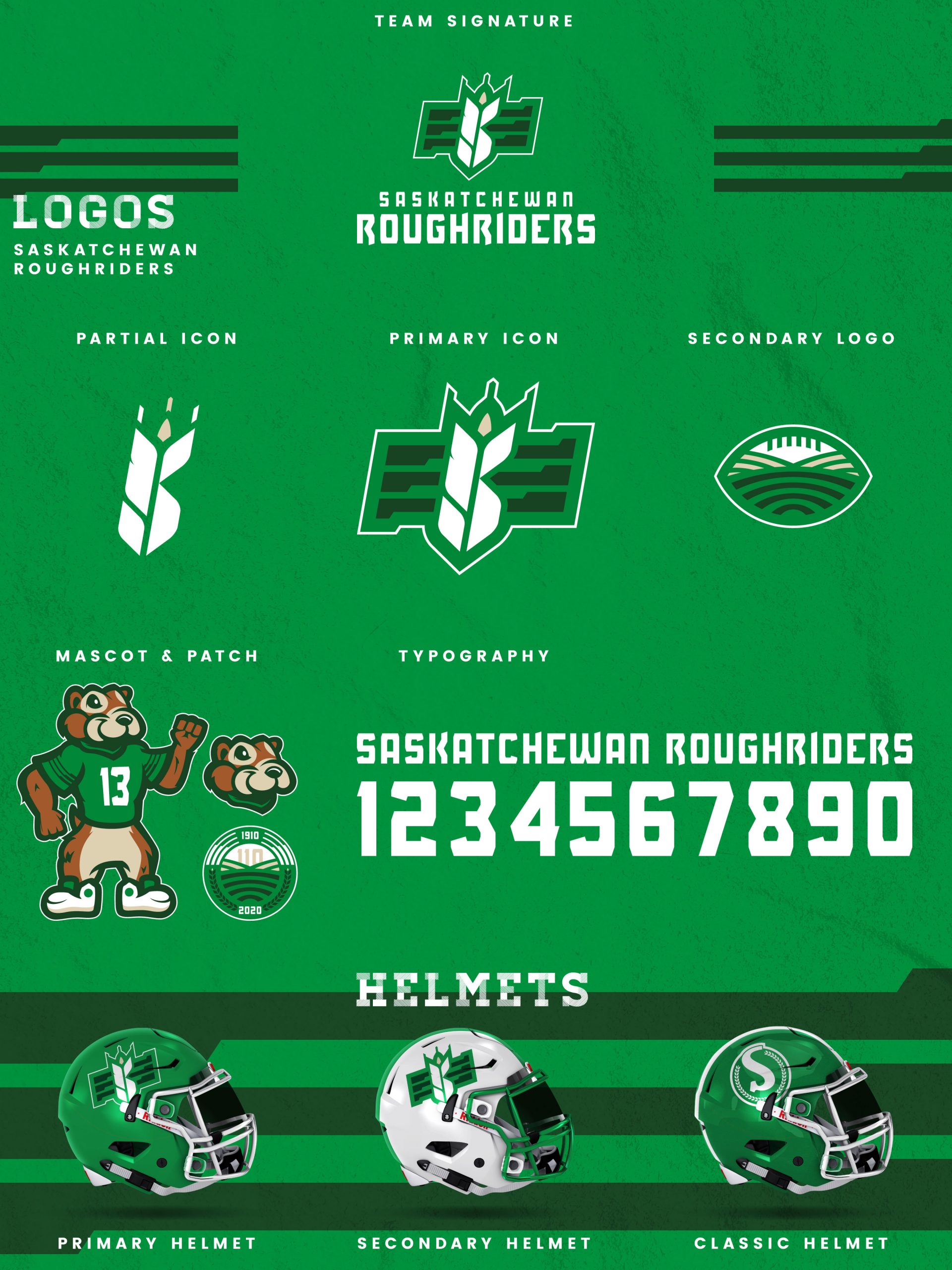
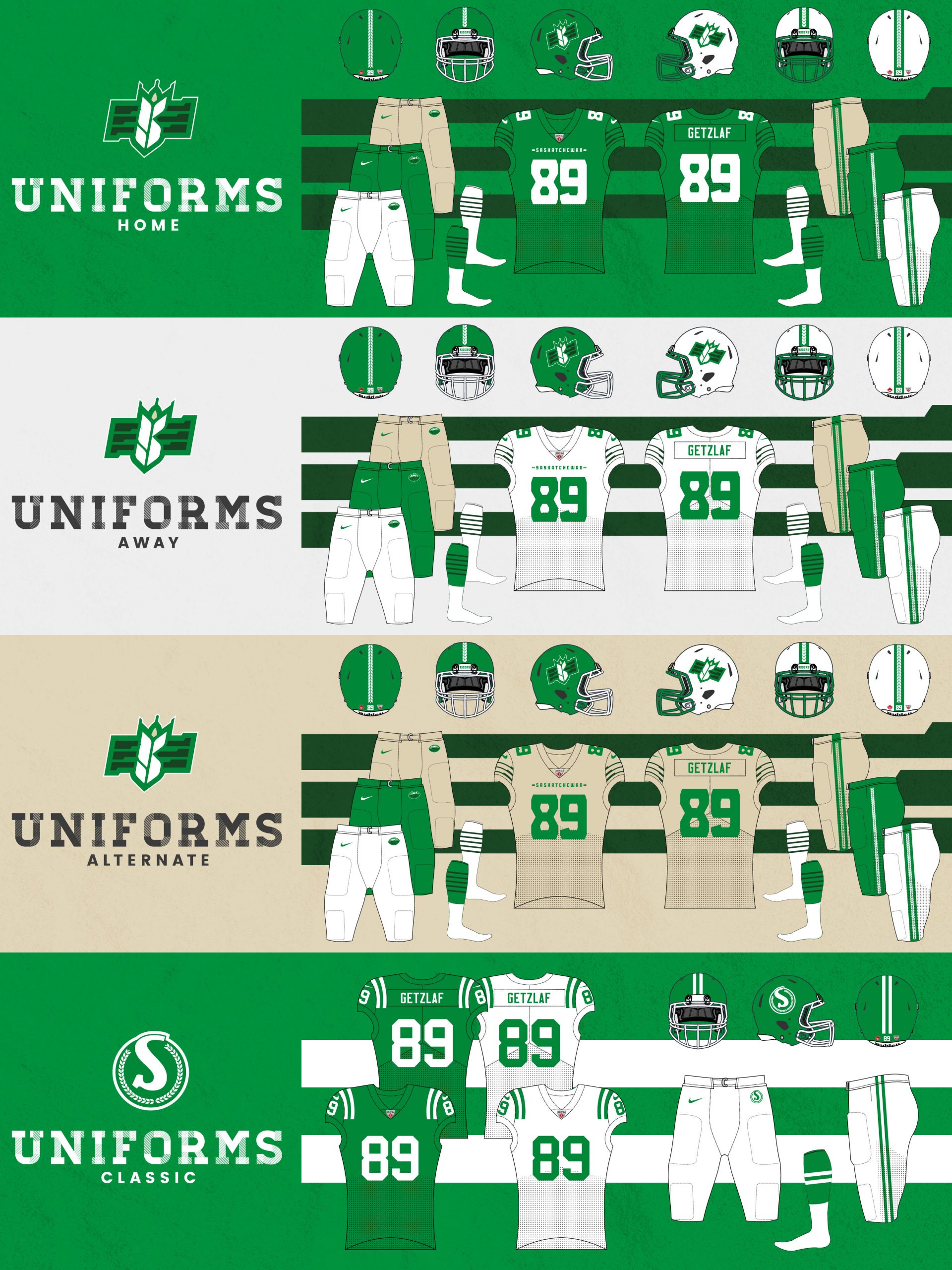
My Saskatchewan Roughriders redesign takes another step in the brand’s evolution, re-stylizing the S logo to showcase the region’s wheat production. The color palette has also been refined, adding touches of forest green and wheat to the existing kelly green and white. The new S-wheat logo is paired with a block sans-serif font for the team’s signature. The S-wheat primary logo also strips away the stripes for a partial icon of the standalone S-wheat. The secondary logo features farmland contained within a football. The farmland is also used on a 110-year anniversary patch, while Gainer the Gopher receives a stylized update. The primary helmet is kelly green with a white facemask, while the secondary helmet is white with a green mask. Both helmets feature a wheat pattern stripe down the middle. The classic helmet revives the circular-S logo in plain green and white. The home jerseys place an emphasis on kelly green and white but with forest green striping from the logo on each sleeve. The white aways also feature the forest green striping and pair it with kelly numbers, as do the wheat-colored alternate jerseys. The home, away, and alternate can all be worn with white, kelly, or wheat pants. The classic uniforms, worn for the Labour Day Classic, bring back the classic feel of the 1960s and ’70s.
Date
July 28, 2020
Category
CFL, Football


