Seattle Seahawks
Seattle Seahawks
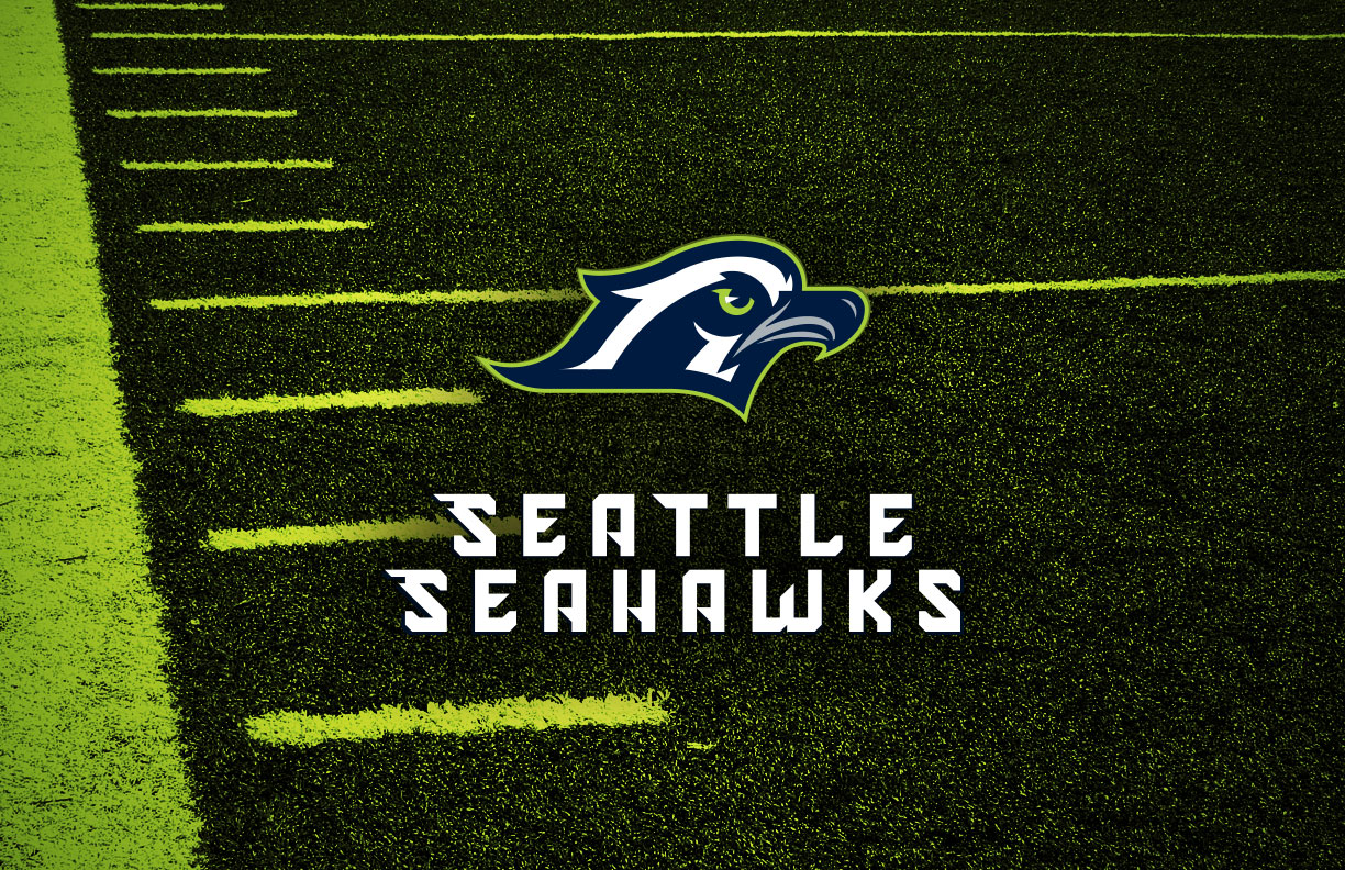
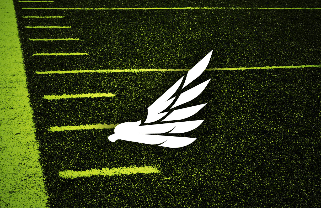
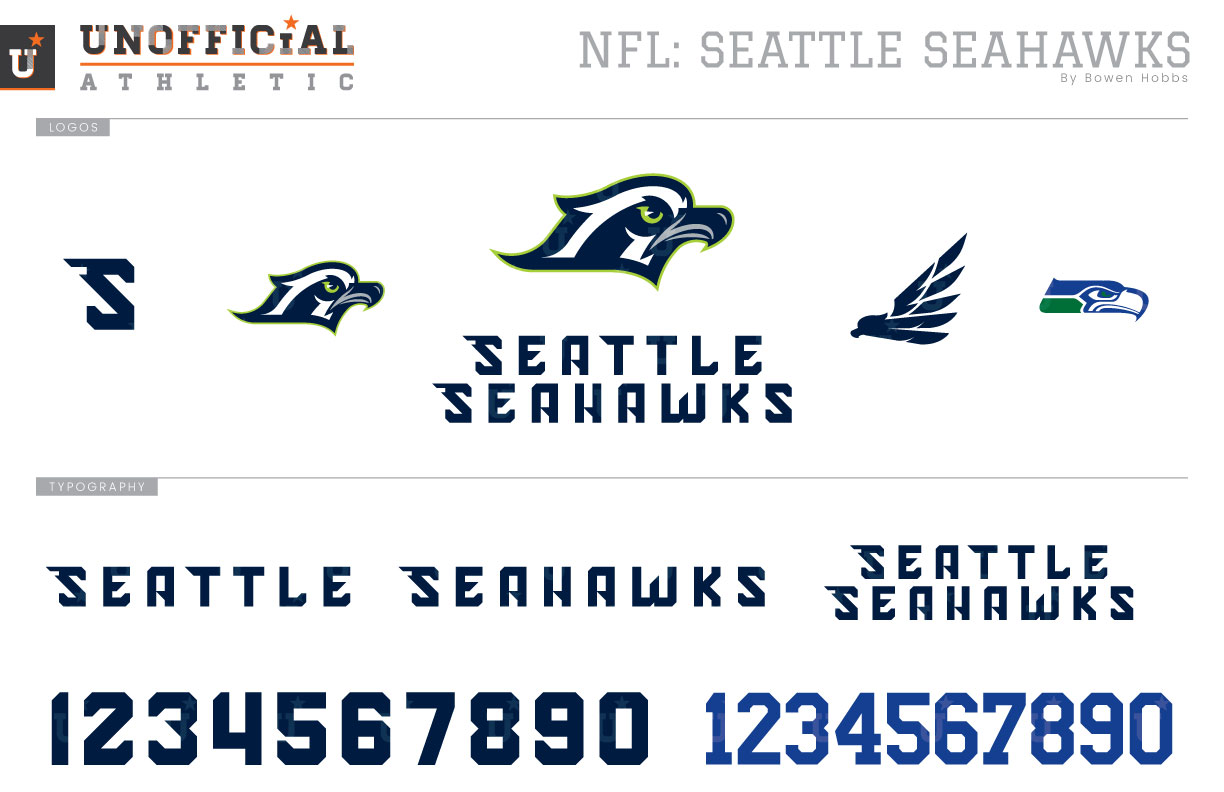
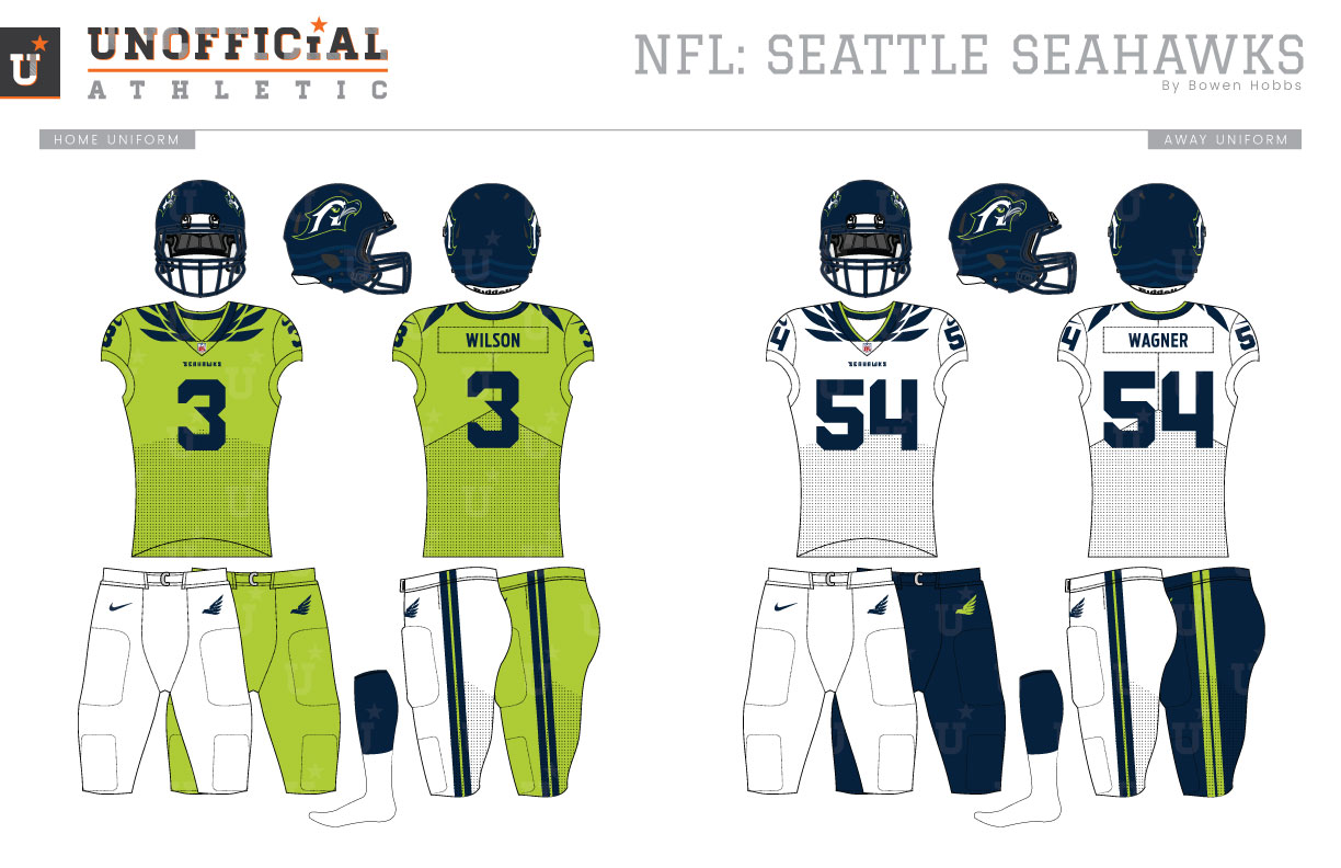
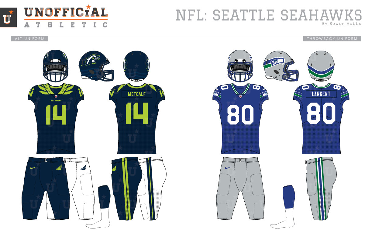
The Seattle Seahawks played their first official game in 1976 against the St. Louis Cardinals. They did so clad in royal, kelly green and silver. Their silver helmets featured a northwestern indigenous-styled hawk head charging forward from the back of the helmet. Their royal blue home jerseys contained bold northwestern stripes on the sleeves in white and kelly green, complementing the single color white numbers. The away jerseys, however, used slightly separated, equally-sized green-royal-green stripes that matched the striping on their silver pants. In 1980, the collar of the white jerseys would become royal, while bigger changes occurred three years later. The 1983 season would see the ‘Hawks update their look with an eye toward consistency. The discrepancies between the home and away jerseys were no more as the team went with a striped collar and a logo-stripe on their sleeves for both home and away. The next update would occur in 1993, when the pant stripes were adjusted to emphasize more green. 2002 would bring the most radical redesign in team history, as the Seahawks would jettison their royal blue, silver, and kelly green for slate blue, navy, and lime green. The hawk logo would be updated to look more aggressive, while the helmets went from silver to slate blue with a navy facemask. The home uniforms, too, were slate blue, but with navy sleeves and navy and lime trim. The numbers were white with a navy outline and SEAHAWKS appears just below the collar. The away jerseys were white with slate blue sleeves and numbers with navy and lime trim. The team had options for white or slate blue pants. In 2009, the Seahawks would unveil a lime alternate jersey with navy pants, although the navy pants would also be worn with the slate jersey sparingly that season and the following year. The current Seahawks look was unveiled in 2012 and focused on navy and wolf grey with bold lime accents that further embraced design elements from indigenous culture. In addition to the navy home, white away, and grey alternates, Seattle would unveil an all-lime set with navy numbers as part of Color Rush in 2016, and would wear the lime jersey with navy pants in 2019 as the NFL loosened its uniform restrictions. My Seahawks redesign dives headfirst into the team’s infamous lime green, making it the team’s main color. The primary icon is a stylized osprey head and is paired with a blocky yet sharp modern typeface to create the team signature. The alternate logo is more minimalist featuring a single-color graphic seahawk in flight. A solitary S and current seahawk head in throwback royal and kelly green complete the logo set. The helmets are navy with the team logo on each side and sublimated waves along the base. The blocky yet sharp font from the team signature is applied to the number set for a distinct modern look to pair with lime green home jerseys. The lime jerseys feature navy single-color typography and bold, graphic feathers around the collar and pair with white or lime pants. The away jerseys are white with navy feathers and type and a touch of lime on the collar, while the alternate jerseys are navy with lime design elements. Both the white and navy jerseys pair with white or navy pants. The throwbacks combine the 1980s royal, silver, and kelly uniforms with the modernized seahawk head logo for a best-of-both-worlds design.
Date
February 7, 2020
Category
Football, NFL

