Tampa Bay Buccaneers
Tampa Bay Buccaneers
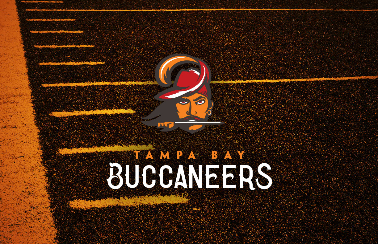
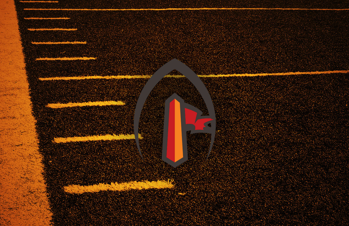
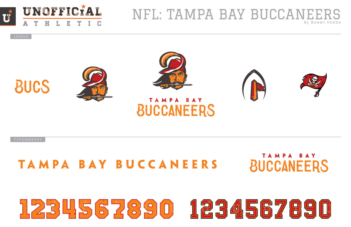
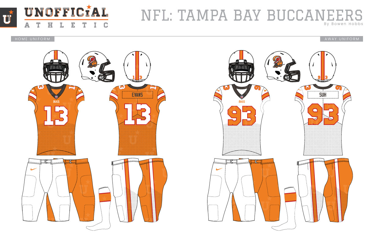
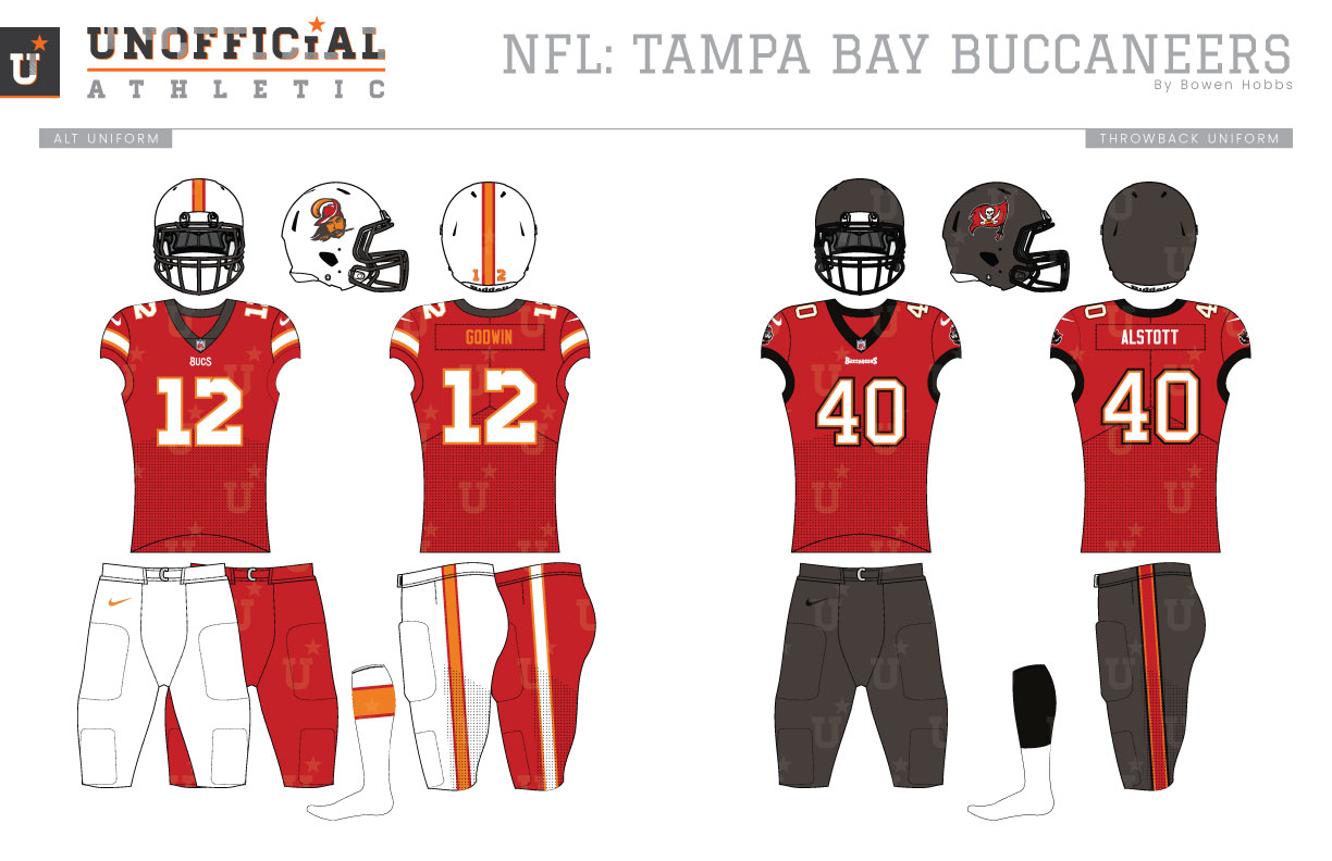
The Tampa Bay Buccaneers were born in the 1970s, an era in which bright colors reigned supreme throughout sports, partly due to the impact of color television. The Bucs’ initial color palette consisted of sunshine orange, red, and white. On each side of the white helmets was their mascot Bucco Bruce, a dapper swashbuckler with long hair, a fancy hat, and a knife between his teeth. The Bucco Bruce helmets were placed over vibrant orange jerseys with white numbers and red trim at home and white jerseys with orange numbers and red trim on the road. Both the home and away jerseys were paired with white pants. The following season the numbers on the road jersey would switch to red with an orange outline. These uniforms, affectionately known as “The Creamsicles” would remain unchanged (aside from the addition of a patch for certain years) through the 1996 season. As was the case with many teams in the 1990s, the Buccaneers darkened their color palette from sunshine orange, red, and white to blood red, pewter, black, and orange. Bucco Bruce was retired in favor of a tattered flag featuring a skull and crossed swords, while a menacing pirate ship served as a secondary mark on the sleeves. The new pewter was used on the helmets and pants while the jerseys were blood red and white for home and away respectively. Orange was worked into the number and pant trim, albeit sparingly. This new darker, more menacing era would get a revision for the 2014 season. The blood red became a more standard shade, and the logos would become sleeker with the addition of silver for shading. The jagged and somewhat wacky 1990s wordmark would be replaced by a more squared version. The biggest changes, however, were to the uniforms. Gone were the traditional uniforms in unique colors that embodied the Alstott-Dunn era. In their place the team would sport new über-modern uniforms with pewter shoulders and LED alarm clock style numbers. Labeled by many as the worst NFL uniforms of all time, the Buccaneers’ next uniforms will almost certainly be improvement over their current edition. My Buccaneers concept brings back Bucco Bruce and reconciles it with the team’s penchant for pewter. My revised Bucco Bruce uses a pewter keyline against an orange Bruce wearing a red hat. This Bruce icon appears above a stylized serif typeface that evokes the Carribbean’s pirate past, while the alternate logo places a tattered flag on an end zone pylon framed by an abstract football. A Bucs wordmark and the 1990s flag logo round out the logo set. The helmets accent the pewter keyline of the new Bucco Bruce icon with pewter facemasks against a white helmet shell. The home jerseys return to their roots of sunshine orange with white numbers and sleeve stripes outlined in red, but with pewter collars and player names to tie the different eras together. The orange home jerseys pair with orange or white pants. The white away jerseys feature a white-for-orange swap in comparison to their home counterparts, while the red alternate jerseys opt for white type and sleeve stripes outlined in orange. The away jerseys pair with white or orange pants, while the alternates can be worn with red or white pants. Lastly, the throwback uniforms celebrate the Bucs’ only championship with a revival of the Alstott-Dunn era uniforms.
Date
November 27, 2019
Category
Football, NFL

