Toronto Argonauts
Toronto Argonauts
The Toronto Argonauts story begins in 1873, making them the oldest existing pro sports team in North America, the CFL, and the East Division. (The Atlanta Braves and Chicago Cubs are slightly older, but have changed names and locations.) The Argos started when a group of amateur rowers in Toronto started the Argonauts Rowing Club and then the Toronto Argonauts Football Club a year later. Their colors combine the hues of Cambridge University (light blue) and Oxford University (dark blue). Over the decades, the Argos have sported many different uniforms, from their 1933 set with alternating dark and light blue stripes all over the jersey, to their current design with no stripes. The aforementioned 1930s design paired the striped jerseys with standard khaki colored pants, as was the case for most teams at that time. By the 1950s, the stripes would be relegated to the long sleeves and the pants would become navy blue to match the jerseys. The early 1970s saw navy blue jerseys with striping similar to Ohio State’s throwbacks, but in white and Cambridge blue on an Oxford blue jersey. Those would be replaced in 1975 by an all-Cambridge blue uniform with white numbers and a navy helmet. The all-Cambridge blues would only last two seasons, with Oxford blue jerseys returning in 1977. Toronto would continue to tinker with their striping into the 1980s, but a much more drastic update was around the corner. The Argos’ 1995 team would eschew football uniform conventions and sport jerseys with teal and a giant Jason the Argonaut sprawling across most of the torso and the player number tucked away on the left chest. That design wouldn’t last long, as the Jason logo would move to the shoulders, still oversized similar to the New England Patriots’ look of Super Bowl XXXI. The Argos’ 2005 – 2011 uniforms would be a product of the times, returning to double blue with shoulder accents and piping down the sides reminiscent of the era, but 2012 would see a return to classic Ohio State-style sleeve stripes. Most recently the uniforms were stripped of all striping when the CFL switched to New Era as their uniform provider.
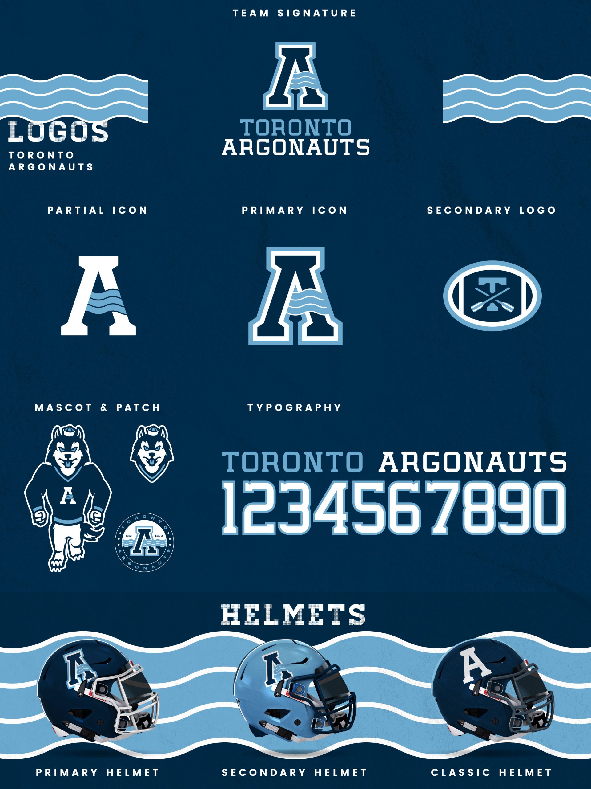
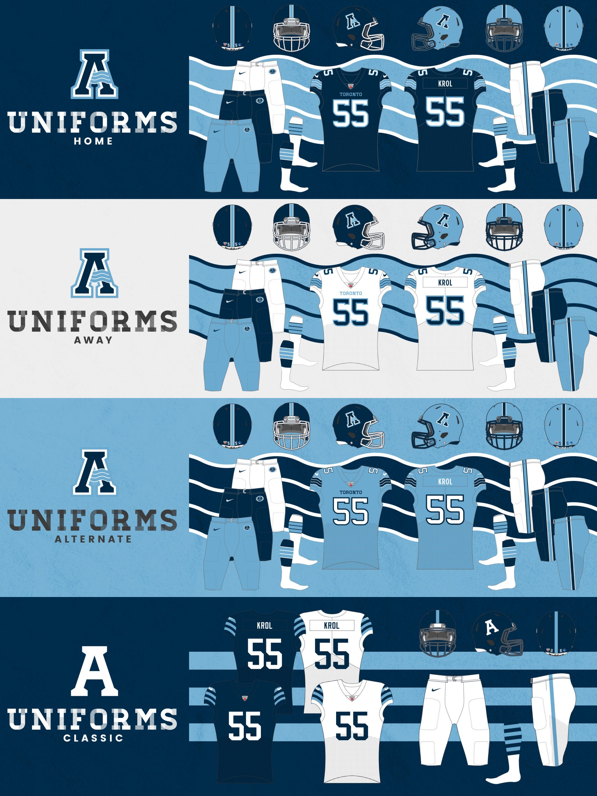
My Argonauts redesign leans into the team’s roots as a rowing club with a revised A logo featuring a wave accent. The primary A icon combines with a rounded slab serif typeface to create the team signature. The secondary mark places a T with crossed oars inside a football to honor the team’s rowing background. The mascot, Argos the dog, is a husky to combine the team’s classical themes with Toronto sports’ affinity for this particular version of man’s best friend. The Oxford blue primary and Cambridge blue secondary helmets both feature the new A icon on each side, while the classic helmet uses a stripped-down A against an Oxford blue shell. The home, away, and alternate jerseys all feature the new rounded slab serif typeface, accented by wavy sleeve stripes that correlate to the new A icon. The Oxford blue home, white away, and Cambridge blue alternate jerseys all pair with pants of the same trio of colors. The classic jerseys honor the Grey Cup-winning teams of the early 1950s with alternating sleeve stripes and block numbers that look as clean now as they did at the time.
Date
August 14, 2020
Category
CFL, Football

