Utah Jazz

Utah Jazz
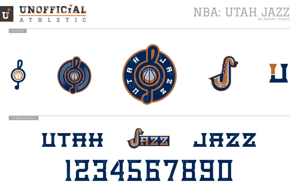
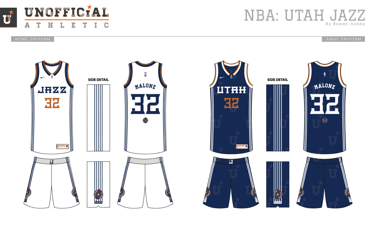
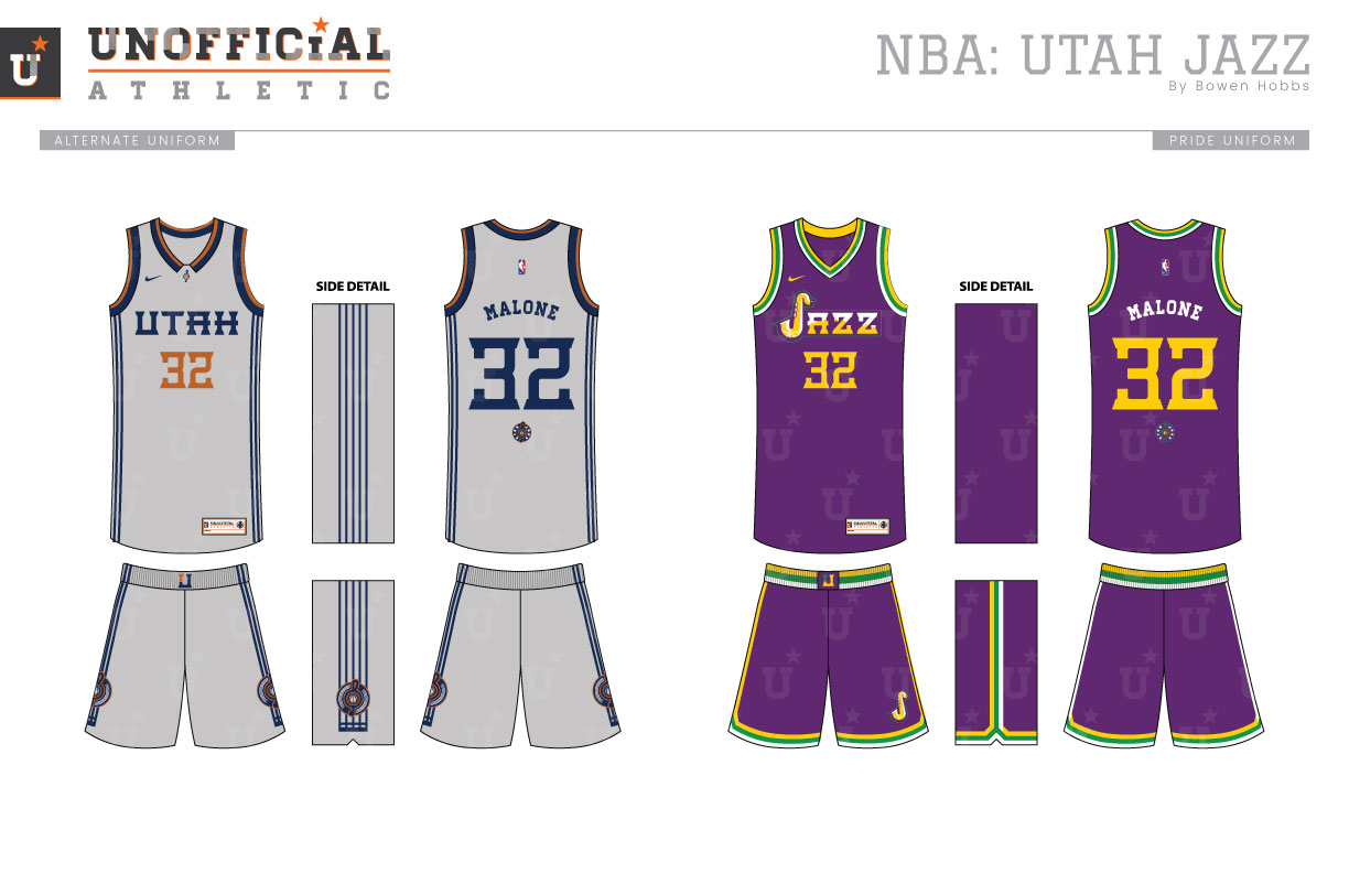
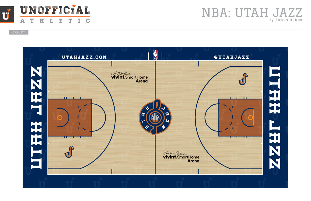
The Jazz moved from New Orleans to Salt Lake City in 1979, keeping the nickname, logo, and Mardi-Gras inspired color scheme of purple, green, and gold. While the nickname endures to this day, the logo and color scheme were changed prior to the 1996-97 season. Purple remained, but green and gold were removed in favor of copper, teal, sky blue, and black. The uniforms displayed a large mountain peak across the front as the club went to two straight NBA Finals and stayed there until 2004, when the team toned their look down in favor of a navy and columbia blue scheme with purple accents in the logo set. In 2010 the club threw their identity back to the 1979 to 1996 era, but with navy remaining in place of purple. In this way the Jazz have always struggled to ride the line between a nickname that makes for sense in their old city and a color palette that evoke the feeling of Utah’s wilderness. The concept strikes that balance with a scheme of navy, copper and silver (as seen on the Beehive State’s license plates) and combines it with a G-Clef roundel containing the words UTAH JAZZ. The type is subbed out for the lined carvings of a record on the partial mark, which further breaks down into a two-color clef-and-ball. The secondary logo is a saxophone-J and is complemented by a UJ mark in the new typeface. That typeface features bold slab serifs, a uniform stroke weight, and slightly rounded corners for a robust look that flashes subtle notes of sophistication. The uniforms borrow their striping from the music staff and appear in white (Association), navy (Icon), and grey (Alternate), while the Pride uniform embraces the team’s beginning in purple, green, and gold. The court uses navy boundaries and copper in the lane for a uniquely Utah environment.
Date
August 30, 2017
Category
Basketball, NBA

