Wisconsin Herd


Wisconsin Herd
In 2017, professional basketball returned to Oshkosh, WI for the first time since 1949. The Oshkosh All-Stars ceased operations in 1949, the same year the NBL would merge with the Basketball Association of American (BAA) to form the NBA. When the Wisconsin Herd’s initial logo was released, the reaction was mixed.
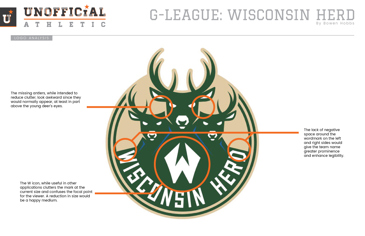
I did an analysis of the mark to establish what the aesthetic issues were:
• The missing antlers, while intended to reduce clutter, look awkward since they would normally appear, at least in part above the young deer’s eyes.
• The lack of negative space around the wordmark on the left and right sides would give the team name greater prominence and enhance legibility.
• The W icon, while useful in other applications, clutters the mark at the current size and confuses the focal point for the viewer. A reduction in size would be a happy medium.
• Lastly, much like the parent team’s logo, the position of the deer is that of the mounted variety, making the mascot DOA.
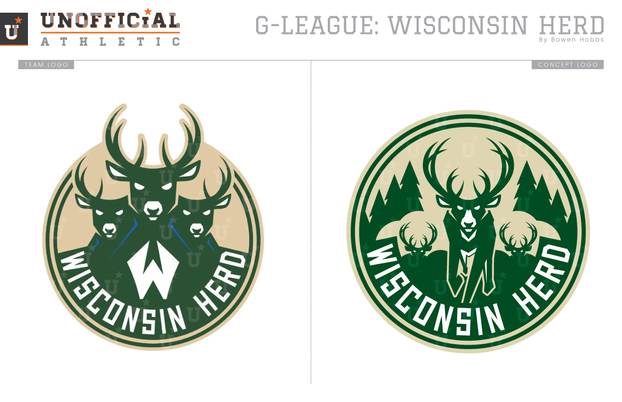
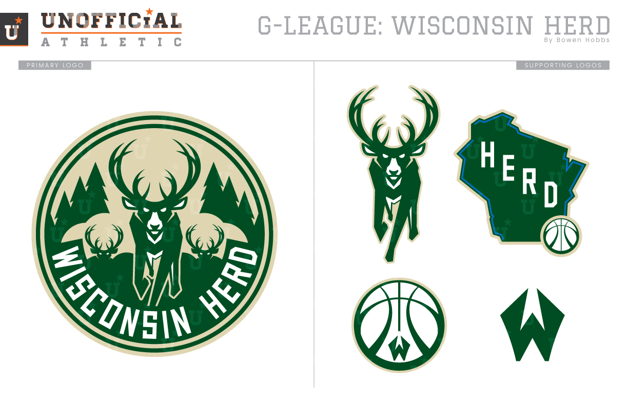
My concept puts the Herd back in nature running freely. While one main deer leads the pack, two other are emerging from the background, through the clouds of the stampede. Pine trees set the scene of the Northwoods. The entire mark is contained within the circle, which is a slight break from the parent team, but works regardless. I also took the liberty of expanding the Bucks/Herd brand to a set of supporting marks, including a state logo, a W-version of the Bucks’ secondary mark, a standalone deer and the W-icon.
Date
May 9, 2018
Category
Basketball, G-League


