Anaheim Ducks
Anaheim Ducks
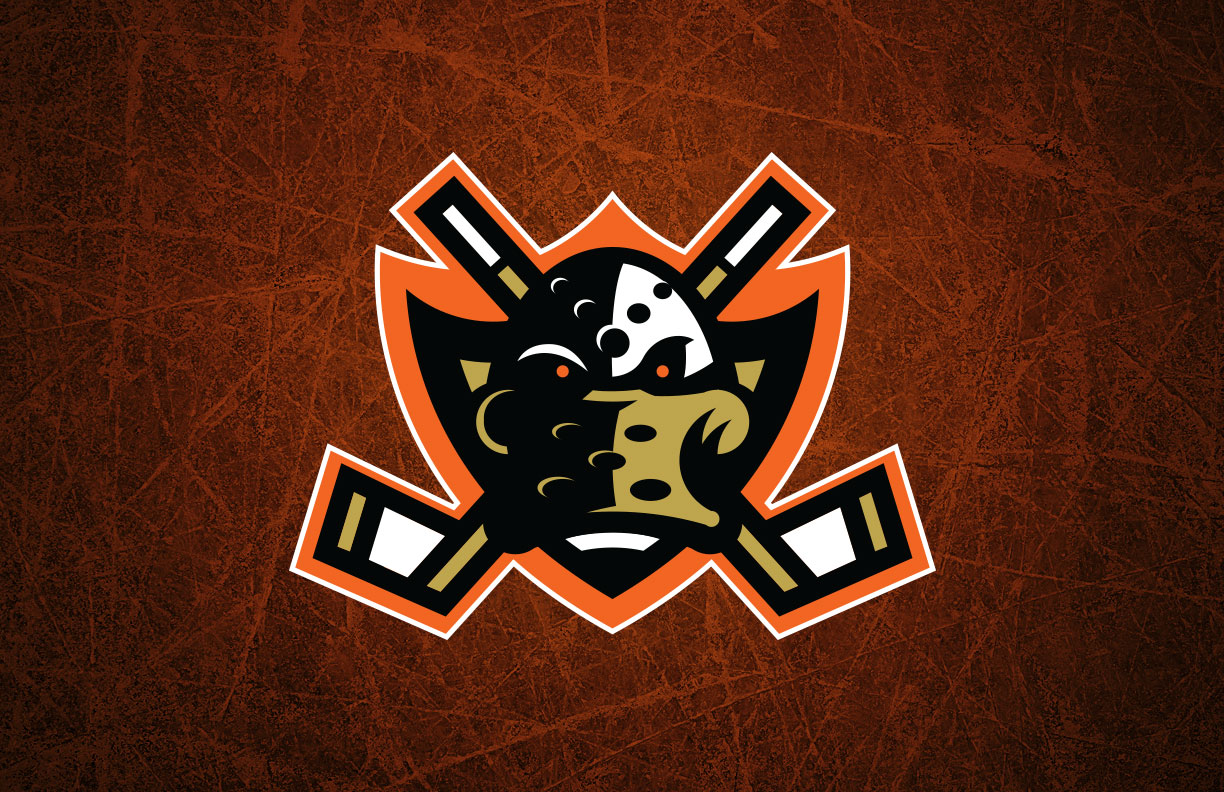
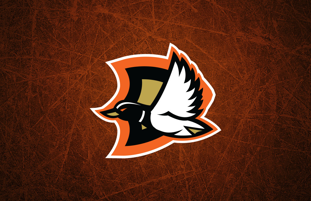
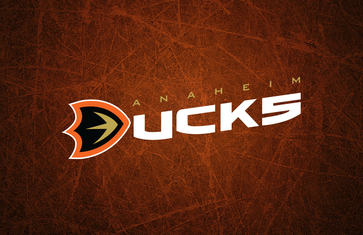
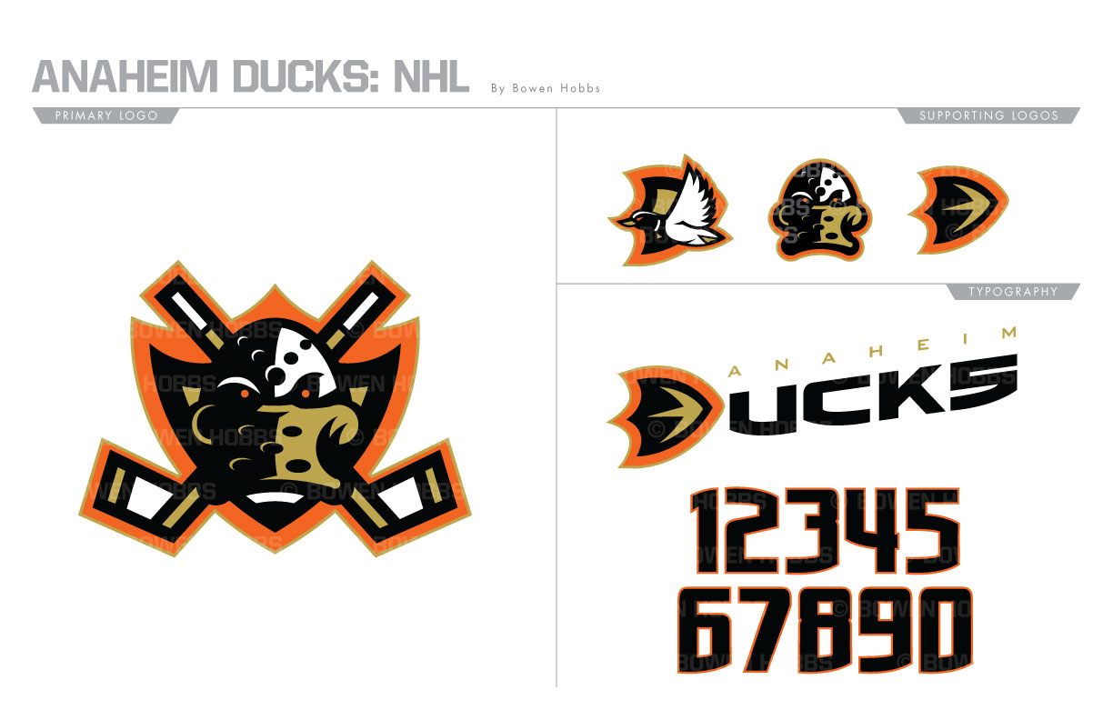
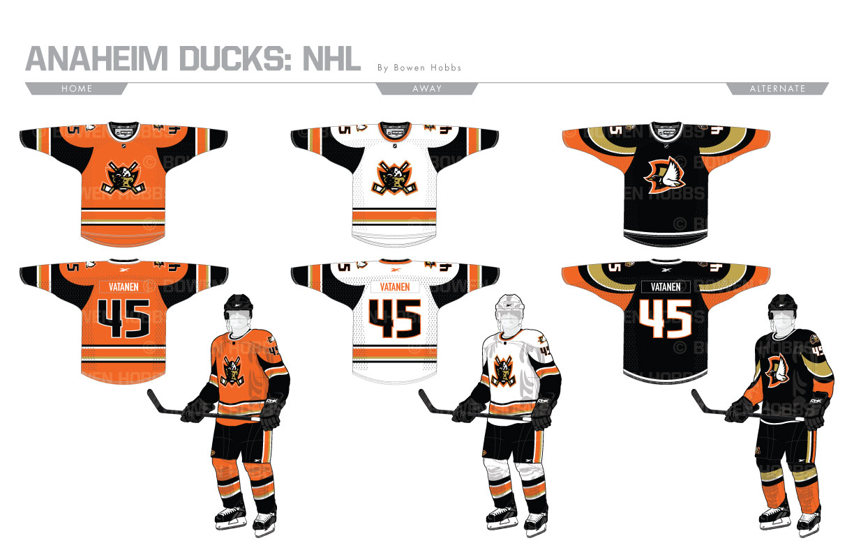
My goal with the Ducks was to revive the goalie mask duck, but with more edge and less Disney. I rotated the mask from a three-quarters position to a head-on orientation ready to take on all challengers. Behind the mask are a pair of crossed goalie sticks and a webfoot shield. The webfoot shield rotates to a D against a flying duck to create the secondary logo. A standalone mask and a webfoot D make up the rest of the logo set. The typeface features squared off letterforms with strategically placed curved strokes that mimic the webfoot crest. The script is tilted upward to represent take off. The home and road sweaters use a curved design on the sleeves to allude to wings against a more traditional striping pattern. They also feature round collars indicative of the mallard. The home specifically is orange in honor of Orange County. The third uniform contains curved elements against an all-black design with the secondary logo on the chest.
Date
June 30, 2017
Category
Hockey, NHL

