Calgary Flames
Calgary Flames
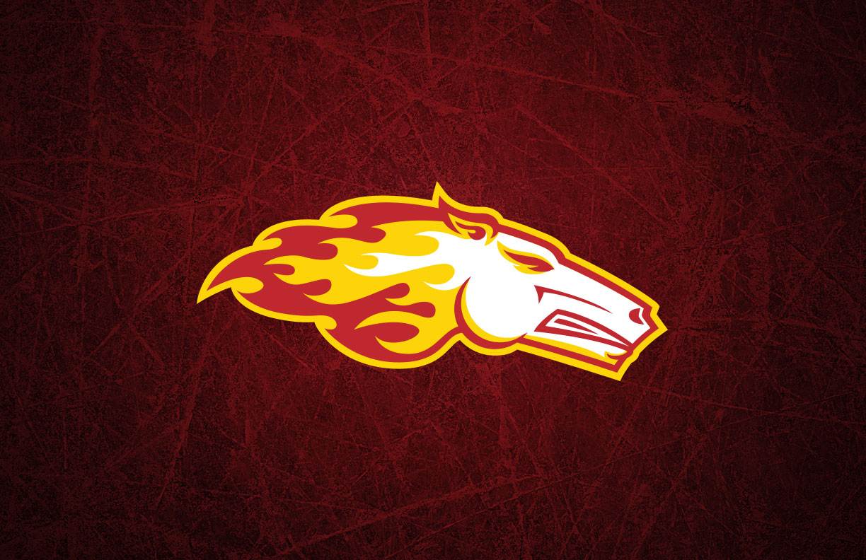
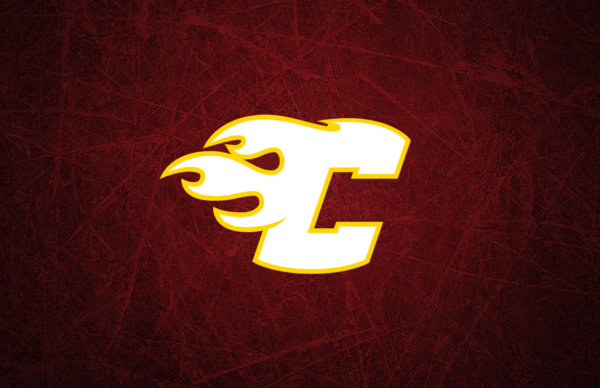
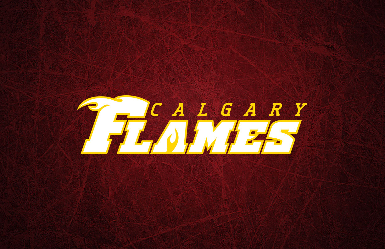
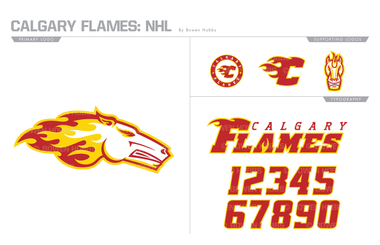
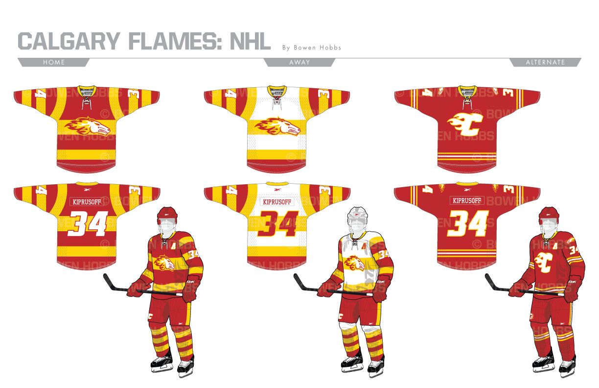
From 1998 to 2007, the Flames had an alternate logo that was rather ambiguous. At first glance it looked like a dragon due to the flames shooting out of its nose. Turns out, it was actually a horse signifying Calgary’s reputation as a rodeo city. My primary Flames logo consists of a horse head in profile with a mane of fire. The secondary is an updated flaming C, with a roundel version and a front-facing horse to complete the logo set. The typeface is an oblique slab serif that conveys strength and a slight western edge. The home and away uniforms take cues from the Flames’ 2011 Heritage Classic uniforms, while the thirds are a modernized version of the team’s classic uniforms from the 80s and early 90s.
Date
June 30, 2017
Category
Hockey, NHL

