Atlanta Braves
Atlanta Braves
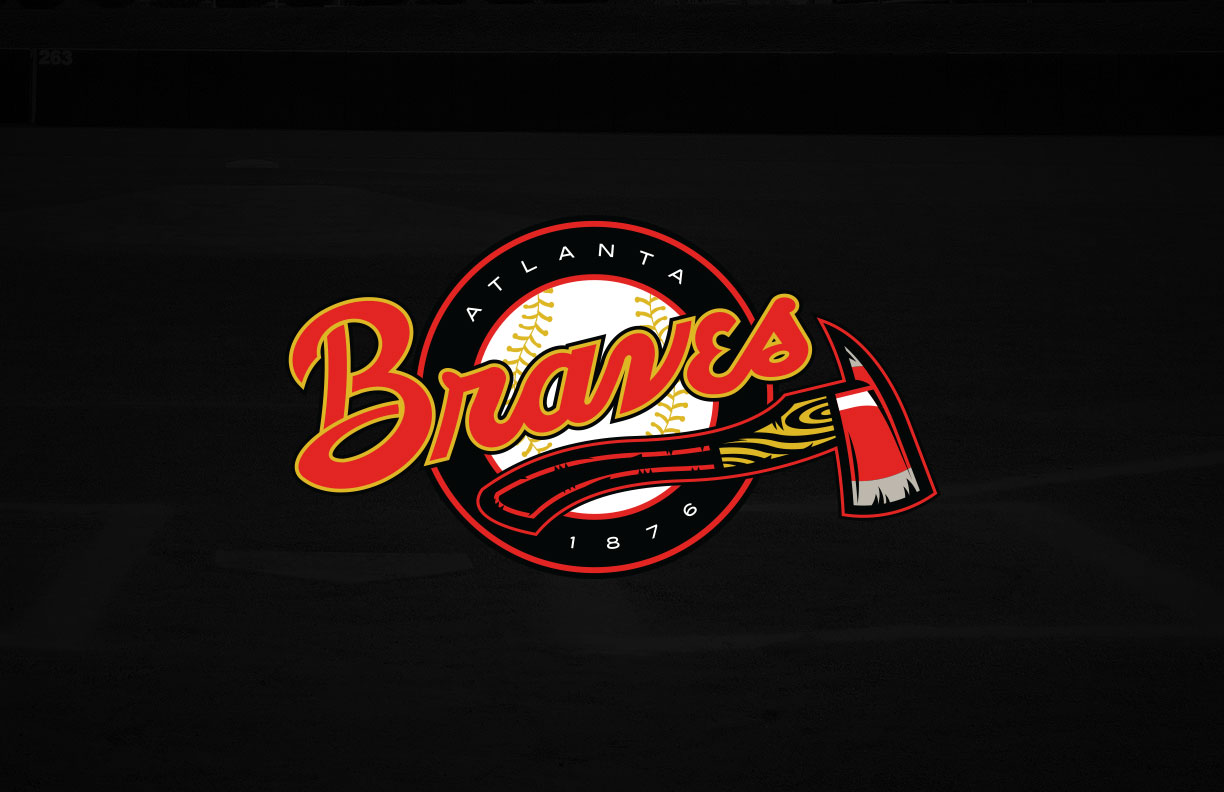
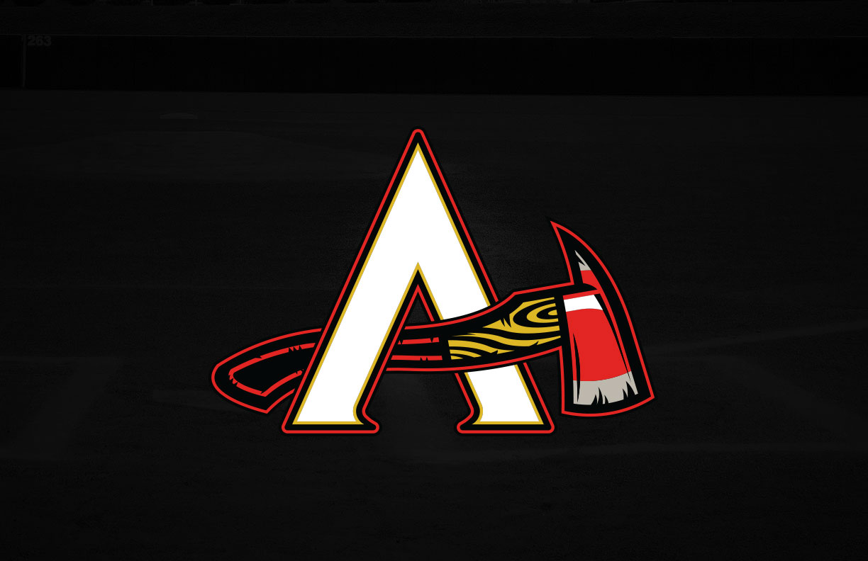
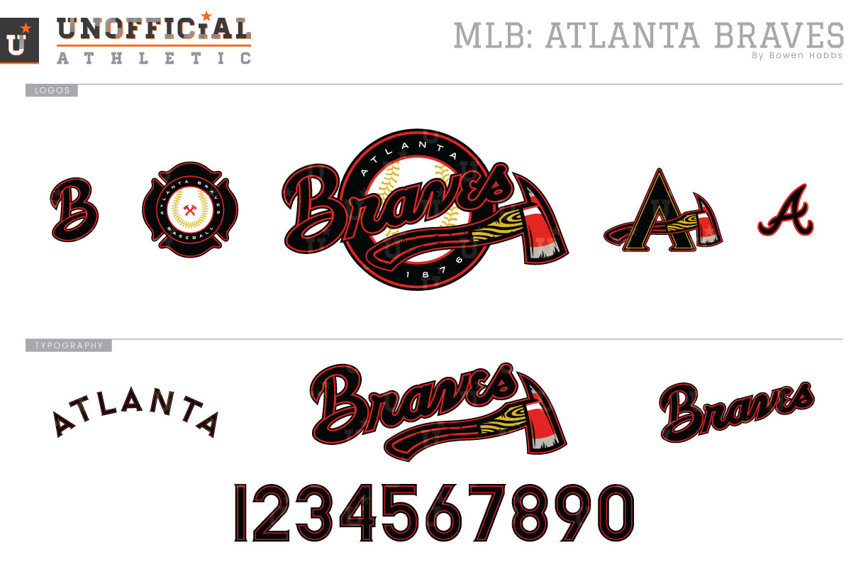
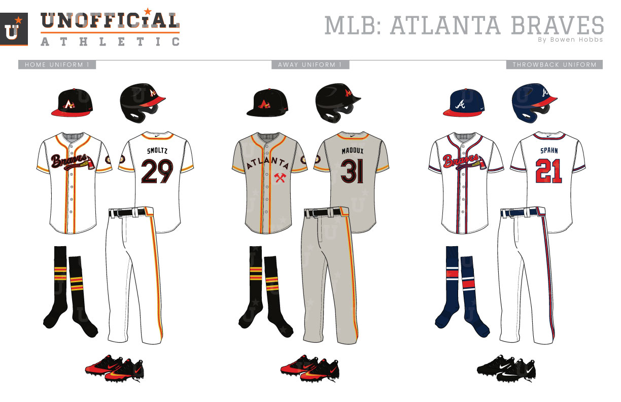
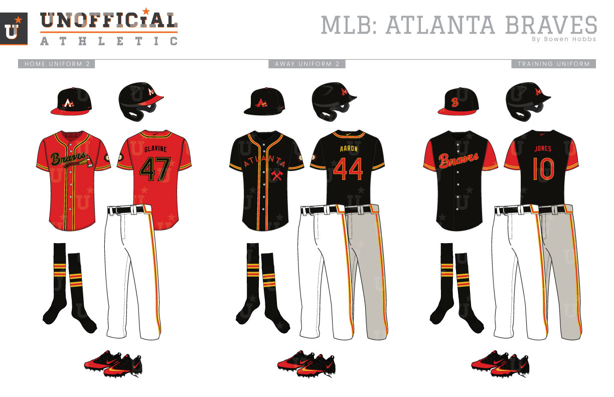
The Braves organization has more than 140 years of history spanning three cities, starting in Boston as a charter member of the National League in 1876. The team had actually been formed five years previous in 1871. Originally called the Boston Red Stockings, they were known as a number of names before settling on the Braves in 1912. In 1953 the Braves would call Milwaukee home, winning a title there in 1957. Their time in Cream City would be limited however, as the team packed their bags for Atlanta in 1966, where they have played since. Over those many years, some variation of the team’s current uniform has been used most consistently. That said, the Braves moniker has not aged as gracefully as those uniforms. With calls to remove Native American symbols from the sports realm, I wanted to develop a Braves concept that managed to accomplish what the Warriors did in 1969: remove the offensive parts of the brand while keeping some of the team’s traditions to not alienate fans. My concept reimagines the term Braves in a way that honors the bravest among us: firefighters. With a palette of black, red, and mustard yellow, my primary logo replaces the tomahawk with a fireman’s ax and adds a baseball to the background to tie the elements together while that same fireman’s ax also forms the crossbar on the A in the cap logo. A Maltese Cross with a baseball in the center forms a sleeve patch that serves as a badge of honor and protection. Complementing those marks are a script-B from the wordmark and a throwback script-A. The new Braves script can be used with or without the axe, depending on context and is complemented by an ATLANTA wordmark that looks equally at home on a baseball jersey as it does the side of a fire truck. The number font matches the ATLANTA wordmark with flared serifs and a geometric construction. The home uniforms feature a black cap with a red brim and a white axe-A. The jerseys and pants feature the Braves script with fire ax and red and mustard piping similar to reflective fireman’s jackets. The striping is also replicated on the socks for good measure. The road greys feature many of the same hallmarks of the homes, but with the ATLANTA wordmark arched across the chest, and a red A on the all-black caps. The throwback uniforms stay true to the classic threads, but with the fire ax replacing the tomahawk. The home alternates offer a red jerseys to pair with the red-brimmed cap, while the black jersey is paired with the all-black cap for home or away use. The spring training/batting practice jerseys are black with red sleeves and feature the axe-less wordmark across the chest and are paired with the script-B cap.
Date
July 6, 2018
Category
Baseball, MLB

