Green Bay Packers


Green Bay Packers
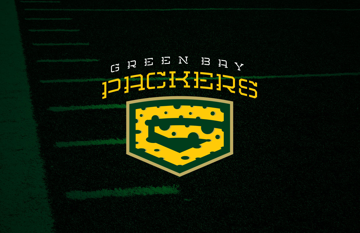
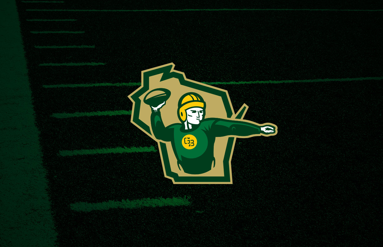
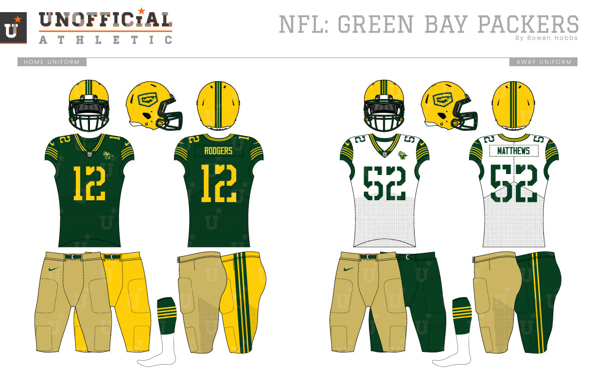
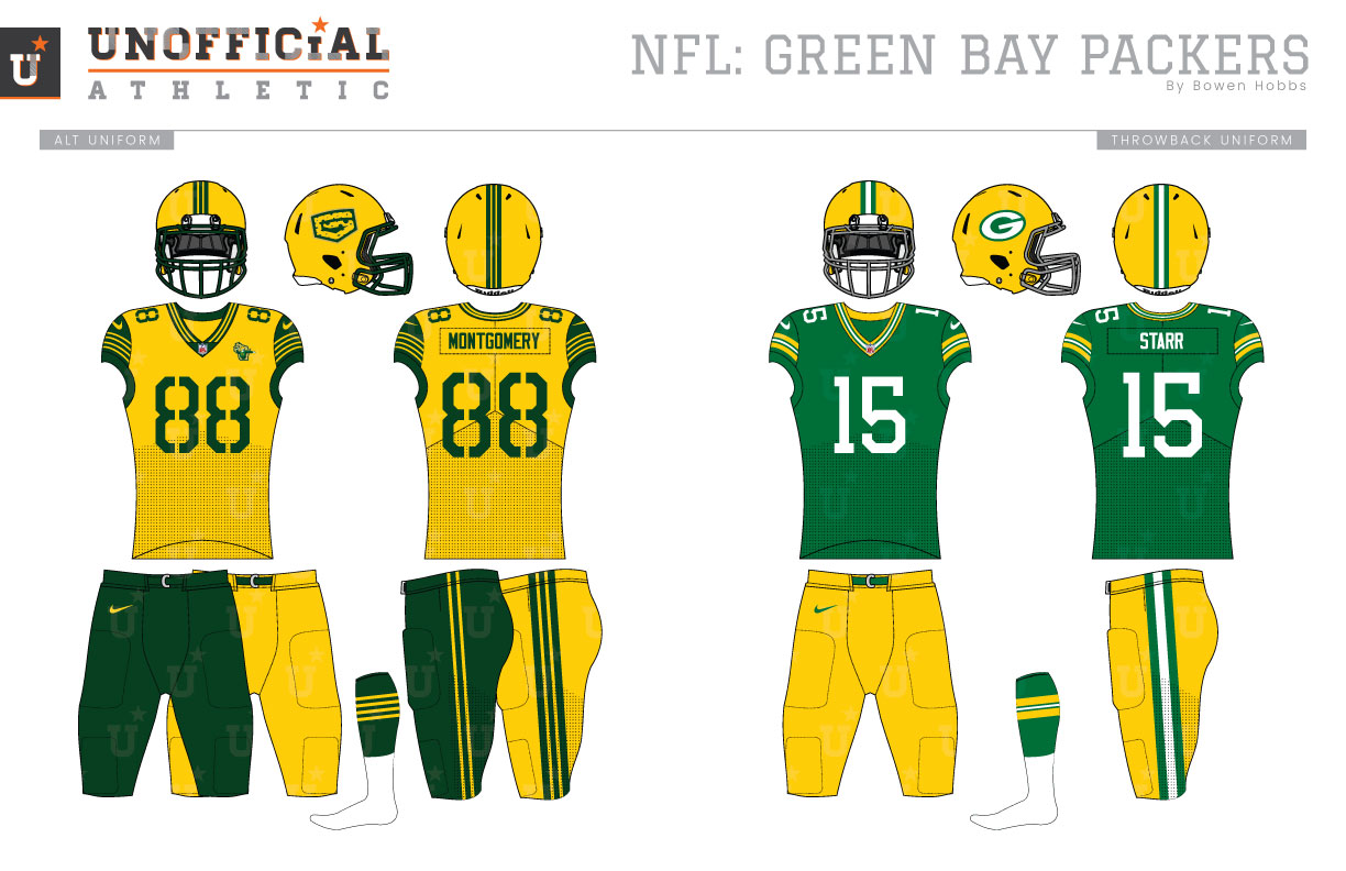
The Green Bay Packers. No team embodies the history of football more than the Green & Gold. While the Chicago Bears and Arizona Cardinals are technically older, the Packers franchise is the oldest in continuous operation with the same name in the same location. And then there are the championships: Green Bay has won 13 total titles, including four Super Bowls and nine NFL Championships before The Big Game had ever been played. Chromatically, the Packers originally wore navy and athletic gold jerseys with brown leather helmets and tan pants. They would use different combinations of navy, forest, gold, and kelly green jerseys over the years until 1960, when a version closely resembling the current iconic uniforms was unveiled. My concept seeks to reimagine the Packers brand without losing its heritage. The primary logo I designed updates the classic oval/football-G to a Cheese Wedge-G in honor of the fans who wear foam Cheeseheads to games. The updated G is combined with a new stencil typeface to create the team’s signature (a relatively standard term for displaying a primary mark with the team name). The alternate logo places a vintage quarterback, complete with a leather helmet and a long-sleeved jersey against the state of Wisconsin to evoke the team’s history and state pride. Along with the signature, primary logo, and alternate logo, I developed a typographic “coaches cap” mark and retained the classic-G for use on the throwback uniforms. The new typeface combines elements of the Packers classic stencil typeface, their numbering system, and old school proportions for a unique look that is equal parts next generation and Greatest Generation. How does one tackle a uniform redesign for a set as iconic as the Packers? I wanted to bring a level of history into the design and eliminate extra or unnecessary elements. The helmet is still athletic gold with a green facemark, but the logo is updated and the striping has changed to a thick green stripe with two thin yellow stripes on top of it. I made a point of always placing the striping on a green background because one of the few issues with the Packers uniforms is the juxtaposition of yellow stripes on white where the lack of contrast takes away from the impact of the yellow. The home jersey doubles the helmet striping on the sleeves with four thin yellow stripes on a green background and solid athletic gold typography. The alternate logo is used as a chest patch. The home jersey also has two pant options: solid throwback khaki and athletic gold with striping consistent to the helmet. The away and alternate uniforms are similar to the home but with forest green type and sleeves, and athletic gold stripes on those sleeves. The away jersey uses a white base paired with khaki and forest green pant options, while the alternate is an athletic gold jersey that is paired with forest green pants or athletic gold pants for an all-cheesehead Color Rush look. The Thursday Throwback uniform is consistent with the Packers looks of the last 75 years, but with a slightly lighter green.
Date
July 9, 2018
Category
Football, NFL


