Atlanta Falcons
Atlanta Falcons
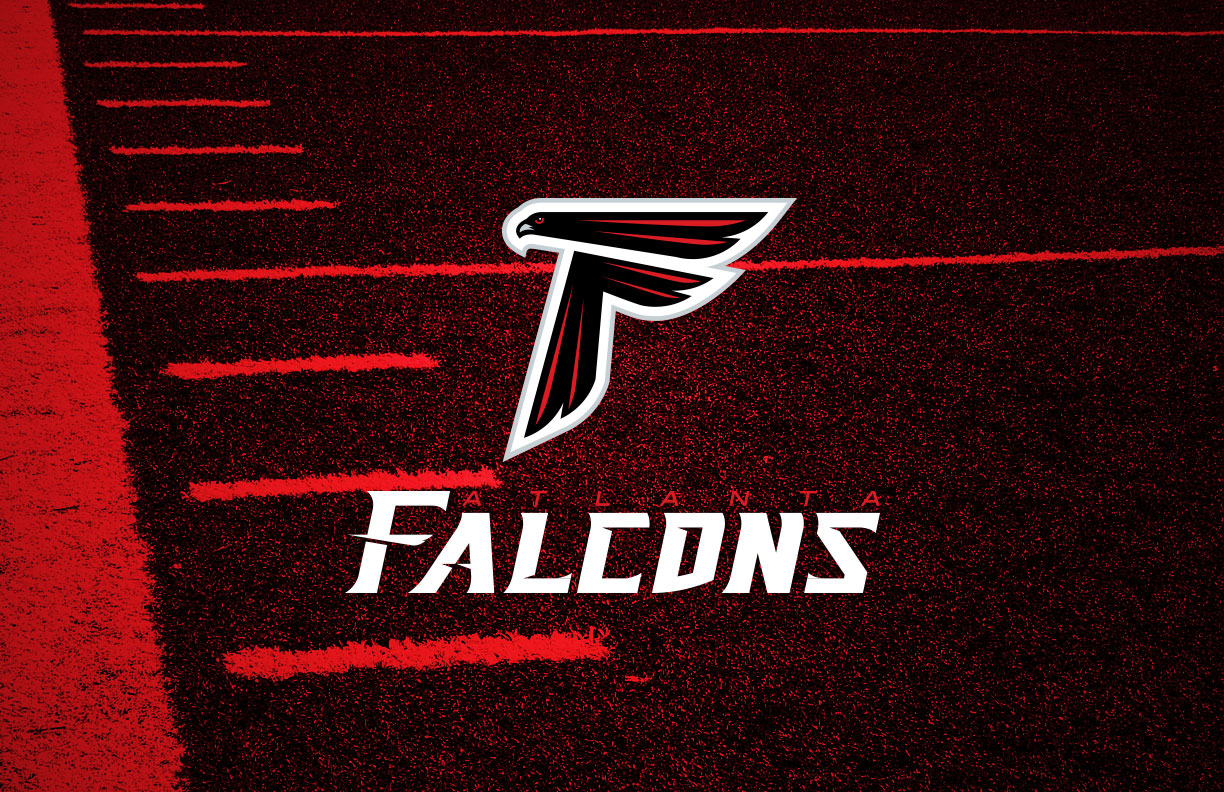
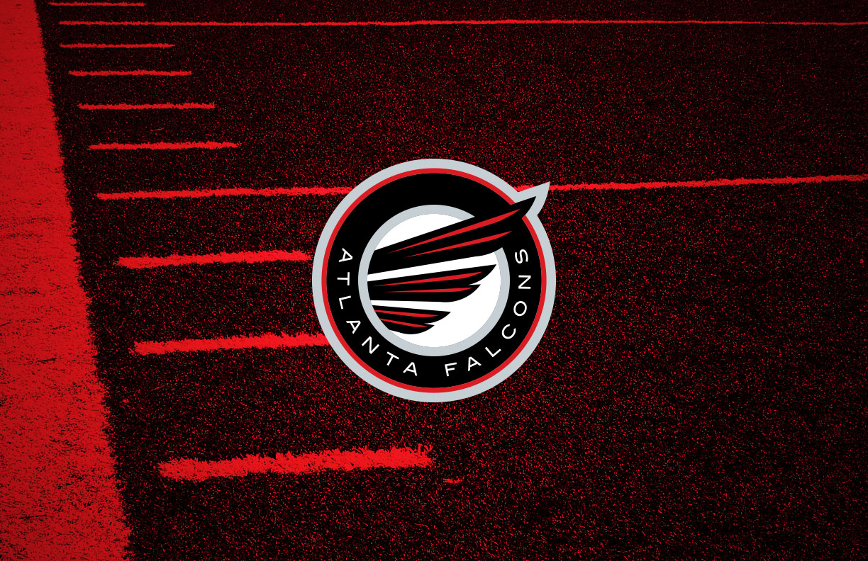
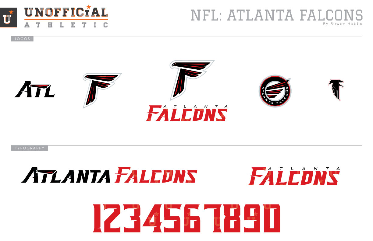
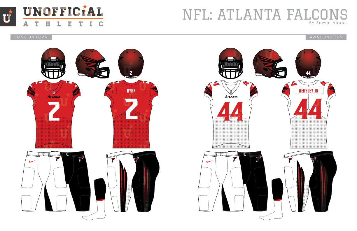
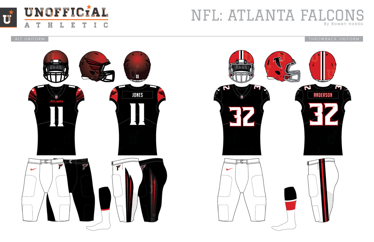
The Atlanta Falcons began play in 1966 as the NFL expanded to new markets in an effort to stay ahead of the rival AFL. The original incarnation of the Falcons donned red helmets, black jerseys, and white pants, a color scheme to show ties to the state’s other big team, the Georgia Bulldogs. Don’t fret, Georgia Tech fans, the Falcons originally had a hint of gold striping in honor of the Yellow Jackets as well. The red helmets had a black falcon on each side that formed an F on the right side of the helmet (and a backward F on the left side). That same icon would appear on the sleeves of the black jerseys featuring no stripes and white numerals outlined on red. The white pants contained a simple black-red-black stripe. The away uniform was the same except it used a white jersey with black numbers. After a couple seasons, the team would add sleeve stripes, but the big change occurred leading up to the 1971 season, when the Falcons would unveil new red jerseys for home games, while the away jerseys still contained black numbers. The gold helmet accents were removed for this iteration. Those uniforms would last until 1978, when the Falcons would switch things up again with red jerseys featuring silver numbers and silver pants to match. The red-and-silver era would last until 1990, when the Falcons would shift back to black as their dominant color, with black helmets and jerseys paired with silver pants. In 1997, the team would update its away jerseys switching from black numbers to red. The Falcons uniforms of today were unveiled in 2003, along with a more aggressive falcon mark that made the subtle F-shape more obvious. The uniforms featured bold, block-shadowed numbers, sectioned sleeves and piping. The black version of the modern Atlanta uniforms were originally designated as the home uniform, lasting a season and a half before the red jersey was promoted to the primary uniform. The away and black uniforms had an option for black pants at first, but the team has simply opted for white pants with their away set, and the black alternates have been replaced by throwback uniforms. My Falcons rebrand re-orients the falcon to face left, creating an even clearer F-shape to the primary logo. I also took the liberty of adjusting the beak and eye for a more realistic interpretation that looks less robotic. The F-Falcon is paired with a sharp and italicized typeface that represents the speed and swiftness of the team’s namesake. The secondary logo is a circular patch containing a falcon wing and ATLANTA FALCONS in the new secondary typeface. To round out the logo set, I developed an ATL coach’s cap logo and retained the original falcon logo for throwback use. The uniform numbers are rendered in the same sharp typeface as FALCONS but aren’t italicized. The helmet design represents a significant departure from Falcons’ helmets past, as the F-Falcon was always a backward F on the player’s left side. To alleviate that readability issue, I created a winged helmet design against a satin finish that appears red in the light and black in darker situations. The home jerseys are red with black wings and numbers. ATLANTA appears jus under the collar. The white away jerseys match the home jerseys, but with red numbers and red cap sleeves that preserve the black and red coloring of the sleeve wings. The alternate jerseys are black with white number and red cap sleeves. The home, away, and alternate jerseys can be paired with either white or black pants. The throwback-inspired uniforms evoke feelings of the team’s original uniforms, with red helmets, black no-frills jerseys, and white pants.
Date
December 10, 2018
Category
Football, NFL

