Atlanta Hawks
Atlanta Hawks
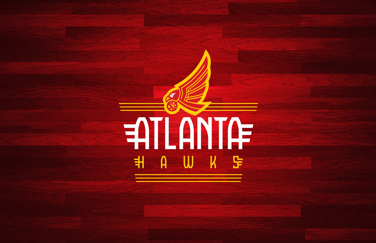
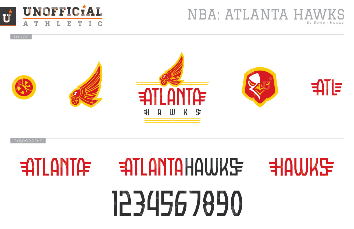
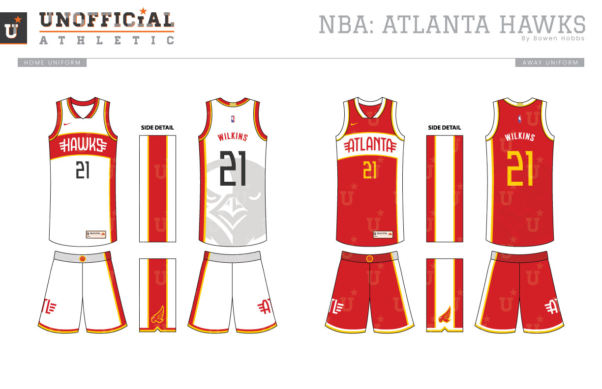
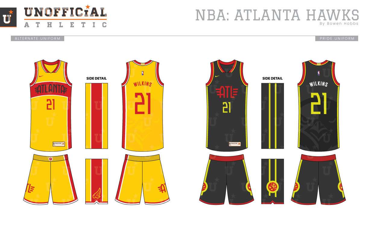
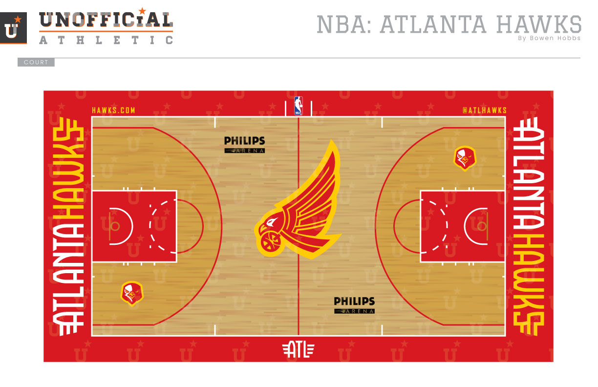
The Hawks have bounced around chromatically speaking, initial using a blue and red color scheme upon arriving in Atlanta. That era was followed by two years of royal and kelly green before the team settled on red and athletic gold for 20 years. In 1992, the team added touches of black, which would stay a part of the team’s color palette in varying amounts for 15 years. What followed was eight years of navy, red, and silver before a switch back to red and black, this time with hints of volt green. My concept reverts back to the days of red and yellow, the team’s most used color scheme with a swooping hawk mark that represents speed and ferocity. The primary logo places the hawk above a modern winged ATLANTA HAWKS type treatment that places a clear emphasis on the ATL. The hawk can function in a standalone capacity as can the claw/ball hybrid mark within it. The secondary logo is a front-facing hawk head, while a winged ATL rounds out the logo set. The Icon, Association, and Alternate uniforms pay homage to the Dominique Wilkins era with a color emphasis on red and athletic gold and an asymmetrical stripe the starts on the chest and flows down the player’s left side. The hawk head is sublimated onto the backs of the jerseys behind the player number. The Hawks have never been afraid to try the daring with their uniforms, and this set fits within that lineage. Speaking of daring, the Pride uniform takes cues from the current set by way of red and volt green elements against a graphite base layer. The ATL mark is placed on the chest while the claw/ball mark appears on the shorts. The court emphasizes the team’s return to red and athletic gold with red boundaries and a subtle yellow stain within the three-point line for a two-tone effect. The swooping hawk appears at center court.
Date
August 30, 2017
Category
Basketball, NBA


