Baltimore Ravens

Baltimore Ravens
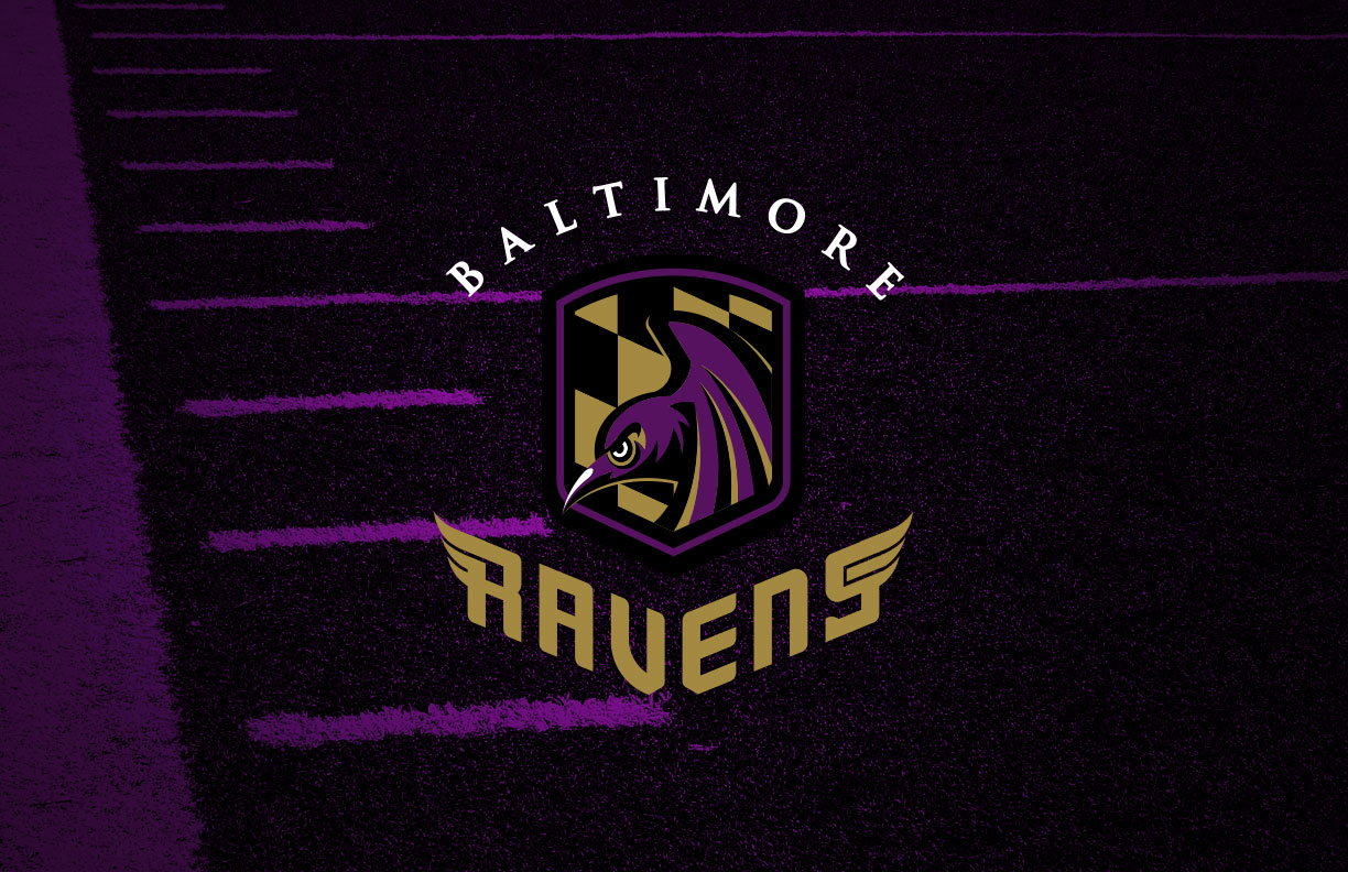
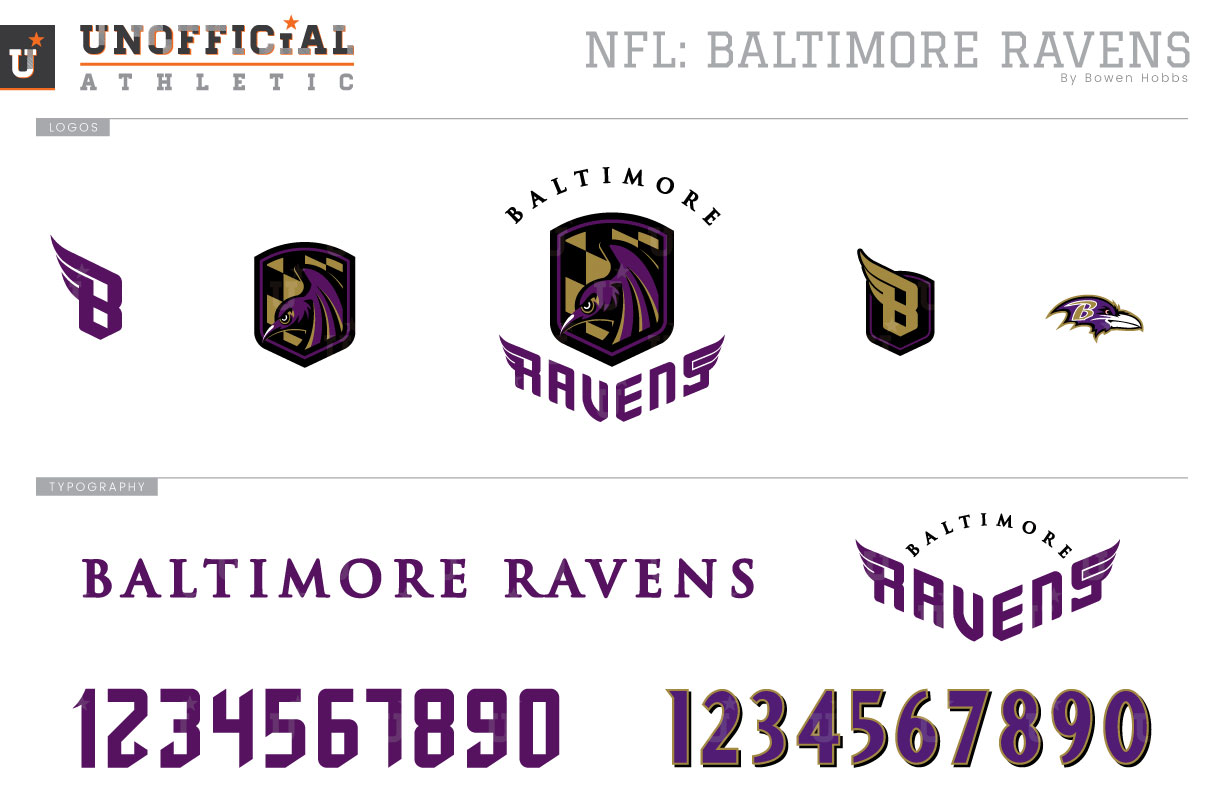
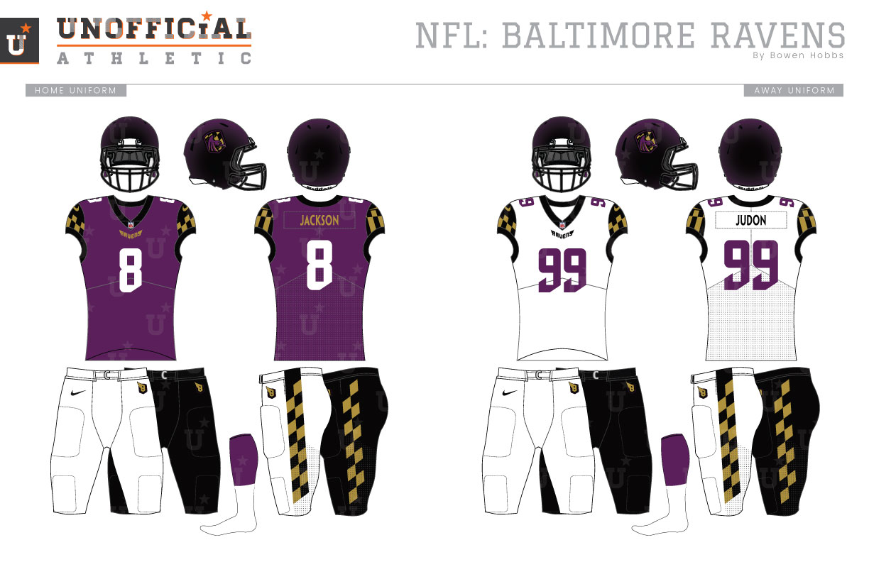
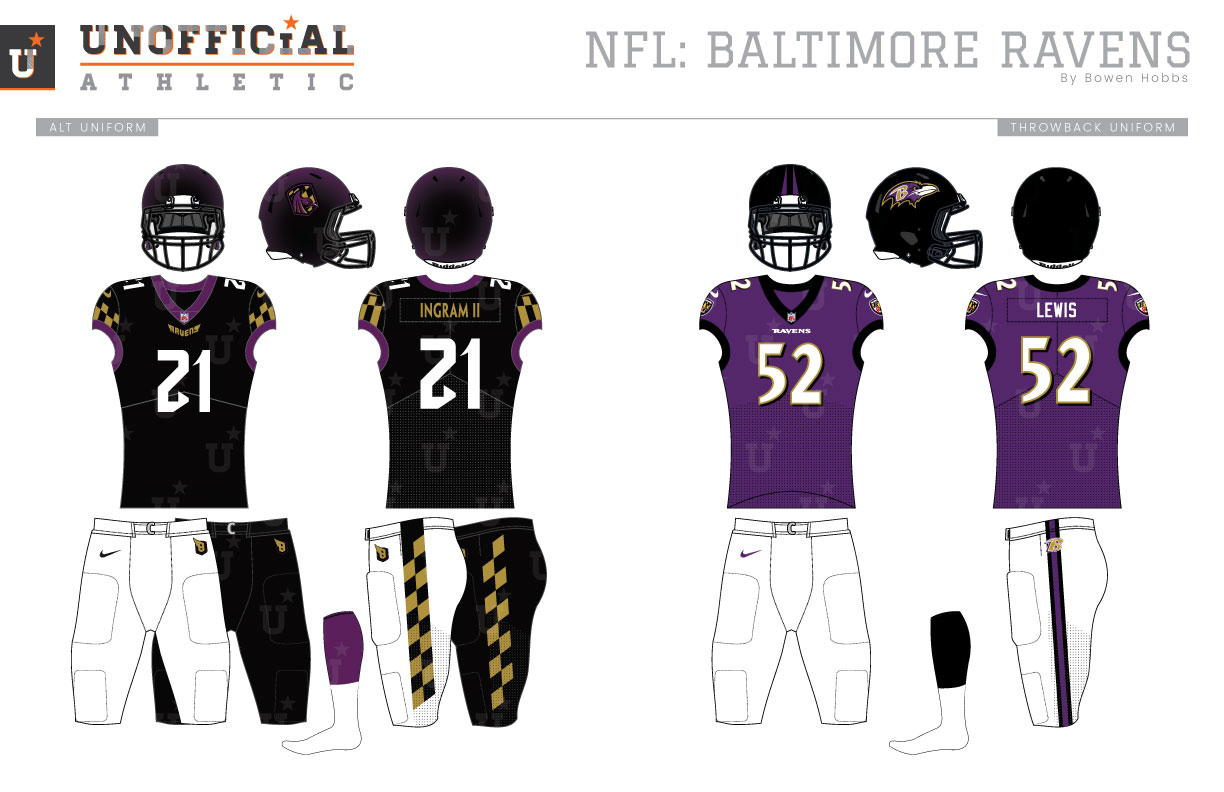
The story of the Baltimore Ravens’ identity is a tale of two lawsuits. The first lawsuit set the stage for the team’s name. After Art Modell moved the franchise to Baltimore between the 1995 and 1996 seasons, the city of Cleveland sued the team for the right to retain the Cleveland Browns branding and history. The city of Cleveland won, preventing the Baltimore Browns from ever happening. With Browns no longer an option for the team name, the franchise chose Ravens as a tribute to Edgar Allen Poe and his poem “The Raven.” Also using the poem as inspiration, Baltimore chose purple, black, and old gold as its colors with small splashes of red and yellow when the Maryland flag was used in one of the secondary logos. The other secondary logos included a front-facing raven, a front-facing raven head, and a raven head in profile rendered in black and white with purple and gold accents. The team’s initial primary logo, a B on a winged shield was the subject of the team’s second branding-related lawsuit. As it turns out, Frederick E. Bouchat initially sketched a raven clutching a shield with a B that looked incredibly similar to the winged shield the team initially unveiled. Although it appears the team’s version was simplified, the uncanny similarities between the shield, the B, and the wings led to a federal court ruling in Bouchat’s favor and the team would unveil a new logo set in 1999. The uniforms from the inaugural season featured black helmets with the B-shield and two tapered purple stripes on top. The jerseys were purple at home and white on the road with double-outlined serif type and the full-body raven on each sleeve. Both the home and away jerseys paired with black pants featuring a single white stripe. Updates would be made the following season as the player numbers would change out the double outline for an outline and a drop shadow. On the pants, the flag shield would move on top of the new triple stripe that replaced the single stripe. A white pair of pants would also be added while the black pants would be retired for a period of time after 1997. The helmets would switch to the new primary logo in 1999, while the 2000 season saw additional tweaks including moving the flag shield from the right hip to each sleeve and placing a stylized B on each hip over the pant stripe. The next big unveiling in 2004 introduced the team’s black alternate jerseys and plain black pants with only the hip B logos on them. The black pants were used exclusively with the black jersey until 2008, when the Ravens went both white jersey-black pants and black jersey-white pants during the season. In 2010, the purple jerseys were worn with black pants for the first time since 1996, and mustard gold pants made a one-game appearance late in the 2015 season. 2016 gave fans the Ravens’ all-purple Color Rush uniforms with gold numbers, and in 2018 the team unveiled a non-Color Rush all-purple set. My Ravens redesign starts with tweaking the color palette, introducing a warmer deeper purple and eliminating the superfluous red and yellow. I also made a decision to focus more on the elements of the Baltimore flag over the Maryland flag, eliminating the red and stylized crosses from the motif. The primary icon takes its shield shape from the Baltimore city flag and placed the black and yellow diagonal checkered pattern inside, but in black and old gold. Accompanying the pattern inside the shield is a sinister and determined raven ready to swoop down and attack. The primary icon is placed between a serif BALTIMORE and a winged RAVENS to create the team signature. The alternate logo places a winged B with a calligraphic flair inside a black shield with a purple outline, while a standalone B and the current raven head mark complete the logo set. The number set uses many of the same rounded rectangular shapes and calligraphic accents the RAVENS wordmark and B logo use. The helmets place the primary icon on gloss black helmets with a purple metallic shine to mimic a raven’s feathers. The home jerseys are deep purple with white numbers, old gold team and player names, and black and old gold diagonally checkered sleeves that offer a regal appearance and link the team to the city. The white away jerseys feature purple numbers, black team and player names, and the same black and gold sleeves as the home jerseys. The alternate jerseys are black with white numbers and purple collar and sleeve trim. The home, away, and alternate jerseys all pair with black or white pants with black and old gold slanted checkers down each leg. The throwback jerseys retain the cues from the Ravens’ two Super Bowl titles including the all-black collar of their first title in 2000.
Date
January 5, 2020
Category
Football, NFL

