Boston Bruins
Boston Bruins
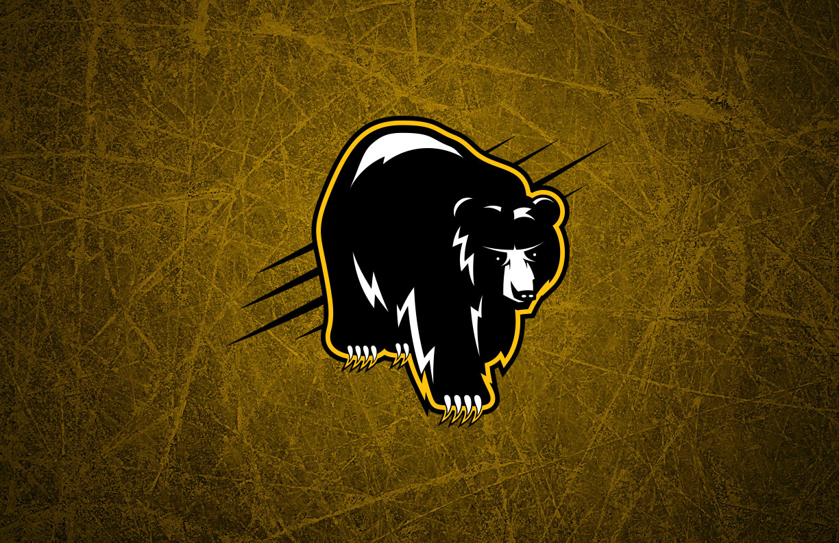
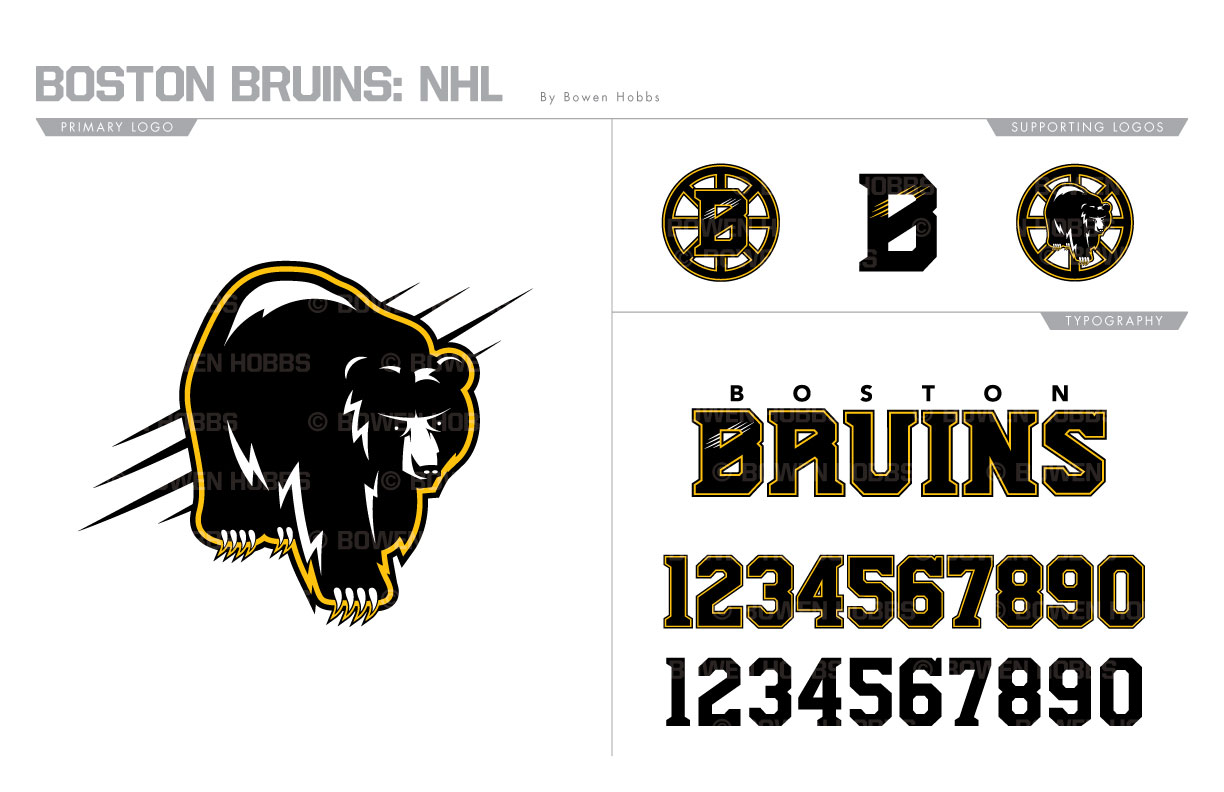
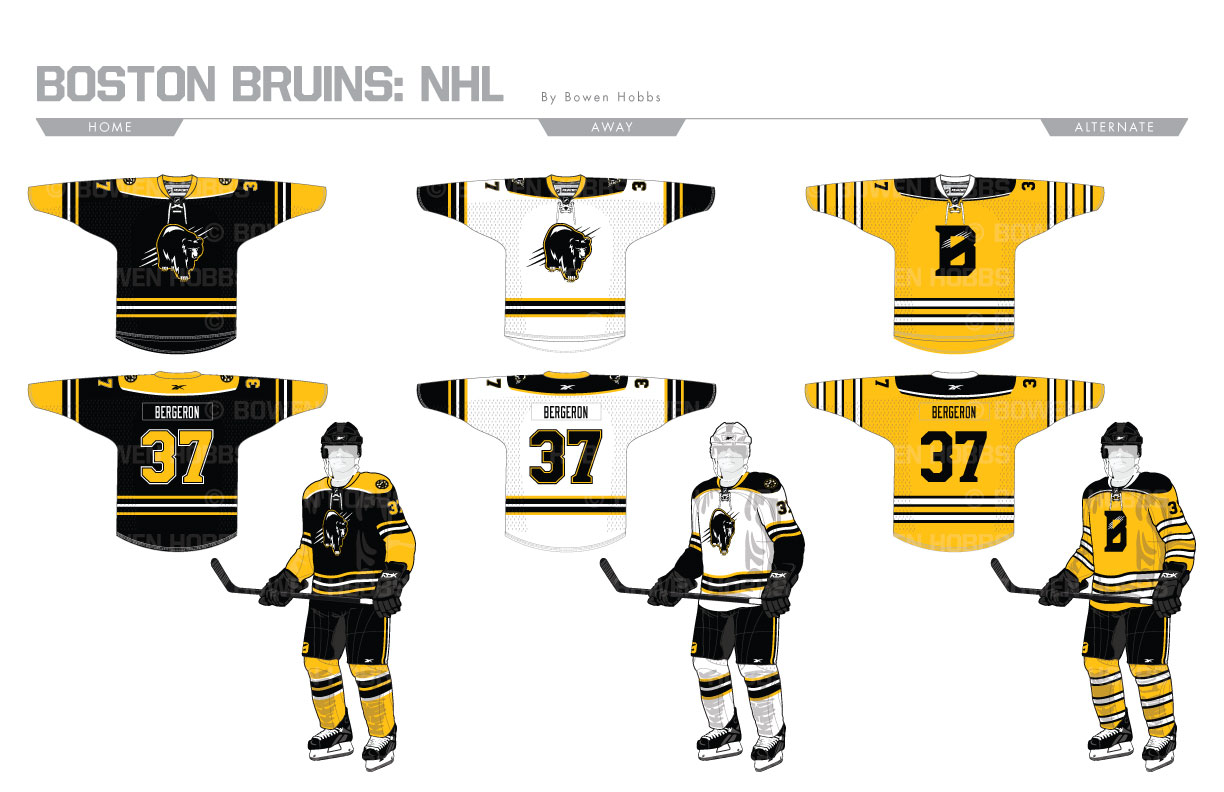
The Boston Bruins are another Original Six team with a wealth of history. My goal with them, however, was to emphasize the bruin over the B. The primary logo is comprised of a prowling black bear accented with slash marks. The rest of the logo set contains an update of the classic B-Spoke, a standalone slashed-B, and a spoke bruin. The typeface is an angular block serif that represents a combination of strength and speed. The home and road uniforms are a tasteful update of the current set, while the alternate blends elements of the Bruins’ visual history from the 1950s and 60s.
Date
June 29, 2017
Category
Hockey, NHL


