Boston Celtics
Boston Celtics
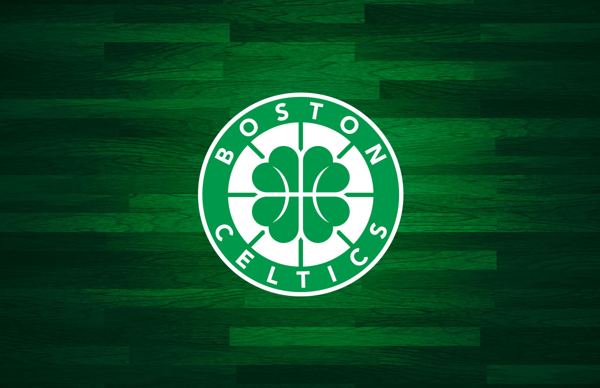
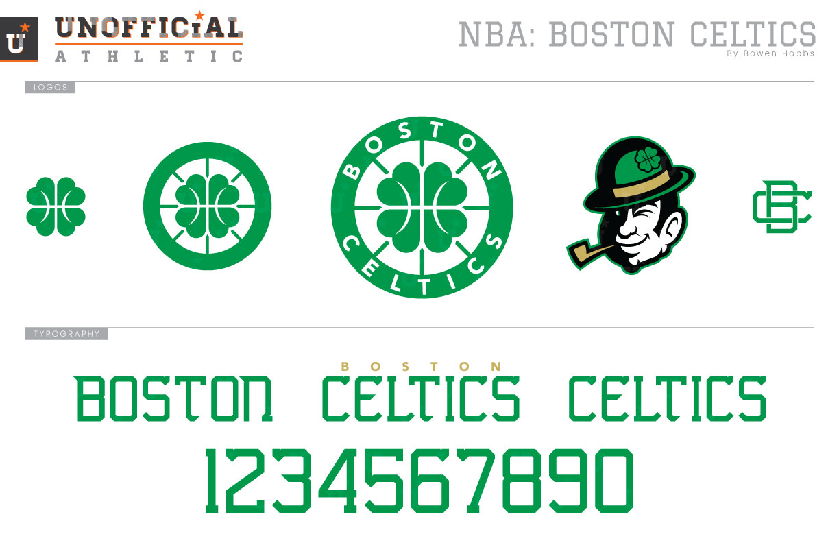
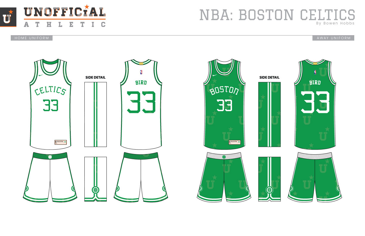
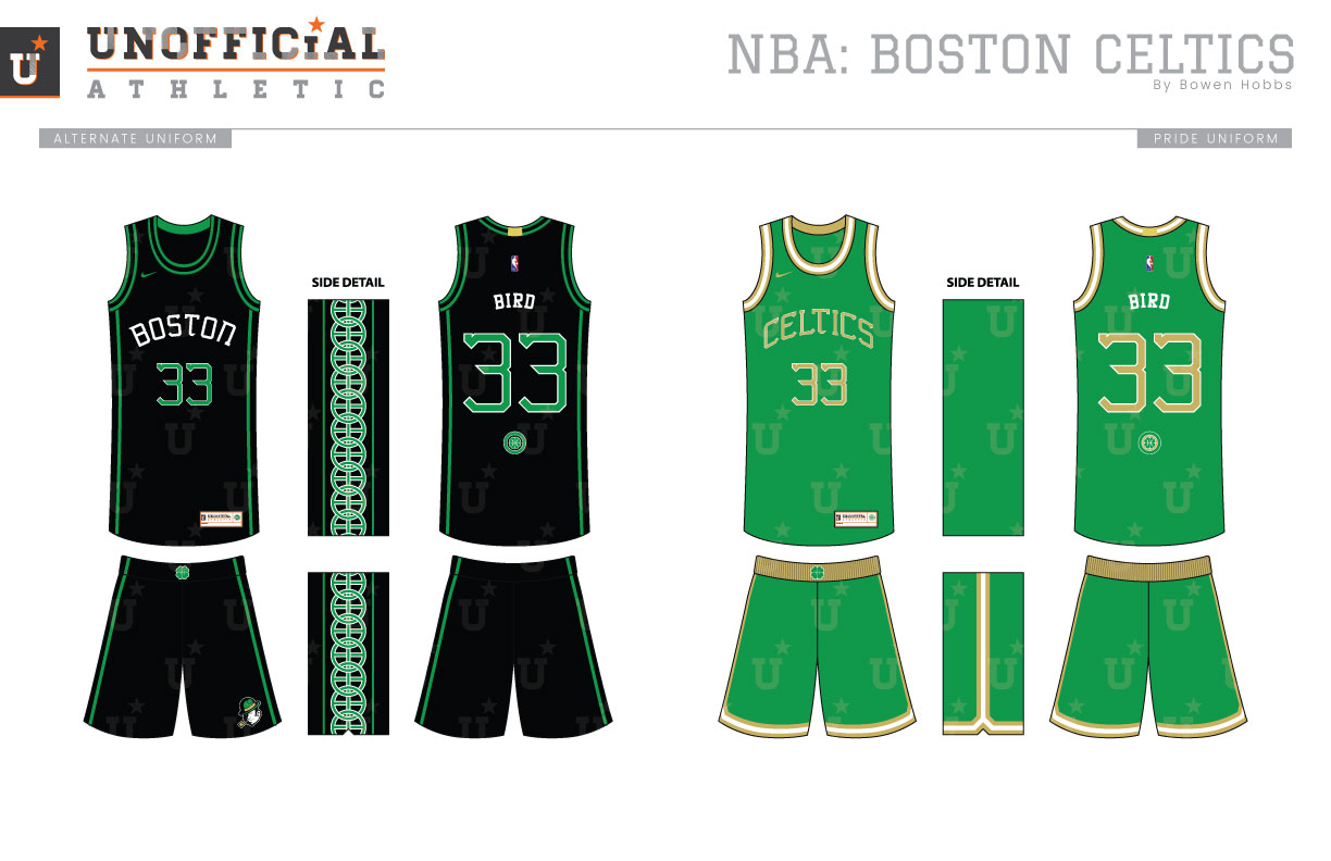
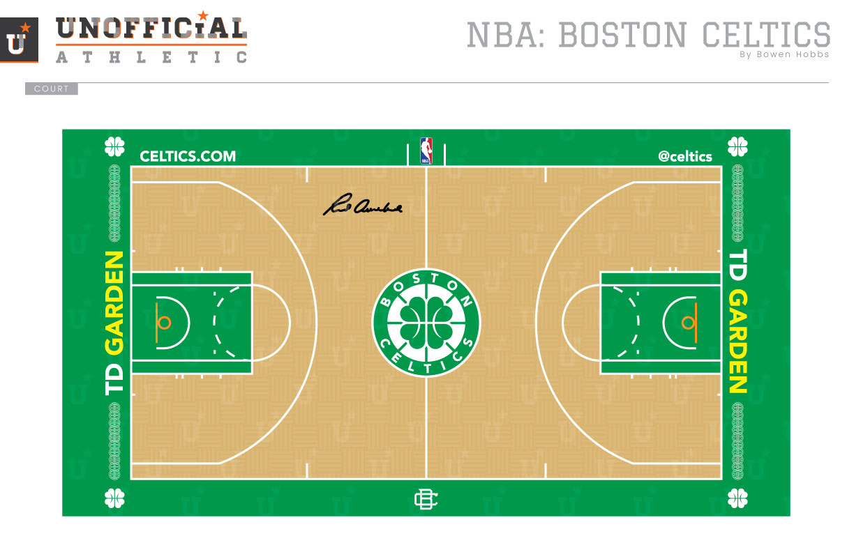
The Boston Celtics, winners of an NBA-record 17 championships, are steeped in tradition. From Auerbach and Bill Russell to Larry Bird and Kevin McHale all the way to Kevin Garnett and Paul Pierce, the Celtics have a storied history to be proud of. Despite this, the Celtics logo, a cartoon of a leprechaun spinning a basketball on his finger, hasn’t aged as gracefully. In fact, neither the primary logo nor a partial version of it appear on the uniforms. My goal was to create an icon simple enough to work at the small sizes of a mark on the shorts or waistband of an NBA uniform, but also engaging enough to not look generic. For the primary logo, I developed a four-leaf clover with the lines of a basketball that extend through the rest of the roundel. Two partial versions of the mark, one without the text and another of just the clover allow the mark additional versatility. I also decided to update the original leprechaun head as an alternate mark, making it cleaner and less dated. An interlocking BC mark completes the logo set. I’ve dubbed the typeface an “Irish block serif” that combines the uniform stroke weight of an athletic block font with the larger corners and flourishes of traditional Irish calligraphy. The uniforms take a slight twist on the classic by continuing the striping pattern from the sides of the shorts onto the jerseys. In addition, the textless roundel mark appears on the shorts and the script on the chest of the jerseys is radially arched instead of vertically arched. The alternate jersey is black and proudly displays a celtic knot pattern that creates a string of basketballs down the sides. The pride uniform is a twist on the Celtics’ St. Patrick’s Day jerseys, complete with a vertically arched script and unstriped jersey sides. The court keeps the parquet flooring and Red Auerbach’s signature, but adds the celtic knotting along the baselines.
Date
August 17, 2017
Category
Basketball, NBA


