Philadelphia 76ers
Philadelphia 76ers
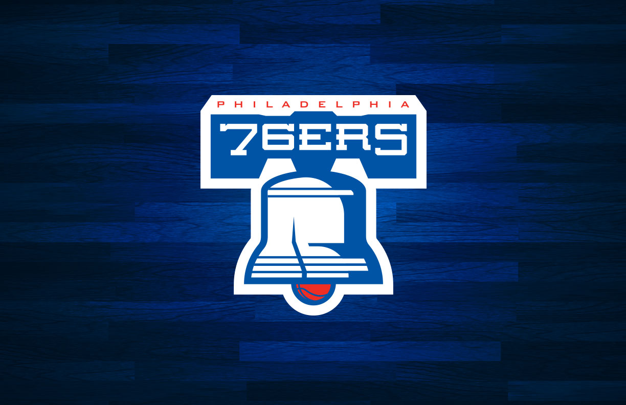
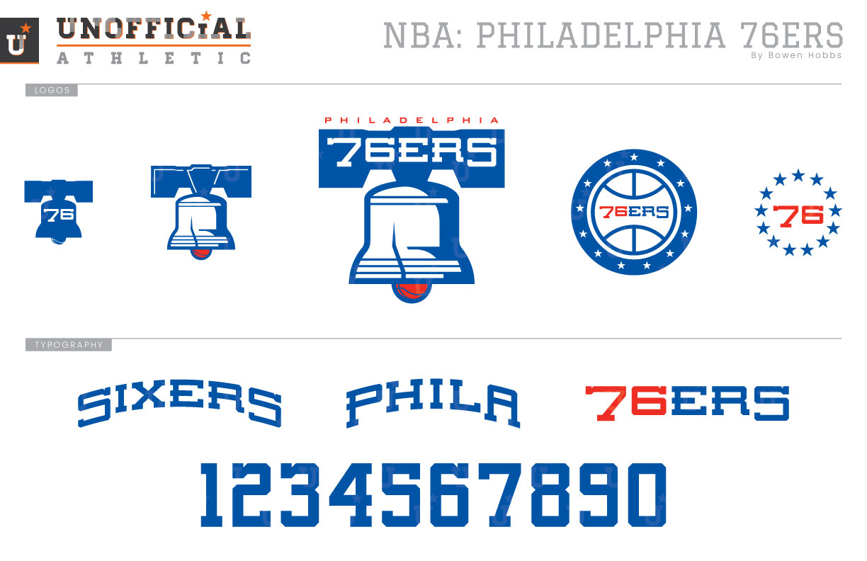
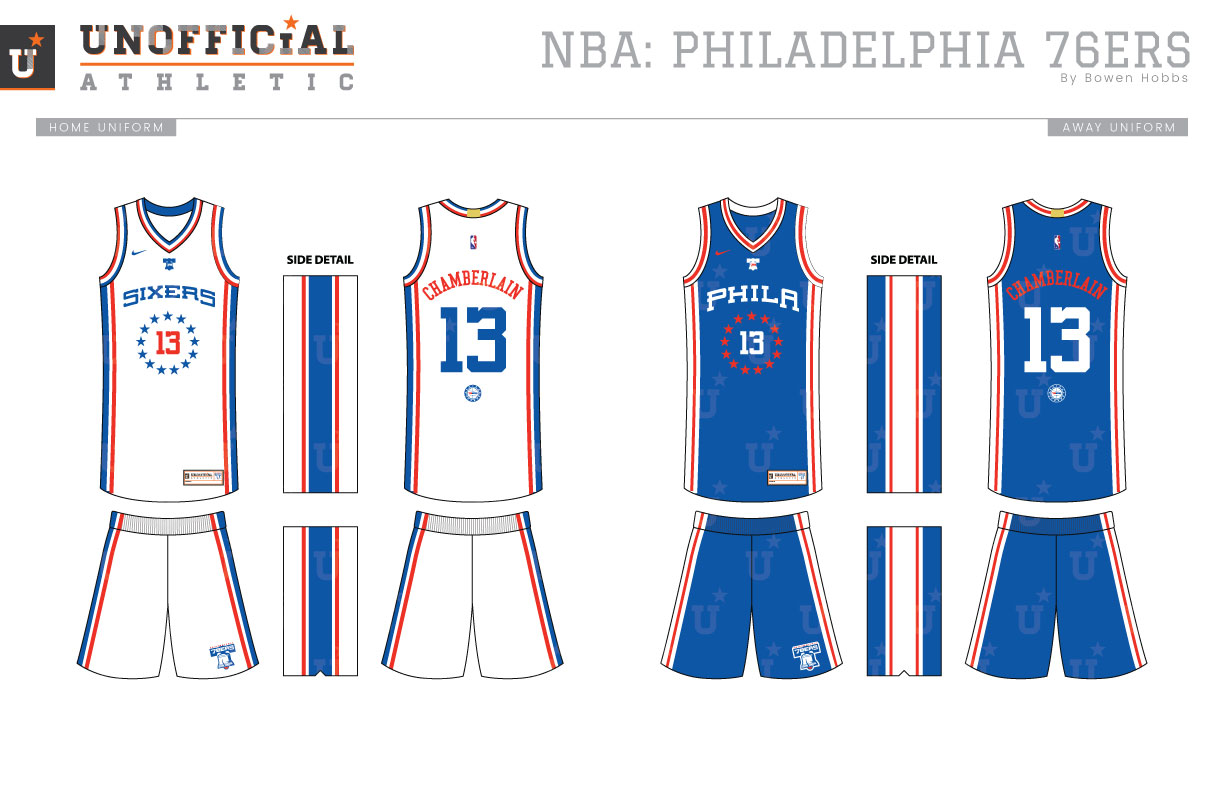
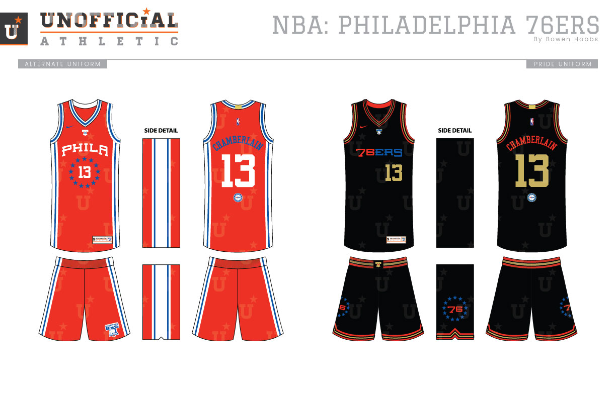
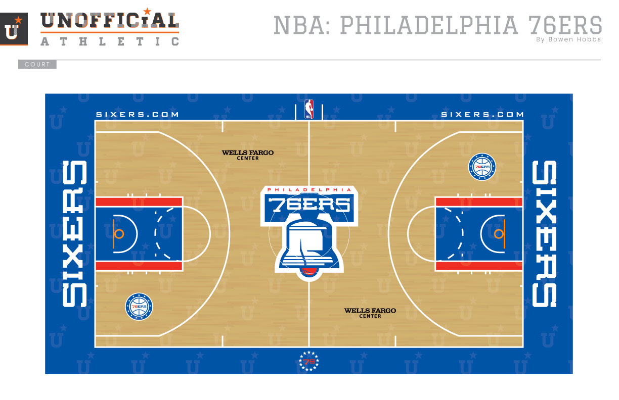
With the exception of the Allen Iverson era, the Sixers have more or less used a similar brand identity throughout their history, shifting from a red dominant scheme, to a blue dominant theme in recent years. While the identity has been relatively clean over that time, it could use room for improvement. I wanted to focus on one of the greatest symbols Philadelphia has to offer: the Liberty Bell. My primary logo starts with the Bell, placing a basketball as the bell’s clapper and the team name in the yoke. The bell logo breaks down into a standalone version and an icon version, complete with 76 inside its silhouette. The secondary mark places the 76ERS wordmark inside a stylized basketball with 13 stars around it. a 76 surrounded by a ring of 13 stars completes the logo set. The typeface is short, stout block serif with a vintage flair and is arched on the SIXERS and PHILA wordmarks. The numerals are a taller and bolder version of the same typeface to fit within the specs of NBA jerseys. Speaking of jerseys, the Association (white) jerseys feature a red-white-and-blue collar that accents the uniform’s side panels. A ring of stars surround the player number on the chest, while the 76-Bell icon is placed just below the collar. The Icon edition is royal blue and matches the Association uniform, but with red-and-white trim and a PHILA wordmark on the chest. The third uniform matches the Icon edition, but with red and blue swapped. The Pride uniform pays homage to the aforementioned Iverson era with black jerseys and shorts accented with mostly red and gold. The wordmark and logos add a small splash of blue to the mix. The court is straightforward and classic, with red accents lining a blue lane, and the Liberty Bell logo front-and-center.
Date
August 26, 2017
Category
Basketball, NBA

