Boston Red Sox
Boston Red Sox
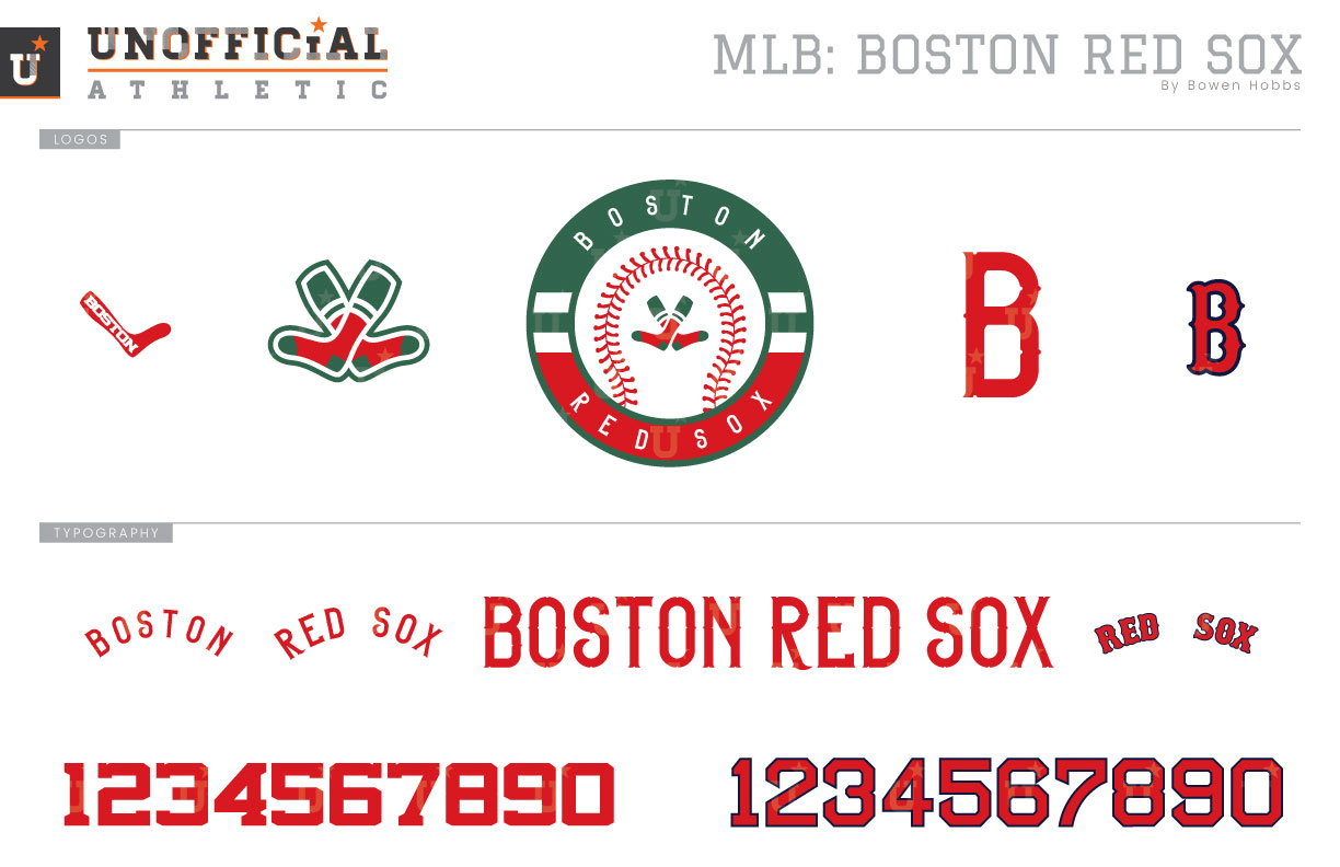
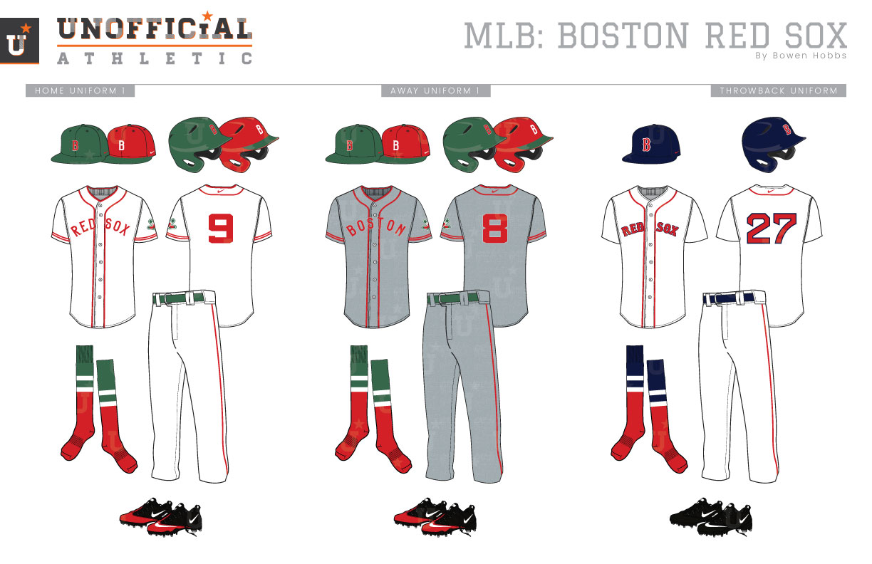
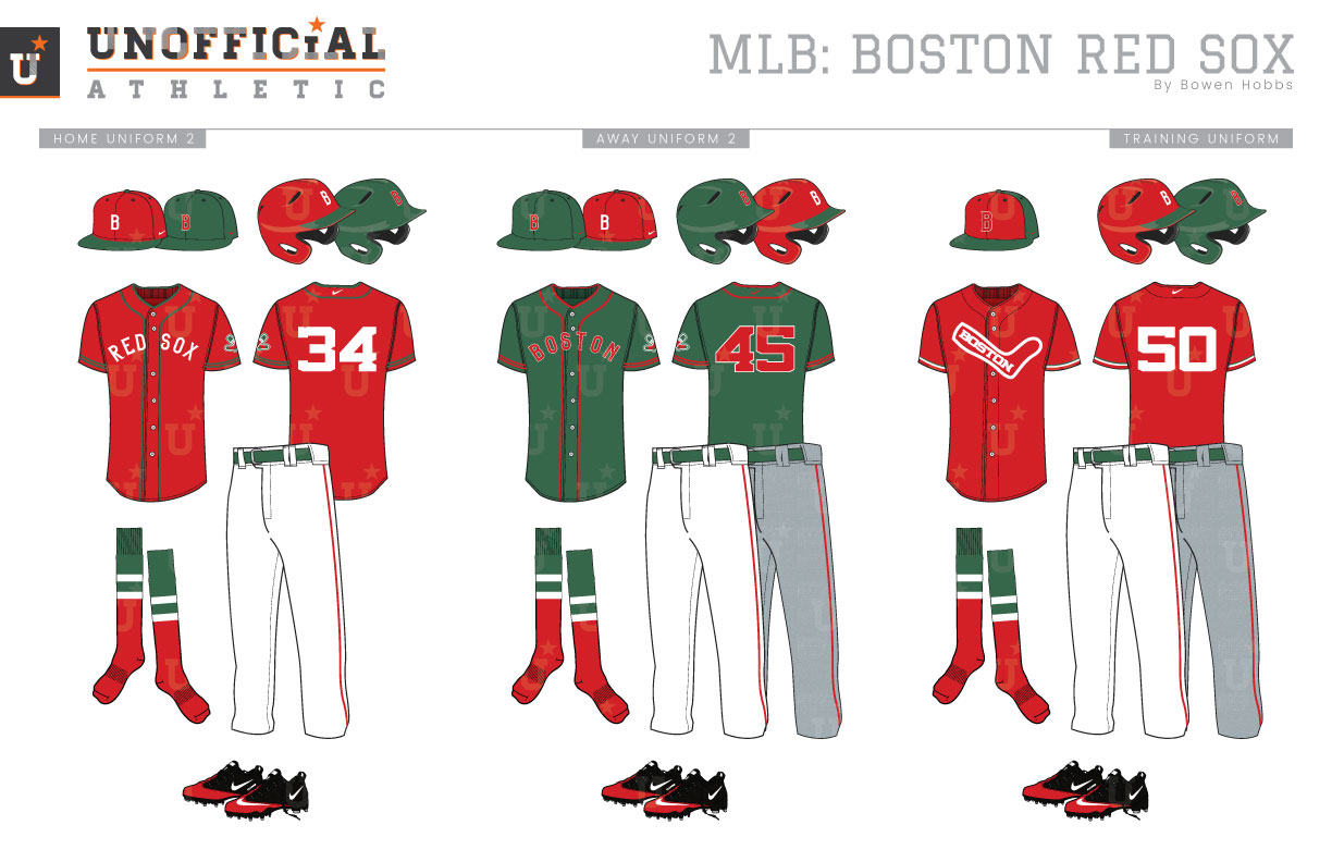
The Red Sox, or Boston Americans as they were known at the time, began play in 1901 as a charter member of the newly formed American League. The Americans were blue and white, but that changed in 1908 when Boston’s AL team changed its name to the Red Sox. The uniforms were redesigned to feature red accents instead of blue, although navy returned to intermittently pair with red starting in 1916. By 1936 navy was a staple alongside red in the team’s color palette, where it has remained to this day. The Red Sox have used a pair of socks in their logo since 1924, although the first version appeared as single red sock with BOSTON on it in 1908. The Red Sox’ classic B first appeared as a block-B in 1933 and has gone through multiple revisions with the current version having been used since 1966. Having used a similar scheme uniform since 1936, the Sawx have built an amazing amount of brand consistency over the years. There were some things I wanted to address with this rebrand however. The first thing I wanted confront was the fact that there are seven navy-and-red teams (Red Sox, Indians, Twins, Angels, Braves, Nationals, and Cardinals) currently in Major League Baseball, which is tied for the most teams of one color scheme in all of the big four sports alongside the number of red-and-black teams in the NBA. Secondly, I wanted to draw more of a distinction between the Red Sox and the Yankees. Both teams employ a large amount of navy blue which is odd for two heated rivals. Lastly, I wanted to evoke the feeling of the Red Sox by drawing inspiration from the only home they’ve known since 1912: Fenway Park. The park’s biggest feature, The Green Monster, looms large in left field, enticing right-handed batters to hit moon shots over its tall but shallow porch. My Red Sox rebrand starts with a new color scheme of Fenway Green and Red, reclaimed from the concourses of the historic venue. The primary logo I designed places two red socks in the center of a roundel. The ring around the baseball is color-blocked to mimic the team’s iconic hosiery. The Tuscan-B that has adorned Sox caps for decades has been reimagined with a more uniform stroke weight and subtle details that recall wood type fonts of the early 20th century. The crossed socks from the primary mark are also used as a sleeve patch by themselves, while a tweaked version of the 1908 sock mark is used as an alternate logo. Lastly, the classic B is kept for throwback purposes. The new primary cap is Fenway Green with a red B outlined in white, while the alternate cap is red with a green bill and white B. The home uniforms are white with red type and trim and can be paired with either cap, although the green cap is the primary designation. The road greys feature red details against a flannel-print grey base and can be worn with either cap as well. The throwbacks retain the classic home uniform with navy caps and red type outlined in navy. The home alternate red jersey combines white type and green trim and is primarily paired with the red caps, although the Fenway Green caps can be used as well. The away alternate goes all in on the new colorway by pairing a Fenway Green jersey featuring red type outlined in white with either the green or red caps. The green jerseys can be worn at home or on the road. The batting practice caps are green with a red front and are complemented by red BP jerseys with the BOSTON-sock mark across the chest.
Date
March 24, 2019
Category
Baseball, MLB


