Brooklyn Nets
Brooklyn Nets
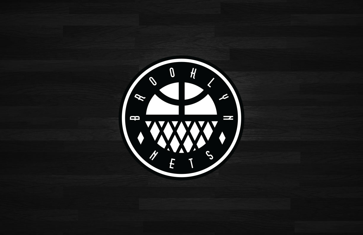
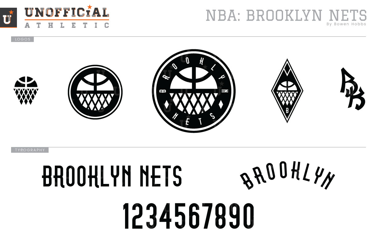
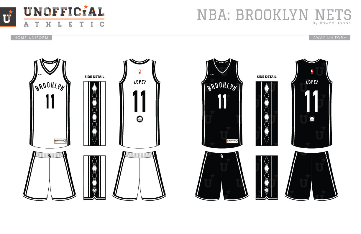
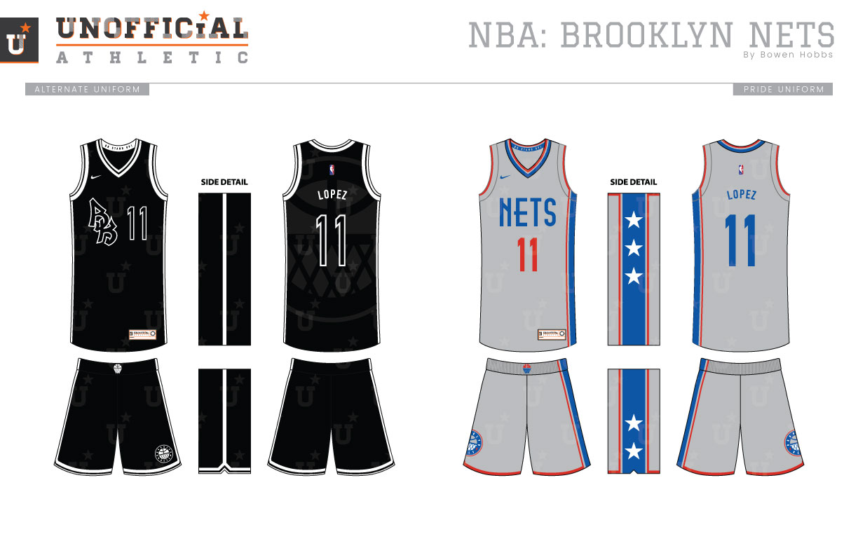
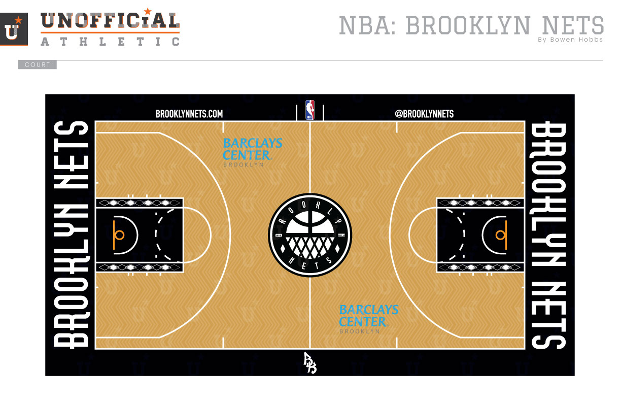
When the Nets moved to Brooklyn in 2012, Jay Z was called in to help with the rebrand. The result was a move to a simple BK-inspired color palette of black and white and a straightforward type treatment once used on the subway system under Gotham. It instantly became a classic identity among the NBA. My concept takes some of the best parts of that brand and adds in a ball/hoop mark that is placed inside a roundel. The ball/hoop icon is also used inside a diamond and in a standalone capacity. The BK graffiti mark adds a flair to an otherwise traditional set. The typeface is updated to add a little vintage flair. Instead of simple trim, the Icon and Association uniforms add an argyle pattern to the sides, a reference to the twice-Eastern Conference Champion Jason Kidd Nets. The Alternate uniform places the BK mark alongside a blacked out numeral with simple white trim, while the Pride uniforms add a grey base to the classic ABA threads. The Nets court keeps the herringbone wood inlay, but updates the lanes with argyle trim and the new wordmark on the baselines.
Date
August 31, 2017
Category
Basketball, NBA

