Dallas Mavericks
Dallas Mavericks
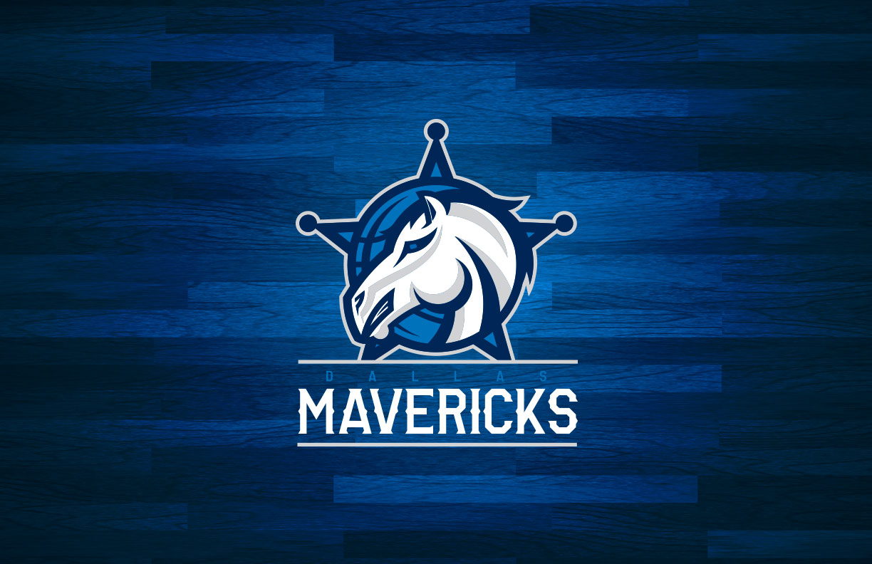
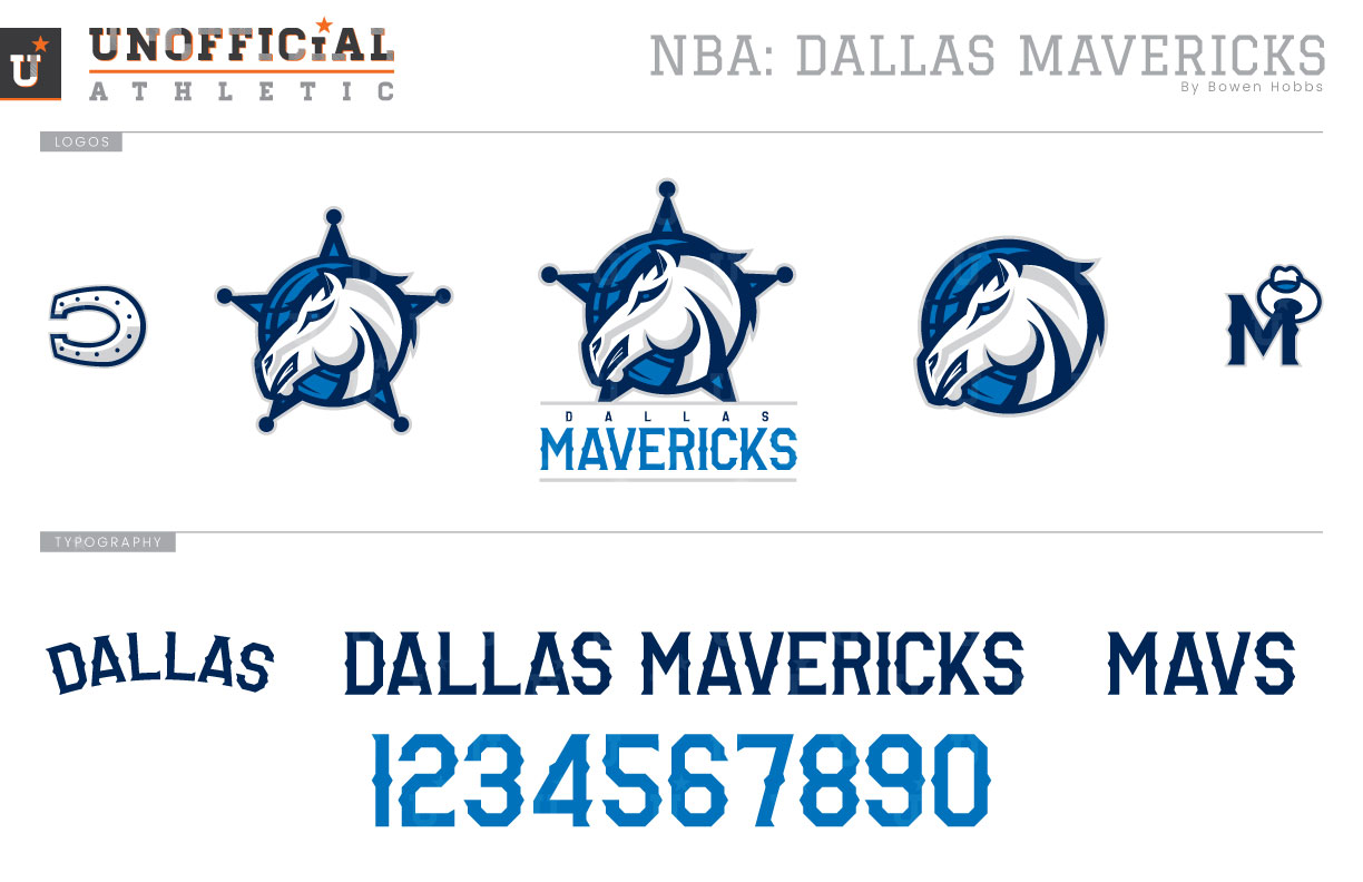
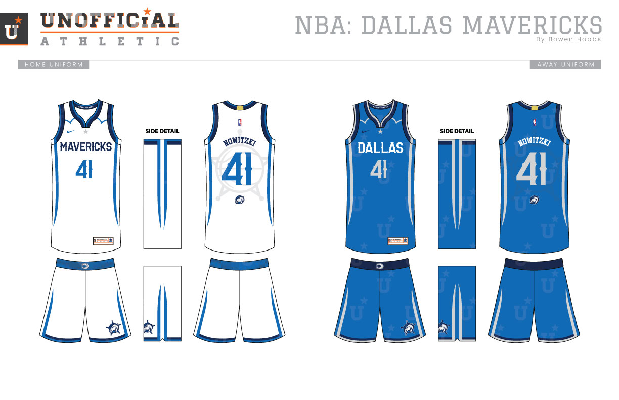
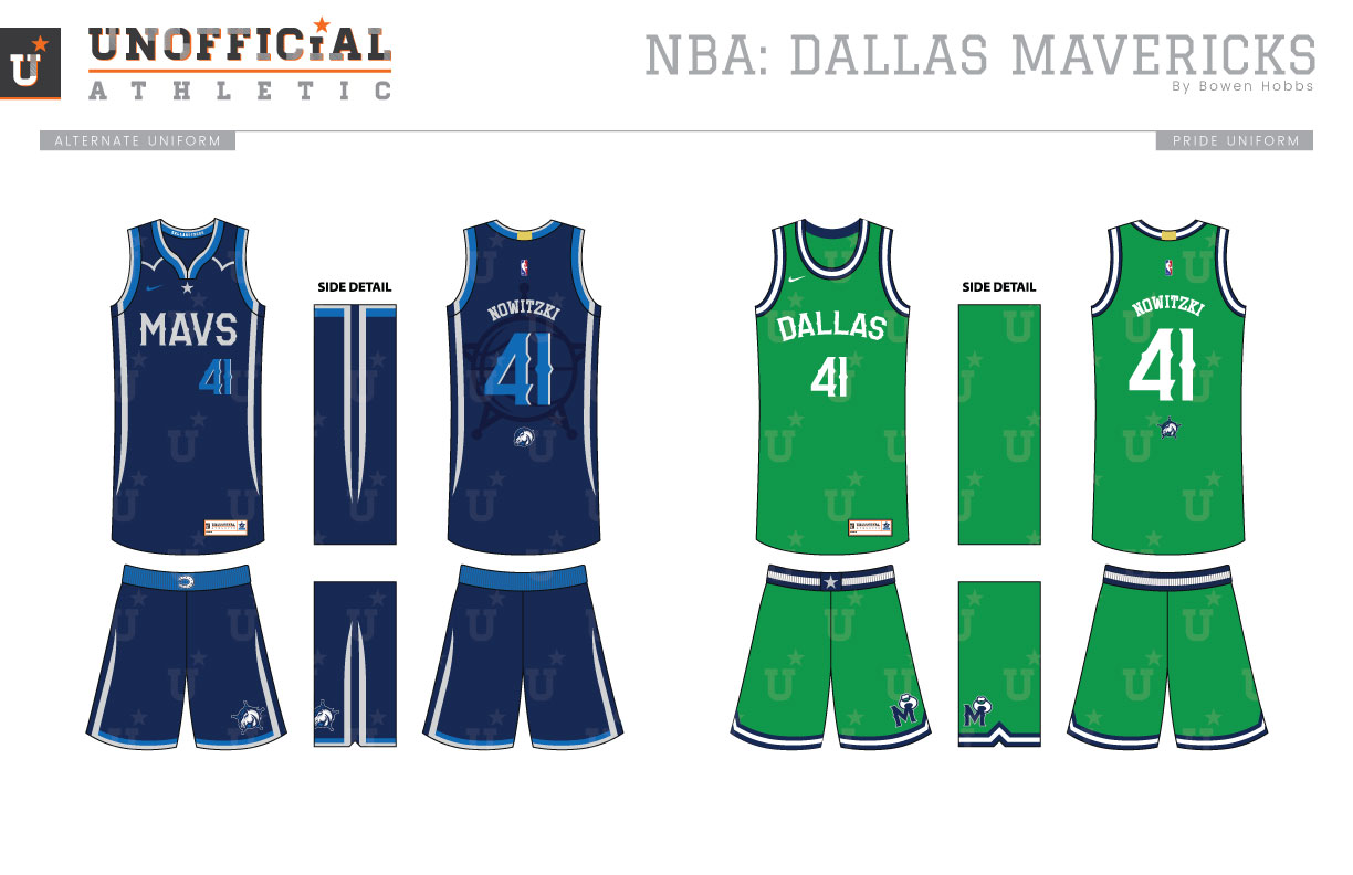
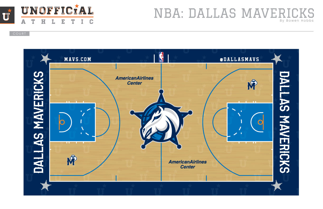
There is much to be happy with regarding the Mavericks 2001 rebrand, from an updated color palette of royal, navy, and silver to focusing on a white stallion as the primary symbol. There are also parts that haven’t aged as well. The typeface has become dated, and the logo uses black instead of navy, somewhat inexplicably. My concept moves the horse from a three-quarters pose to a profile placement against a blue basketball. Another difference is in the containing shape: I placed the horse/basketball icon against a star sheriff’s badge instead of a triangular shape. The DALLAS MAVERICKS signature is placed just below on the primary mark. A Horseshoe-D and a modernized throwback logo add a pair of icons to the logo set. The typeface combines elements of an athletic block typeface with subtle western barbs on the vertical strokes. The uniforms features western shirt details on the collar bones with tapered stripes along the sides. A sheriff’s badge is sublimated behind the player number on back. The Pride uniforms recall the Mavs’ kelly green beginnings with a modernized classic containing navy and white trim and simple white type. The court features dueling shades of blue with the sheriff’s badge/horse combo mark at center court.
Date
August 31, 2017
Category
Basketball, NBA

