Charlotte Hornets
Charlotte Hornets
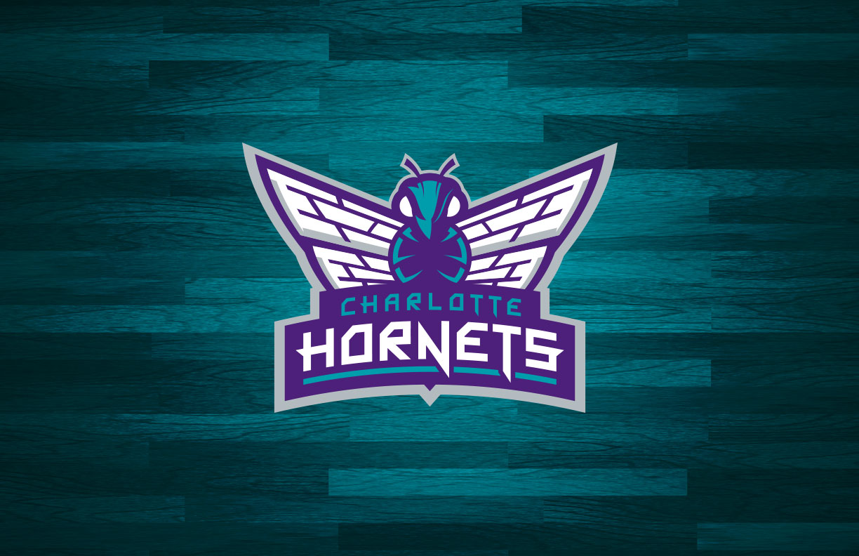
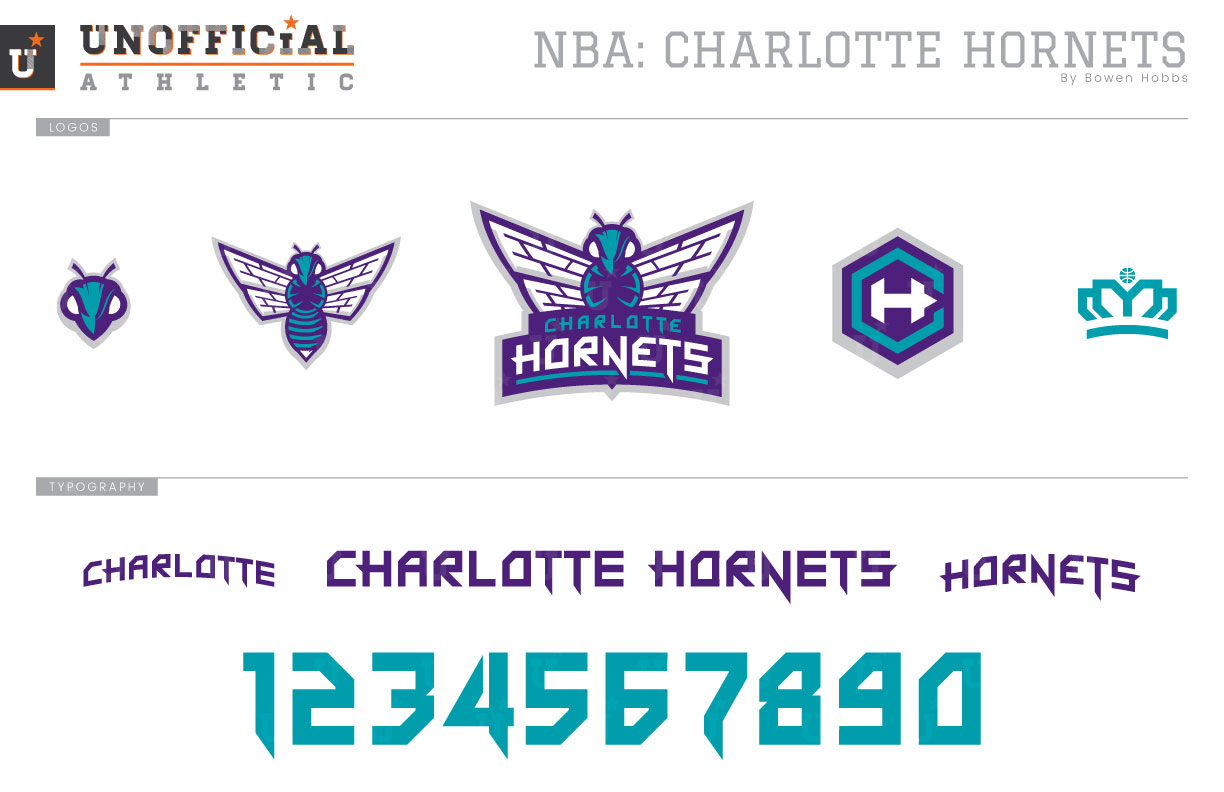
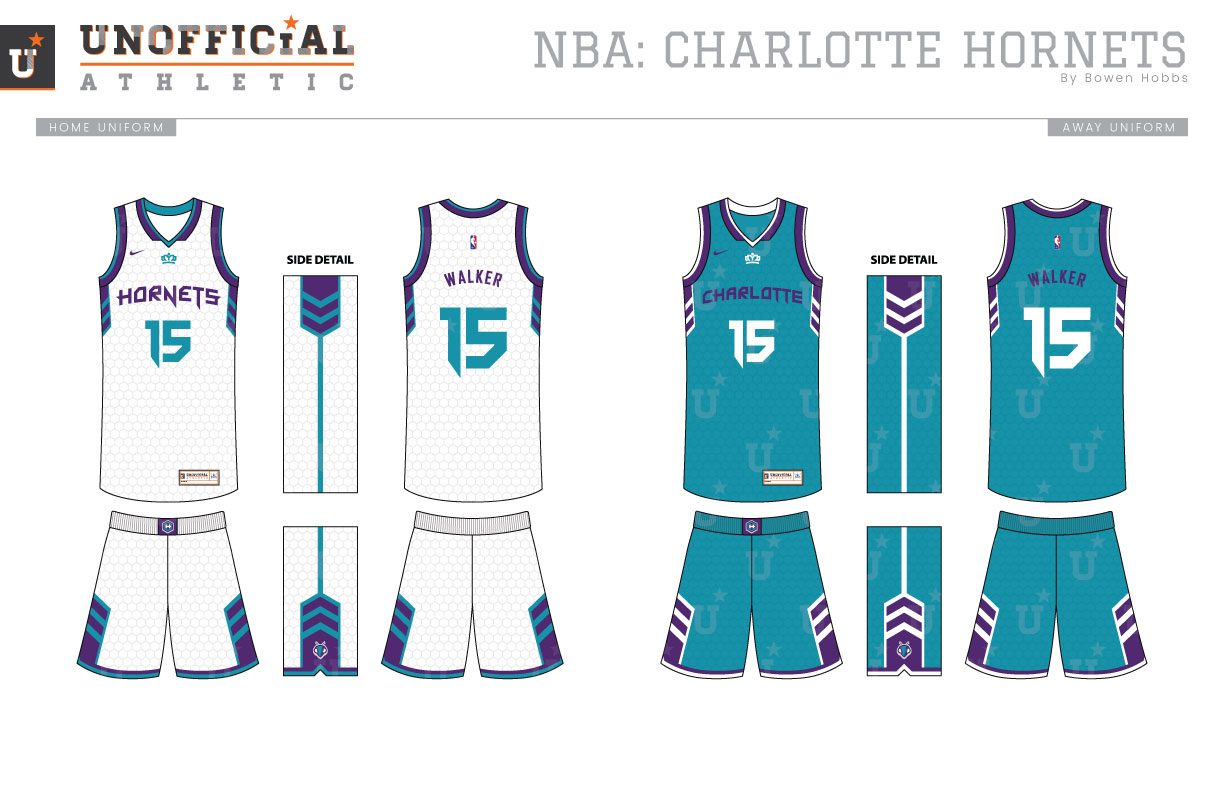
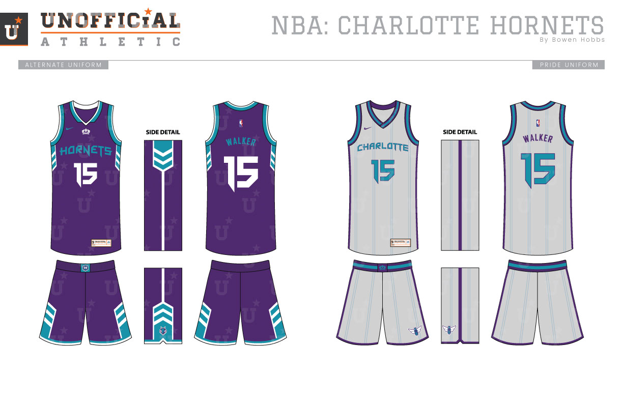
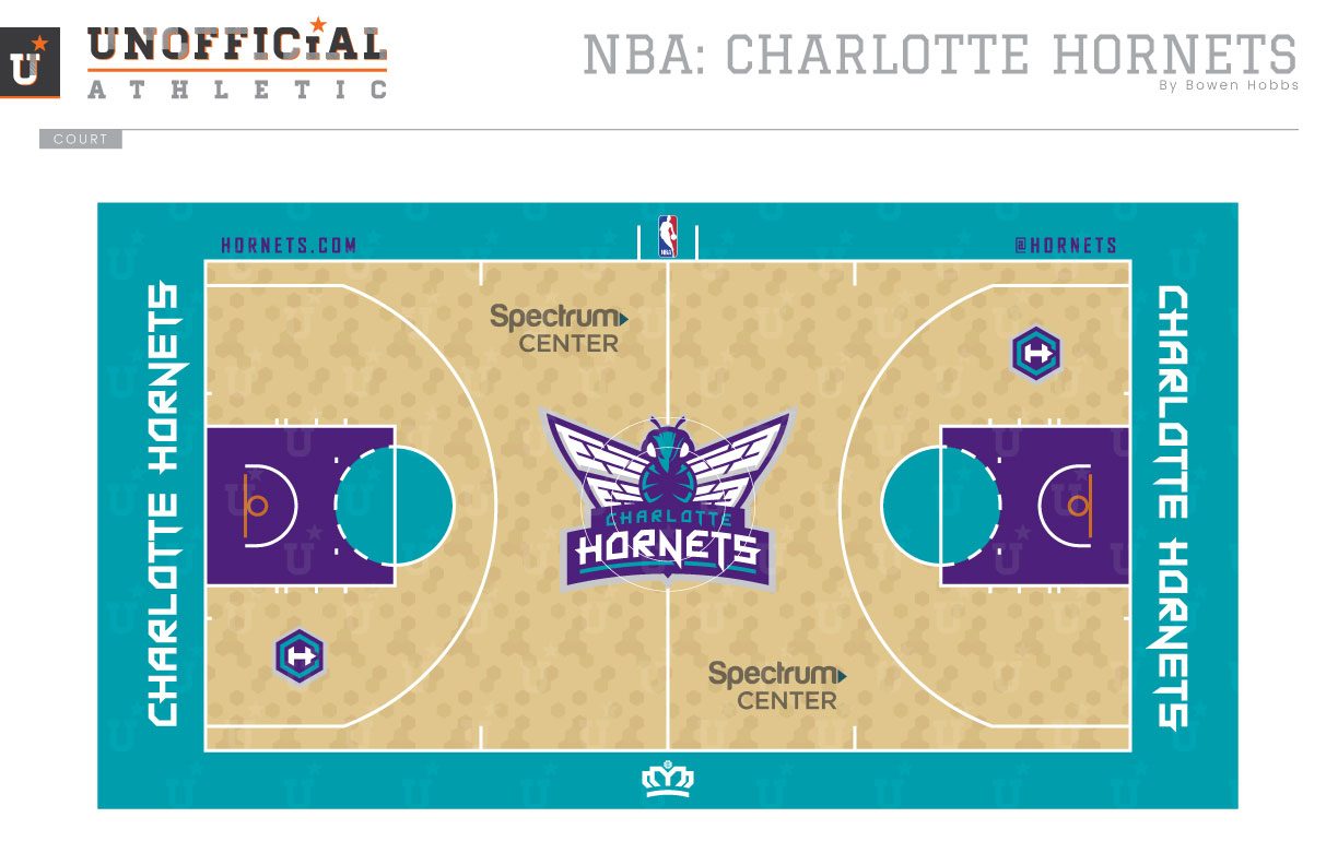
The original Charlotte Hornets went to New Orleans in 2002 and retained the Hornets moniker until 2013. The next season, the Charlotte Bobcats renamed themselves the Hornets. Naturally, I kept the teal and purple color scheme that is emblematic of Charlotte basketball, but with a touch of silver added. My concept adds more detail to the hornet’s wings, as well as a meaner gaze to the bug. A basketball is formed by the hornet’s legs, while the wordmark is aligned to the bottom with the stinger poking out under the N. The hornet also appears without the wordmark, and as an icon of just the head. A hexagonal CH mark and a stylized crown representing the Queen City complete the logo set. The typeface is angular and sharp, playing on the stinger motif. Speaking of stingers, the uniforms emphasize a chevron/stinger design along the sides. A honeycomb pattern appears throughout the uniform as well, while the the Queen City crown appears just below the collar. The Pride uniform is a light grey with double pinstripes that draw their inspiration from the team’s original threads. The court eschews the traditional linear hardwood pattern for a honeycomb design with a teal out-of-bounds area, purple lanes, and teal keys.
Date
April 22, 2018
Category
Basketball, NBA

